Jointrybe
jointrybe.com/
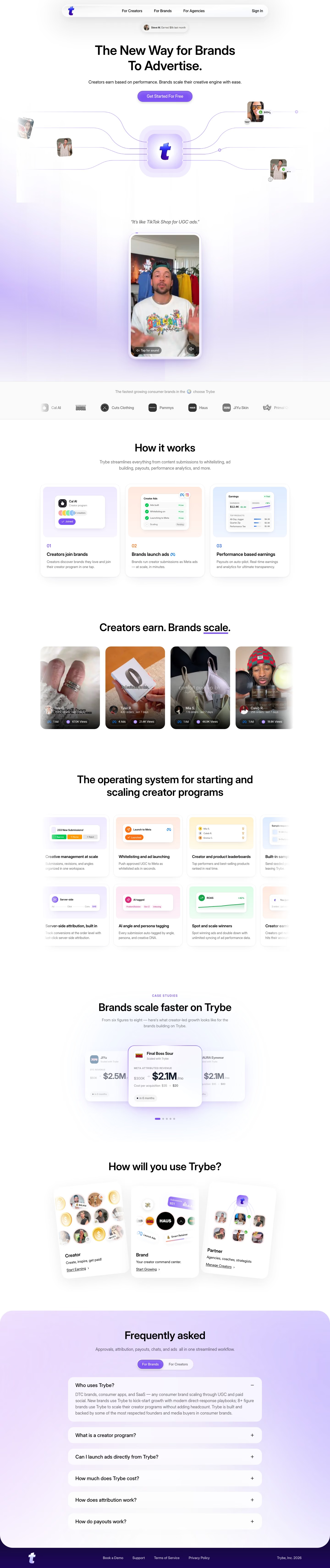
Trybe is a performance-based UGC platform connecting creators with brands, handling content submissions, ad approvals, attribution tracking, and creator payouts in one workflow; the site describes it as "like TikTok Shop for UGC ads." Rather than generic case studies, it names specific brands with before/after revenue and CPA figures over stated timeframes, such as Final Boss Sour scaling from $300K to $2.1M monthly revenue while cutting CPA from $35 to $20 over six months. A creator-performance carousel shows individual creators by name with real order and view counts (one example: 1,357 orders, 67K views), applying the same numeric specificity to creators as to brands. Pricing is stated plainly as free to start and capped at 1.5%.
- Category
- Marketing
- Style
- LightMinimal
- Stack
- Next.jsTailwind CSS
- Fonts
- Inter DisplayGeist
- Palette
- Meta title
- Trybe — Performance-based UGC for Creators & Brands
- Sections
- 4
- Updated
Jointrybe's landing page, section by section
Each section below is cropped straight from Jointrybe's live page — useful references for marketing landing page design.
Jointrybe design review: how the homepage is built
The page carries the brand name Trybe throughout, while the catalog lists it as Jointrybe. It runs about 6835 pixels at 1440 wide: a floating nav pill, a centered hero with a phone-framed video, a logo strip, process cards, a creator video carousel, feature cards, a case-study carousel, an audience picker, an FAQ panel and a dark footer. Colour is a lavender wash behind white cards, with purple #7d52f4 on the button and logo and peach #e99788 tints in card illustrations and #fcfcfe as the page white. Inter Display sets headings and Geist sets body text.
Above the fold
The nav is a rounded pill with the logo at left, three centered links, "For Creators", "For Brands" and "For Agencies", and "Sign In" at right. A chip beneath reads "Final Boss Sour grew by 80%". The two-line headline is followed by one subhead line and a single purple pill button, "Get Started For Free". Purple lines run from five creator thumbnails, some with badges such as "$6548", into a logo tile above the quote "It’s like TikTok Shop for UGC ads."
Logo strip, process cards and creator videos
A grey logo strip lists "Cal AI", "Cuts Clothing", "Pammys", "Haus" and "JiYu Skin". "How it works" follows with a grey explainer and three cards numbered 01 to 03: "Creators join brands", "Brands launch ads" and "Performance based earnings". Next, "Creators earn. Brands scale." underlines the word scale in purple above four portrait video tiles with figures such as "67.0K Views".
Feature grid and case-study carousel
The heading "The operating system for starting and scaling creator programs" introduces two rows of feature cards that bleed off the right edge, for example "Creative management at scale" and "Server-side attribution, built in". A purple "CASE STUDIES" label then precedes "Brands scale faster on Trybe", above a carousel whose raised center card for Final Boss Sour shows "$2.1M" per month.
Closing section and footer
"How will you use Trybe?" shows three slightly tilted white cards, "Creator", "Brand" and "Partner", ending in the links "Start Earning", "Start Growing" and "Manage Creators". A rounded lavender panel titled "Frequently asked" holds a toggle, "For Brands" and "For Creators", and six question rows with plus icons; "Who uses Trybe?" is open. A dark footer band carries the logo, "Support", "Terms of Service", "Privacy Policy" and "Trybe, Inc. 2026".
On mobile
At 390px the page is about 6213 pixels tall. The headline wraps to three lines, with the button directly beneath the subhead. The nav pill is gone and the proof chip carries different wording. Process cards stack full width, feature cards fall to two per row, the audience cards become a swipeable carousel with purple arrows, and the footer links wrap onto two lines above the logo.
Worth borrowing
- Creator thumbnails with payout badges wired into the logo tile explain the two-sided model before any copy is read.
- The raised center case-study card with one large figure lets a single result read at a glance.
- Three tilted audience cards ending in different verb links split visitors into creator, brand and partner paths.