
Trymemoir
trymemoir.ai/
Memoir turns shipped code into short demo videos automatically: it watches a team's GitHub activity, pulls the merged PR, captures live screens of the product, applies the company's brand palette and voice, and assembles a roughly 42-second clip delivered to Slack for approval. The site's headline is "From product truth to market proof, at product speed," and it names its own process steps (Inputs, Memory, The Cut, Delivered, Compounds) as a five-stage system rather than a feature list. A live interactive demo lets a visitor paste any company's website URL and watch Memoir generate an illustrative tailored demo brief in real time, with an explicit disclaimer that no external message is actually sent. Y Combinator backing is noted in the footer.
Trymemoir's landing page, section by section
Each section below is cropped straight from Trymemoir's live page — useful references for marketing landing page design.
Trymemoir design review: how the homepage is built
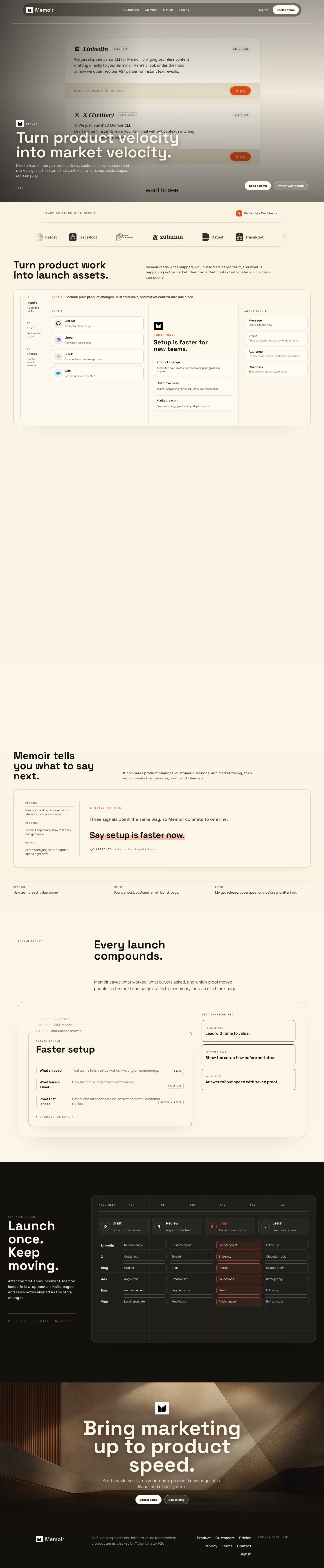
The homepage is a light, minimal page about 6,975 pixels tall at 1440px wide. It moves from a photographic hero through a cream product walkthrough and a dark campaign grid to a closing banner of tan stone. Cream panels carry most of the page, with the rust accent #872714 used for the highlighted approval line and the Ship column. The brand on screen is Memoir, while meta.name is Trymemoir, so the logo and wordmark differ from the listing name. Typefaces are Space Grotesk and JetBrains Mono for display and Manrope for body copy. What sets it apart is the launch-planning mock, a channel-by-day grid.
Above the fold
The hero is a full-bleed photograph in grey, brown and cream, with a navigation bar reading "Customers", "Memory", "Motion" and "Pricing". Two draft cards sit behind the headline "Turn product velocity into market velocity.", set in large white type across two lines, which overlaps the card text beneath it. Pill buttons "Book a demo" and "Watch with sound" close the hero.
Logo strip, input panel and launch-asset section
A strip headed "Teams building with Memoir" shows logo marks. The section headed "Turn product work into launch assets." pairs a paragraph with a three-step panel numbered 01 Inputs, 02 Brief and 03 Assets. Cards list GitHub, Linear, Slack and CRM as inputs, a brief headed "Setup is faster for new teams.", and four assets: Message, Proof, Audience and Channels.
Signal weighing panel and compounding card stack
The block headed "Memoir tells you what to say next." shows a panel with three signals labelled PRODUCT, CUSTOMER and MARKET, then the output line "Say setup is faster now." highlighted in rust, tagged APPROVED. "Every launch compounds." introduces three stacked dated cards, "Audit trail", "CRM import" and "Workspace invites", above an active launch card titled "Faster setup" and a column headed "NEXT CAMPAIGN KIT".
Campaign grid, closing banner and footer
A dark block headed "Launch once. Keep moving." sets a week grid of Draft, Review, Ship and Learn phases against rows for LinkedIn, X, Blog, Ads, Email and Web. Cells read "Founder point" and "Publish page", and a rust line marks the Thursday column. The closing banner reads "Bring marketing up to product speed." above "Book a demo" and "See pricing". The footer lists Product, Pricing, Privacy and Contact, plus TACHYON LABS, INC.
On mobile
At 390px the hero stacks tall, with the headline on four lines and a faint serif wordmark overlapping the subhead. The three-step panel becomes one column of full-width cards. The campaign grid turns into a long vertical list of channel sections that runs far past the other breakpoints. The closing banner keeps its centred stack, and the footer links wrap onto two lines.
Worth borrowing
- Inputs, brief and output appear as three linked panels, so the process reads without the copy.
- A single highlighted line, "Say setup is faster now.", stands in for the proof of that process.
- One announcement is laid across six channels in a grid, which shows the product's scope on one screen.





