
Dia
diabrowser.com/
Dia is a Productivity & Collaboration product. See its diabrowser.com landing page design in full — desktop and mobile screenshots plus close-ups of the heroes, footers and about us. It's built with Next.js and Tailwind CSS. Its type is set in Exposure VAR, anchored by a #fbc62b palette. Study how Dia structures its messaging, layout and visual hierarchy, then explore more of the best Productivity & Collaboration website designs.
- Category
- Productivity & Collaboration
- Style
- LightColorful
- Stack
- Next.jsTailwind CSS
- Fonts
- Exposure VARABC Oracle
- Palette
- Meta title
- Dia | The browser for better days at work.
- Sections
- 3
- Updated
Dia's landing page, section by section
Each section below is cropped straight from Dia's live page — useful references for productivity & collaboration landing page design.
Heroes
More heroesAbout Us
More about usDia design review: how the homepage is built
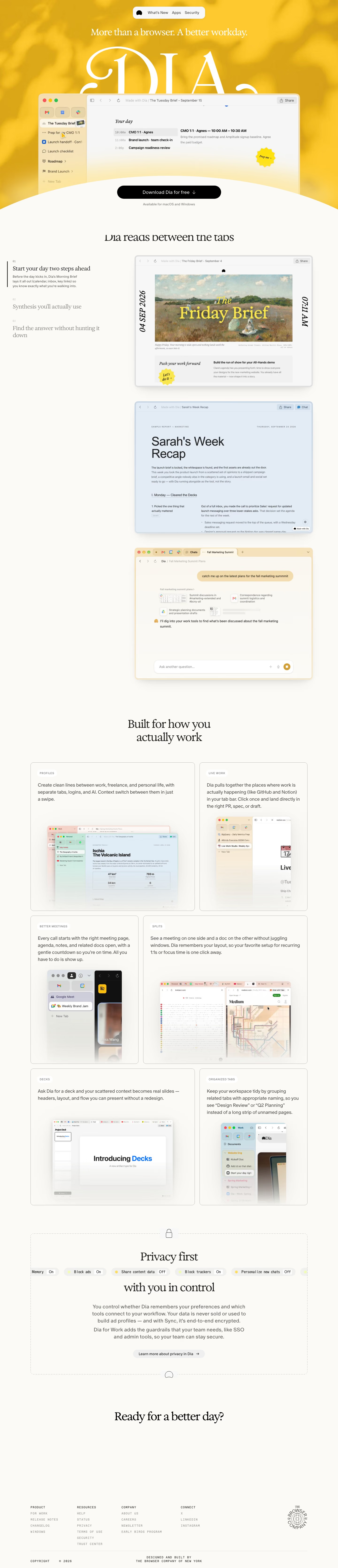
Top to bottom: a floating pill header, a yellow hero where an oversized serif wordmark is cut off behind an app window, a three-step feature list beside tall screenshots, a six-card grid, a dotted privacy box, a one-line closing question and a small monospaced footer. It measures 6674 pixels on desktop. A saturated yellow near #fbc62b with #f9e8b7 highlights floods only the hero, and everything after it sits on off-white. Exposure VAR and ABC Oracle are the listed display faces. The distinctive move is letting the product name act as a giant backdrop to its own interface.
Above the fold
The header is a small white pill holding a logo mark and three links, "What's New", "Apps" and "Security". "More than a browser. A better workday." sits above the huge wordmark. A browser mockup overlaps the letters, its tab sidebar listing "The Tuesday Brief" and "Prep for my CMO 1:1". A curved off-white edge rises under a black "Download Dia for free" pill and a line reading "Available for macOS and Windows".
Three-step feature list with screenshots
"Dia reads between the tabs" introduces three numbered items at left, "Start your day two steps ahead", "Synthesis you'll actually use" and "Find the answer without hunting it down". Only the active item shows a vertical rule and a paragraph; the others fade to grey. At right sit three framed screenshots in different tints: a painting-backed brief in warm yellow, "Sarah's Week Recap" on pale blue, and a chat window on cream.
Six-card work grid
Under "Built for how you actually work", thin-bordered cards fill a two-column grid in alternating wide and narrow widths. Each opens with a small caps tag, "PROFILES", "LIVE WORK", "BETTER MEETINGS", "SPLITS", "DECKS" and "ORGANIZED TABS", then a paragraph of two to four lines and a cropped screenshot fading into the bottom edge. The "DECKS" card shows a slide titled "Introducing Decks".
Privacy box, closing line and footer
A dotted rectangle with a padlock tab holds "Privacy first" and "with you in control", split by a row of pill toggles such as "Block ads" and "Share content data" marked On or Off, then a paragraph and a grey "Learn more about privacy in Dia" pill. "Ready for a better day?" follows. The footer sets four columns, "PRODUCT", "RESOURCES", "COMPANY" and "CONNECT", in spaced uppercase mono beside a circular seal.
On mobile
At 390px the page grows to 7368 pixels. The header becomes a rounded bar with the logo and a plus icon, and the headline wraps to two lines over a much smaller mockup. The hero button now reads "Send download link" and repeats under the closing question. All three numbered steps expand with their screenshots between them, the card grid becomes one column, and the footer folds into two columns.
Worth borrowing
- Cropping a giant wordmark behind the product window gives the hero a brand moment without extra copy.
- Fading inactive steps to grey while one stays expanded keeps a three-part story to one visible paragraph.
- Swapping in "Send download link" at 390px matches the call to action to a device that cannot install the app.





