Different
different.ai/
Different is a Marketing product. See its different.ai landing page design in full — desktop and mobile screenshots plus close-ups of the heroes, features, footers, testimonials, ctas, and 4 more. It's built with Webflow. Its type is set in Feature Display, anchored by a #47181b palette. Study how Different structures its messaging, layout and visual hierarchy, then explore more of the best Marketing website designs.
Different's landing page, section by section
Each section below is cropped straight from Different's live page — useful references for marketing landing page design.
Heroes
More heroesFeatures
More featuresTestimonials
More testimonialsCTAs
More ctasLogo clouds
More logo cloudsAbout Us
More about usCareers pages
More careers pagesBlog pages
More blog pagesDifferent design review: how the homepage is built
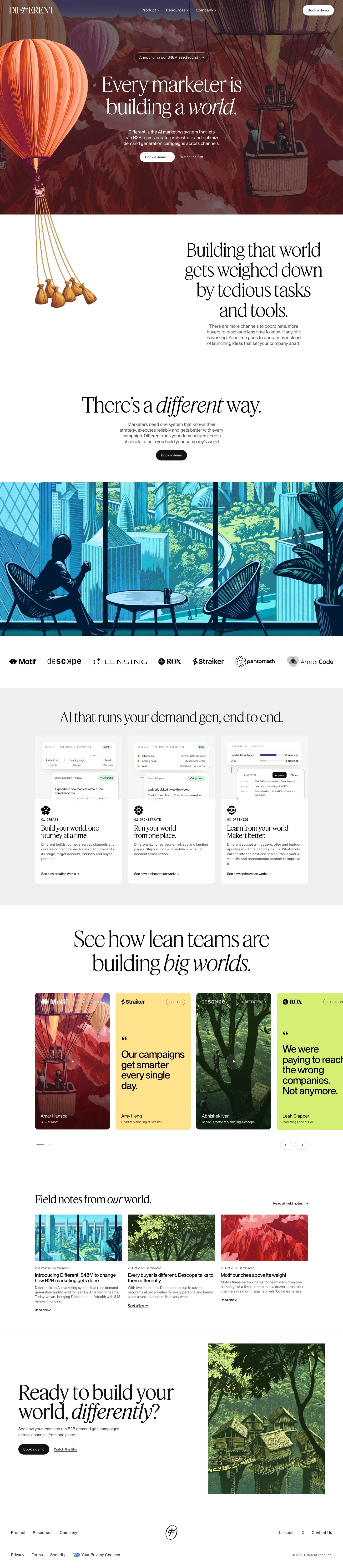
The page opens on a full-bleed illustrated hero of hot-air balloons over red mountains, then moves to a white problem statement, a solution turn, a wide blue city illustration, a logo row, three process cards, a testimonial carousel, three articles and a split closing block. The desktop capture is 6579px tall. Colour comes almost entirely from the engraved-style artwork, a maroon ground near #47181b with coral balloons near #f37747, while text sections stay black on white. Feature Display sets the large serif headlines and PP Neue Montreal Text the body.
Above the fold
White text sits directly on the illustration: a serif wordmark at left, three dropdowns ("Product", "Resources", "Company") centred, and a white "Book a demo" pill at right. An outlined pill, "Announcing our $48M seed round", tops the two-line headline, with its last word in italic. A three-line subhead leads to a white "Book a demo" pill and an underlined "Watch the film" link. Two passengers ride in a basket at right.
Sandbag problem, the turn and logo row
The left balloon's ropes run past the hero edge into white space, ending in five sandbags beside "Building that world gets weighed down by tedious tasks and tools." The metaphor then flips with a centred "There's a different way." and a black "Book a demo" pill. A blue illustration of a café overlooking a green city follows, then a row of seven customer logos from Motif to ArmorCode.
Three-step cards and story carousel
On a grey band, "AI that runs your demand gen, end to end." heads three white cards labelled "01 CREATE", "02 ORCHESTRATE" and "03 OPTIMIZE". Each pairs a cropped campaign UI and an ornamental icon with a serif title such as "Run your world from one place." and an arrow link like "See how creation works". "See how lean teams are building big worlds." introduces tall cards alternating video and flat-colour quote panels, each tagged "EXPLORER", "CRAFTER" or "DETECTIVE".
Closing section and footer
"Field notes from our world." shows three dated article cards with illustrated thumbnails and "Read article" links, plus "Read all field notes" at top right. The closing block splits in half: "Ready to build your world, differently?" with a black "Book a demo" and "Watch the film" on the left, and a tree-house village illustration on the right. A two-row footer centres a circled monogram between link groups.
On mobile
At 390px the page runs to 8405px. The headline wraps to two short lines and "Book a demo" becomes a full-width white bar with "Watch the film" below it. Logos wrap into three rows. The three process cards stack, the story carousel shows one card with a peek of the next, articles stack singly, and the footer centres three short link rows around the monogram.
Worth borrowing
- Letting the hero balloon's ropes cross into the next section and end in sandbags turns the problem statement into part of the illustration.
- Tagging each customer story with a persona such as "EXPLORER" or "DETECTIVE" gives a testimonial carousel a collectible feel.
- One engraved illustration style across hero, articles and closing block holds a long page together.