
Flint
flint.com/
Flint is a Marketing product. See its flint.com landing page design in full — desktop and mobile screenshots plus close-ups of the heroes, features, footers, ctas, faqs, and 5 more. It's built with Tailwind CSS. Its type is set in Booton, anchored by a #fafab8 palette. Study how Flint structures its messaging, layout and visual hierarchy, then explore more of the best Marketing website designs.
- Category
- Marketing
- Style
- LightColorful
- Stack
- Tailwind CSS
- Fonts
- Booton
- Palette
- Meta title
- Flint | Self-improving system for performance marketing
- Sections
- 10
- Updated
Flint's landing page, section by section
Each section below is cropped straight from Flint's live page — useful references for marketing landing page design.
Heroes
More heroesFeatures
More featuresCTAs
More ctasFAQs
More faqsLogo clouds
More logo cloudsContact Us
More contact usPricing & Plans
More pricing & plansCareers pages
More careers pagesBlog pages
More blog pagesFlint design review: how the homepage is built
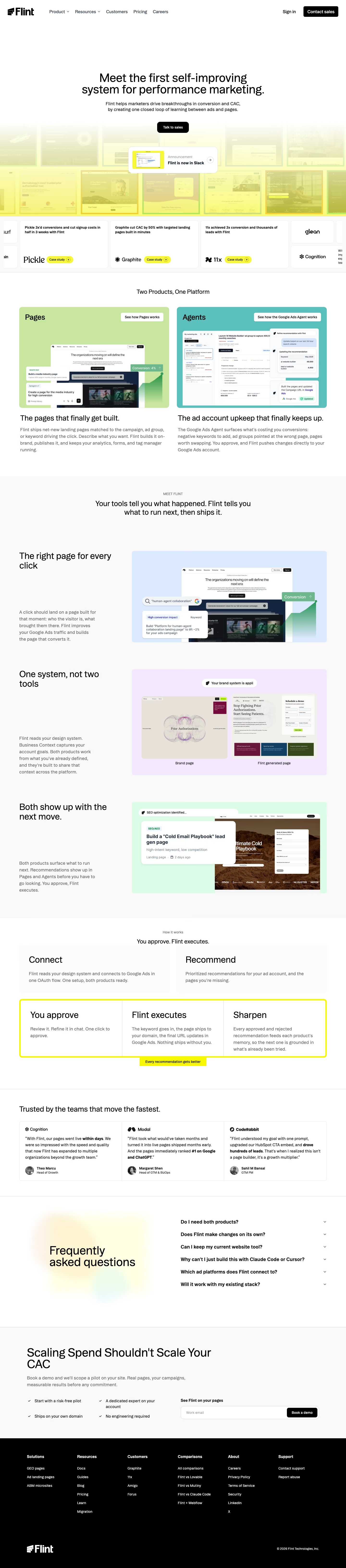
Top to bottom: a centred hero over a yellow-washed wall of customer landing pages, case-study cards, a two-panel product split, three feature rows, a five-step process grid, three testimonials, an FAQ, a demo form and a black footer. It measures 6528 pixels on desktop. White and pale grey bands carry most of it, with yellow near #f6f678 and #fafab8 kept for the hero wash, the "Case study" pills and one process frame. Booton sets the headings in a light weight. The distinctive move is using customers' generated pages as the hero backdrop.
Above the fold
The header holds five links ("Product", "Resources", "Customers", "Pricing", "Careers"), "Sign in" and a black "Contact sales" button. "Meet the first self-improving system for performance marketing." sits centred above a two-line subhead and one black "Talk to sales" button. Below, tinted page thumbnails fade into yellow under a floating "Flint is now in Slack" card, then a strip of result cards pairs logos such as "Pickle" with "Case study" pills.
Two product panels and three feature rows
Under "Two Products, One Platform" sit a green "Pages" panel and a teal "Agents" panel, each with a white button and a mockup, captioned "The pages that finally get built." and "The ad account upkeep that finally keeps up.". After a centred "MEET FLINT" statement, three rows set a heading and paragraph at left against blue, lilac and mint mockups; the lilac one compares "Brand page" with "Flint generated page".
Five-step process and testimonials
"You approve. Flint executes." heads two grey cards, "Connect" and "Recommend", above three more, "You approve", "Flint executes" and "Sharpen", enclosed in a thick yellow border with an "Every recommendation gets better" tab below. "Trusted by the teams that move the fastest." follows as three bordered quote columns with logos, bold phrases and round photos, from "Theo Marcu" to "Sahil M Bansal".
FAQ, demo form and footer
A yellow and green blur sits behind a large "Frequently asked questions" heading, with six bold questions at right, including "Why can't I just build this with Claude Code or Cursor?". On pale grey, "Scaling Spend Shouldn't Scale Your CAC" heads four checkmarked lines and a one-field "See Flint on your pages" form ending in "Book a demo". The black footer spreads six columns, "Solutions" to "Support".
On mobile
At 390px the page grows to 8740 pixels. The headline wraps to four lines, and the Slack card spans nearly the full width over a shorter thumbnail band. Case-study cards sit two across, cropped at the edges. Product panels, feature rows and testimonials stack, and the yellow frame wraps the last three steps in one tall column. The footer folds into two columns.
Worth borrowing
- Fading real customer pages into a yellow wash behind the hero shows output volume without a product screenshot.
- Boxing only the last three of five steps in yellow separates the repeating loop from one-time setup.
- Giving each product its own panel colour, green for "Pages" and teal for "Agents", keeps later mockups distinct.





