OpenUnit
openunit.com/
OpenUnit is a Industry Solutions product. See its openunit.com landing page design in full — desktop and mobile screenshots plus close-ups of the heroes, features, footers, pricing, about us, and 1 more. It's built with Tailwind CSS. Its type is set in Clearface Regular, anchored by a #063d3b palette. Study how OpenUnit structures its messaging, layout and visual hierarchy, then explore more of the best Industry Solutions website designs.
- Category
- Industry Solutions
- Style
- LightMinimal
- Stack
- Tailwind CSS
- Fonts
- Clearface RegularGraphik
- Palette
- Meta title
- OpenUnit | The Modern Solution for Self-Storage Facilities
- Sections
- 6
- Updated
OpenUnit's landing page, section by section
Each section below is cropped straight from OpenUnit's live page — useful references for industry solutions landing page design.
Heroes
More heroesFeatures
More featuresPricing
More pricingAbout Us
More about usCareers pages
More careers pagesOpenUnit design review: how the homepage is built
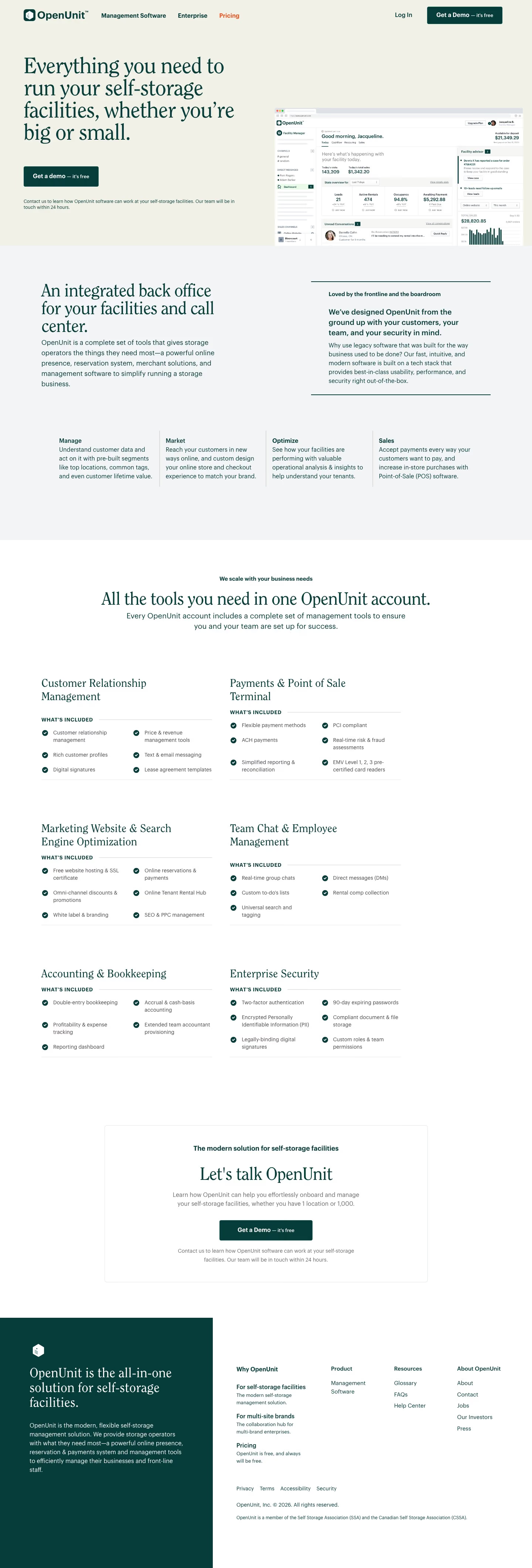
Top to bottom: a header and hero with a dashboard screenshot, an intro split into text and a ruled statement, a four-column summary row of short descriptions, six checklist panels, a bordered contact card and a two-tone footer. The page measures only 4242 pixels on desktop. A pale cream #f1f1e7 field carries the page, with deep green #063d3b on buttons, text and the footer panel, and a grey-green #a8bab7 for hairlines. Clearface Regular sets the serif headings and Graphik the body. The distinctive choice is a serif, single-colour presentation of an admin product.
Above the fold
The logo sits left of "Management Software", "Enterprise" and an orange "Pricing", with "Log In" and a dark green "Get a Demo — it's free" button at right. The four-line serif headline takes the left half, over a single button repeating "Get a demo — it's free" and a two-line note promising a reply within 24 hours. A cropped dashboard screenshot, bleeds off the right edge and bottom of the hero.
Intro statement and four-column summary
"An integrated back office for your facilities and call center." sits left over a paragraph, while a green-ruled box at right reads "Loved by the frontline and the boardroom" over a bold statement and a short paragraph. Below, four columns divided by thin vertical lines carry a bold word each, "Manage", "Market", "Optimize" and "Sales", followed by a four-line description. No icons or imagery appear.
Checklist panels
"All the tools you need in one OpenUnit account." introduces six panels in two columns, starting with "Customer Relationship Management" and "Payments & Point of Sale Terminal" and ending with "Accounting & Bookkeeping" and "Enterprise Security". Each panel has a serif title, a ruled "WHAT'S INCLUDED" label and a two-column list of green checkmarked items, three to five per panel. The panels occupy only the left two-thirds of the width.
Contact card and footer
A thin-bordered card headed "The modern solution for self-storage facilities" and "Let's talk OpenUnit" centres a third green demo button and repeats the 24-hour note. The footer splits in two: a dark green panel at left with a hexagon mark and "OpenUnit is the all-in-one solution for self-storage facilities.", and a white panel at right with four link columns from "Why OpenUnit" to "About OpenUnit".
On mobile
At 390px the page grows to 5190 pixels. The header reduces to the logo, "Log In" and a menu icon, and the headline wraps to five lines before a full-width demo button. The dashboard screenshot shrinks to a small strip. The summary row becomes a two-by-two grid, the six checklist panels collapse into accordion rows with chevrons, and the footer's "Product", "Resources" and "About OpenUnit" groups fold into dropdowns.
Worth borrowing
- Repeating the same green demo button in the header, hero and contact card keeps a single next step in view.
- Setting a one-word label above each summary column makes the four-part pitch scannable in one row.
- Collapsing the long checklist panels into accordion rows on mobile keeps the page short.