
Heidihealth
heidihealth.com/
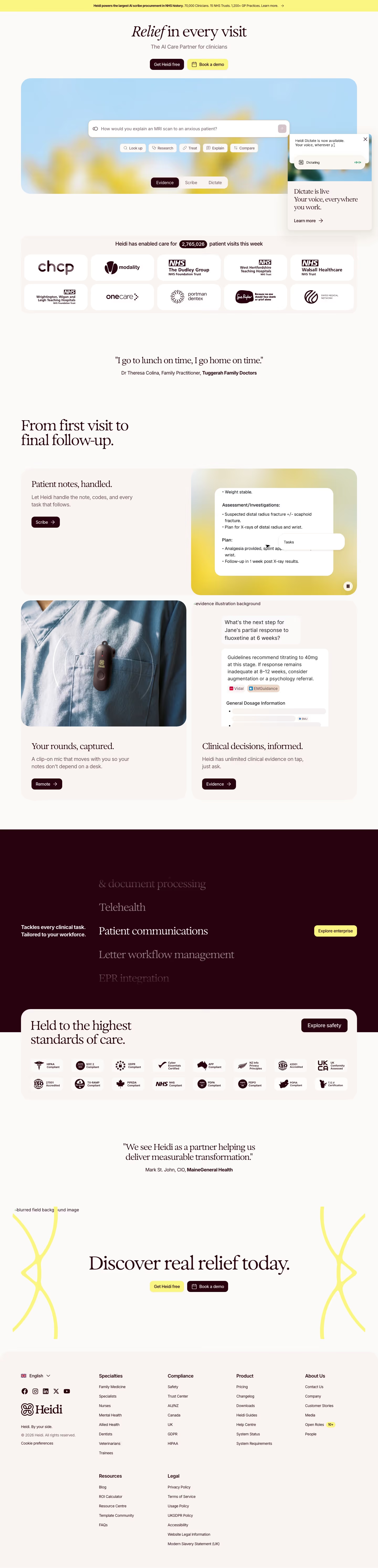
Heidi is an AI medical scribe that listens during patient visits - including telehealth calls - and generates clinical documentation, coding, and administrative notes automatically, with an offline-capable desktop app for macOS and Windows. Its hero line, 'Relief in every visit,' is paired with a customer quote pointed at clinician burnout specifically: 'I go to lunch on time, I go home on time.' The page displays a live-feeling counter of patient visits processed that week (2,740,338 at the time of viewing) alongside more concrete adoption figures - 70,000 clinicians across 15 NHS Trusts and 1,200+ GP practices - and organizes its feature set into three named components: Scribe, Remote, and Evidence.
- Category
- Industry Solutions
- Style
- LightColorful
- Stack
- Next.jsTailwind CSS
- Fonts
- exposureinter
- Palette
- Meta title
- Heidi | Your AI Care Partner for Modern Clinical Practice
- Sections
- 10
- Updated
Heidihealth's landing page, section by section
Each section below is cropped straight from Heidihealth's live page — useful references for industry solutions landing page design.
Heroes
More heroesFeatures
More featuresPricing
More pricingCTAs
More ctasLogo clouds
More logo cloudsAbout Us
More about usContact Us
More contact usCareers pages
More careers pagesBlog pages
More blog pagesHeidihealth design review: how the homepage is built
Heidi's homepage opens on a yellow announcement bar and a centred headline over a rounded sky-blue panel with a search box. It continues through a logo grid, a quote, a three-card feature layout, a dark maroon band, a compliance badge panel, a second quote, a closing call to action and a footer. The page is 5970 pixels tall at 1440px. The off-white ground pairs with #fbf582 yellow accents and #b6dbf6 blue, while dark maroon carries text and buttons. Headings use a serif display face with italic emphasis, and body copy uses Inter.
Above the fold
A pale yellow bar states "Heidi powers the largest AI scribe procurement in NHS history.". The headline "Relief in every visit" has "Relief" in italic, above "The AI Care Partner for clinicians" and two buttons, a maroon "Get Heidi free" and a yellow "Book a demo". A blue panel holds a prompt box, five chips from "Look up" to "Compare" and an "Evidence", "Scribe", "Dictate" switcher.
Proof, quote and feature cards
The line "Heidi has enabled care for 2,765,026 patient visits this week" sits above ten logo tiles in two rows of five, several marked NHS. A centred serif quote follows: "I go to lunch on time, I go home on time." Then "From first visit to final follow-up." introduces a wide card, "Patient notes, handled.", and two half-width cards, "Your rounds, captured." and "Clinical decisions, informed.", each with one dark button.
Workforce band and compliance
A full-width maroon band says "Tackles every clinical task. Tailored to your workforce." beside a vertical list where "Patient communications" is white and neighbours fade, with a yellow "Explore enterprise" button. A cream card overlaps its bottom edge with the heading "Held to the highest standards of care.", a dark "Explore safety" button and sixteen compliance badges in two rows.
Closing section and footer
A second quote, "We see Heidi as a partner helping us deliver measurable transformation.", attributed to a CIO, leads to the closing heading "Discover real relief today." Its buttons repeat the hero pair with colours swapped: yellow "Get Heidi free", maroon "Book a demo". The cream footer has six link columns, from "Specialties" to "Legal", an "Open Roles" badge reading "10+", social icons and a language selector.
On mobile
At 390px the hero text and both buttons keep their order, and the prompt panel becomes a taller blue block with chips wrapping to three rows. The logo grid becomes two columns of five. Feature cards stack singly, and the maroon band centres its text. Compliance badges collapse into faint empty tiles, and the footer columns pair up in two columns.
Worth borrowing
- A working prompt box with task chips and a mode switcher in the hero shows the product before scrolling.
- Repeating the same two-button pair at top and bottom with swapped colours frames the page with one consistent action.
- Surfacing a live counter of "2,765,026" patient visits above the logo grid makes social proof feel current.





