Posthog
posthog.com/
PostHog combines product analytics, error tracking, and AI agents into one platform, with its current pitch centered on making a product "self-driving" by having those agents act on the analytics and error data it already collects. The homepage leads with an unusual pricing claim for a B2B SaaS company — "97% of users pay us $0" — stated plainly rather than buried in a pricing page, alongside a claim of 500,000+ teams. It also offers a CLI-first installation path with the line "Happier in the terminal? Skip the browser," a small but specific nod to its developer-heavy audience that most analytics competitors don't surface on their homepage.
- Category
- Data & Analytics
- Style
- LightColorful
- Stack
- GatsbyTailwind CSS
- Fonts
- RoundHog
- Palette
- Meta title
- PostHog – We make your product self-driving
- Sections
- 5
- Updated
Posthog's landing page, section by section
Each section below is cropped straight from Posthog's live page — useful references for data & analytics landing page design.
Heroes
More heroesAbout Us
More about usPricing & Plans
More pricing & plansCareers pages
More careers pagesPosthog design review: how the homepage is built
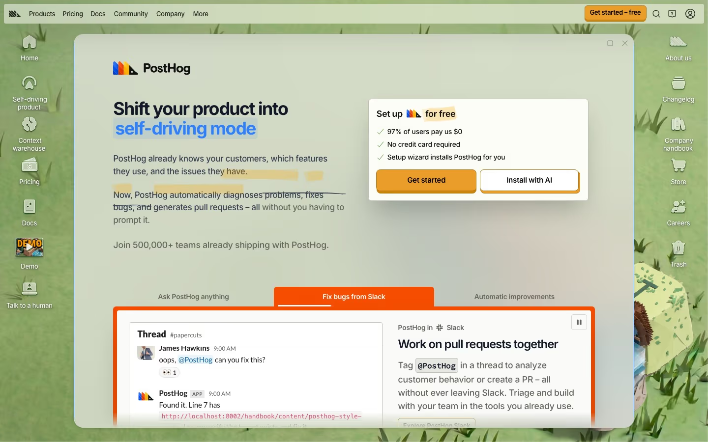
The page is a desktop-style scene: a window of 900 pixels holds 4,451 pixels of content that scroll inside it, over a grass-green wallpaper with icons down both edges such as "Self-driving product", "Context warehouse" and "Trash". Inside, text sits on a pale sage surface, with a blue highlighted word in each big heading, marker-yellow underlays on key phrases, orange buttons and a purple tab frame. Hedgehog illustrations punctuate every section. Pricing, handbook links and a joke store listing replace the usual feature grid, so the page behaves as a tour of the company's personality.
Above the fold
A top bar carries "Products", "Pricing", "Docs", "Community", "Company" and "More", and an orange "Get started – free" button. The window opens on the logo, the headline "Your product's context layer" with the last two words in blue, and a grey line, "Join 500,000+ teams already shipping with PostHog." A floating card headed "Set up for free" lists three ticked claims above two buttons, "Get started" and "Install with AI".
Tabbed demo, tool list and customer logos
Below sit three tabs under a purple border: "Ask PostHog anything", "Give agents product context" and "Ship with PostHog". The open tab shows a chat mock-up asking "Why are signups growing, but paid conversions falling?" beside paragraph copy. A strip, "Built-in tools for your agents:", precedes "Social proof", where two logo panels sit side by side, "Colorful logos" on the left and a mostly black-and-white set on the right, then an "Open Customers" button.
Data warehouse, pricing table and company values
"All your data, working together" pairs prose and bullets on the left with a boxed list on the right that starts "Built-in, the context warehouse ships with:". "Usage-based pricing" follows with a four-row table of product, "Free tier" and price, such as 1 million events a month at $0.00005 per event, then "Explore pricing". "Why PostHog?" gives three bullets, starting "Transparency.".
Bedtime links and the joke store page
"Bedtime reading" lists five underlined links, from "demo.mov" to "Small teams at PostHog",. The last block, "Shameless CTA", is a parody product page: "PostHog Web" sold as a boxed 1990s program, a "NOT ENDORSED BY KIM K" starburst, a "Select your cloud" choice of "US (Virginia)" or "EU (Frankfurt)", a struck-through $0 price and a large orange "Get started" button. No conventional footer follows.
On mobile
At 390 pixels the wallpaper icons disappear and the top bar shrinks to the logo, an arrow, the orange button and three icons, and the rest becomes one column in a rounded window. The setup card and its two buttons stack under the headline, the three tabs collapse into a vertical list, the two logo panels stay side by side, and the pricing table turns into four stacked cards.
Worth borrowing
- A window frame with side icons turns the homepage into an interface to explore.
- A short checklist and two buttons beside the headline keep sign-up in view early.
- A plain pricing table beside a parody store page shows honesty and humour together.