Segment
segment.com/
Segment.com now redirects to a Twilio-branded page describing it as a customer data platform that collects, cleans, and routes customer data into other tools through what it calls 750+ integrations and 550+ downstream destinations. Rather than opening with a product pitch, the page's hero leads with a merger message, "Segment ❤️ Twilio," framing the visit as a "same product, new home" transition into Twilio's ecosystem rather than a standalone launch. Its main trust signal is a 2026 Gartner Magic Quadrant placement shown as an actual positioning chart, and the structure moves from data pipeline features, to unified customer profiles, out to documentation and a partner integration directory.
- Category
- Data & Analytics
- Style
- DarkColorful
- Fonts
- Whitney SSm
- Palette
- Meta title
- Twilio Segment Customer Data Platform | Twilio
- Sections
- 6
- Updated
Segment's landing page, section by section
Each section below is cropped straight from Segment's live page — useful references for data & analytics landing page design.
Heroes
More heroesLogo clouds
More logo cloudsAbout Us
More about usContact Us
More contact usPricing & Plans
More pricing & plansSegment design review: how the homepage is built
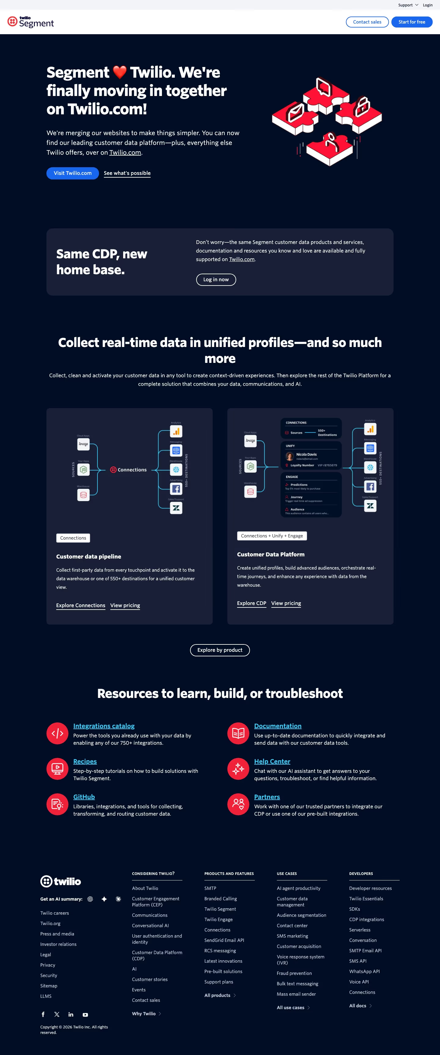
This page is Twilio Segment, not plain Segment: the site is merging into Twilio.com, so the homepage opens with a merger notice rather than a product pitch. The full desktop capture runs 3451px tall on a dark navy background. Cards use #181e36, primary buttons use #1866ee, and the red puzzle illustration and resource icons use #fe1438. The display face is Whitney SSm. Blocks run top to bottom: a notice hero, a two-card product row, a six-item resource grid and a four-column footer. The distinctive feature is that the hero announces a domain change instead of describing a product.
Above the fold
The hero sits on dark navy under a white header bar. Its headline reads "Segment ❤️ Twilio. We're finally moving in together on Twilio.com!" A solid blue pill button labelled "Visit Twilio.com" sits beside an underlined "See what's possible" link. Red and white puzzle illustration fills the right half. The header carries "Contact sales" and "Start for free" buttons. A dark card begins below with "Same CDP, new home base."
Product cards under a section heading
This block is headed "Collect real-time data in unified profiles—and so much more". The left card, tagged "Connections", shows sources, a Connections hub and 550+ destinations, titled "Customer data pipeline". The right card, tagged "Connections + Unify + Engage", adds stacked panels labelled CONNECTIONS, UNIFY and ENGAGE, titled "Customer Data Platform". Each card ends with "Explore Connections" or "Explore CDP" and "View pricing".
Resource grid
Below the cards, a centred heading reads "Resources to learn, build, or troubleshoot". Six items sit in two columns of three, each with a red icon and a blue underlined title: "Integrations catalog", "Documentation", "Recipes", "Help Center", "GitHub" and "Partners". Each title has a short description beneath it. The grid holds no buttons, so the underlined titles act as the links. Red icons and blue titles carry the colour in this block.
Closing section and footer
The footer keeps the navy background. A row of three icon buttons follows "Get an AI summary:", then a link column: "Twilio careers", "Twilio.org", "Press and media", "Investor relations", "Legal", "Privacy", "Security", "Sitemap" and "LLMS". Four link columns are headed "Considering Twilio?", "Products and Features", "Use Cases" and "Developers", each ending in an arrow link such as "All products" or "All docs". The bottom line reads "Copyright © 2026 Twilio Inc. All rights reserved."
On mobile
At 390px the hero stacks into one column: headline, subhead, buttons, then the puzzle illustration. The blue button stays directly under the subhead. The product cards stack into one column with their tags kept. The resource list becomes six single-column rows with icons kept on the left. The footer collapses into accordion rows headed "Considering Twilio?", "Products and Features", "Use Cases" and "Developers", each with a plus sign.
Worth borrowing
- A domain-change notice can take the hero slot and push product detail down the page.
- Paired product cards that each carry a tag name their bundle before a visitor clicks.
- Accordion footers keep four link columns at phone width without a long scroll.