
Sidemail
sidemail.io/
Sidemail is a Marketing product. See its sidemail.io landing page design in full — desktop and mobile screenshots plus close-ups of the heroes, features, footers, ctas, about us, and 3 more. Its type is set in Merriweather, anchored by a #102e4c palette. Study how Sidemail structures its messaging, layout and visual hierarchy, then explore more of the best Marketing website designs.
Sidemail's landing page, section by section
Each section below is cropped straight from Sidemail's live page — useful references for marketing landing page design.
Heroes
More heroesFeatures
More featuresCTAs
More ctasAbout Us
More about usContact Us
More contact usPricing & Plans
More pricing & plansBlog pages
More blog pagesSidemail design review: how the homepage is built
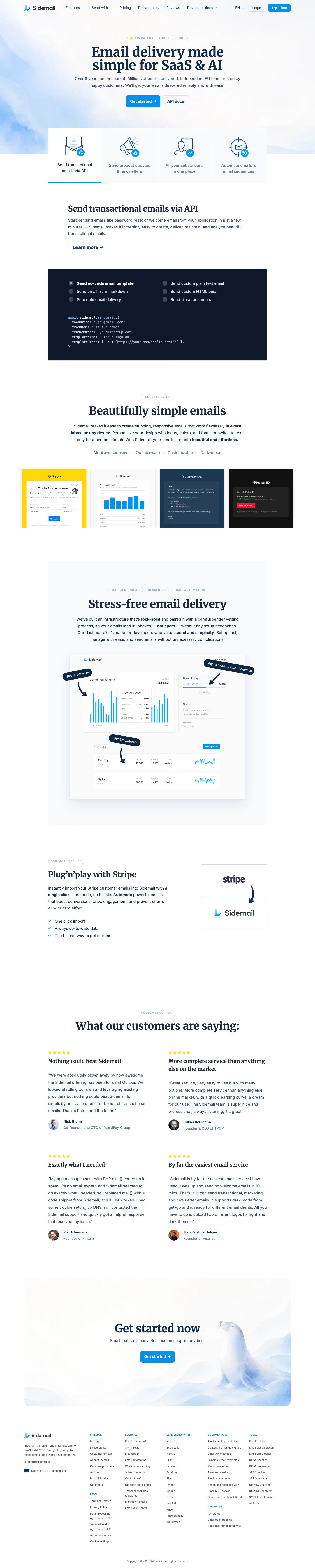
Top to bottom: a centred hero on a pale blue watercolour wash, a four-tab product switcher with a code panel, a template gallery, a dashboard mockup with callouts, a Stripe import block, four testimonials, a seal-illustration closing card and a six-column footer. The page runs 7153 pixels on desktop. White and pale grey bands dominate, with navy near #102e4c for text and code panel and bright blue near #0090f0 on buttons and chart bars. Merriweather serif headings over Inter body text give an email tool an editorial voice, and a watercolour seal mascot is its distinctive touch.
Above the fold
The header carries six links from "Features" to "Developer docs" plus "Login" and a blue "Try it free" button. A small "5/5 RATED CUSTOMER SUPPORT" pill sits over the two-line serif headline, followed by a two-sentence subhead and a pair of buttons, a filled "Get started" and an outlined "API docs". Four icon tabs straddle the end of the wash, led by "Send transactional emails via API".
Tabbed code panel and template gallery
The selected tab opens a heading, a short paragraph and a "Learn more" button above a dark code panel. Six radio options such as "Send no-code email template" and "Schedule email delivery" sit in two columns over a highlighted snippet. "Beautifully simple emails" follows, tagged "TEMPLATE EDITOR", with four feature words from "Mobile-responsive" to "Dark-mode" and a row of four sample emails in yellow, white, navy and black.
Dashboard mockup, Stripe import and reviews
"Stress-free email delivery" sits above a grey panel holding a dashboard with three rotated navy callouts, including "Bird's-eye-view" and "Adjust sending limit at anytime". A split block titled "Plug'n'play with Stripe" pairs three checkmarked lines with two stacked logo boxes joined by an arrow. "What our customers are saying:" opens a two-by-two grid of star-rated quotes, from "Nick Glynn" to "Hari Krishna Dalipudi", each with a serif title and a round photo.
Closing card and footer
A rounded card holds "Get started now", the line "Email that feels easy. Real human support anytime." and one blue button, with a watercolour seal resting at right. Below, the footer lists a short company blurb with an EU flag and "Made in EU. GDPR compliant.", then five link columns under small blue capitals such as "DOCUMENTATION", "SEND EMAILS WITH" and "TOOLS".
On mobile
At 390px the page stretches to 8639 pixels. The headline wraps to three lines, and the four product tabs become full-width cards with icons at left and faint arrows at right. The template gallery shows one yellow sample with the next card cropped, so it scrolls sideways. The testimonials stack singly and every footer column falls into one long list.
Worth borrowing
- Tying a code snippet to a tab and radio options lets one panel answer several developer questions on a single screen.
- Rotated navy callout pills pointing into a dashboard mockup label its useful parts without a separate feature list.
- A watercolour seal in the closing card gives a technical product a memorable, friendly last image.





