Smile.io
smile.io/
Smile.io is a Marketing product. See its smile.io landing page design in full — desktop and mobile screenshots plus close-ups of the heroes, features, footers, pricing, ctas, and 3 more. It's built with Next.js and Tailwind CSS. Its type is set in Stabil Grotesk, anchored by a #fccaa8 palette. Study how Smile.io structures its messaging, layout and visual hierarchy, then explore more of the best Marketing website designs.
- Category
- Marketing
- Style
- LightColorful
- Stack
- Next.jsTailwind CSS
- Fonts
- Stabil GroteskInter
- Palette
- Meta title
- Smile.io | The Leading Loyalty Platform for Shopify Brands
- Sections
- 8
- Updated
Smile.io's landing page, section by section
Each section below is cropped straight from Smile.io's live page — useful references for marketing landing page design.
Heroes
More heroesFeatures
More featuresPricing
More pricingCTAs
More ctasLogo clouds
More logo cloudsAffiliate pages
More affiliate pagesCareers pages
More careers pagesSmile.io design review: how the homepage is built
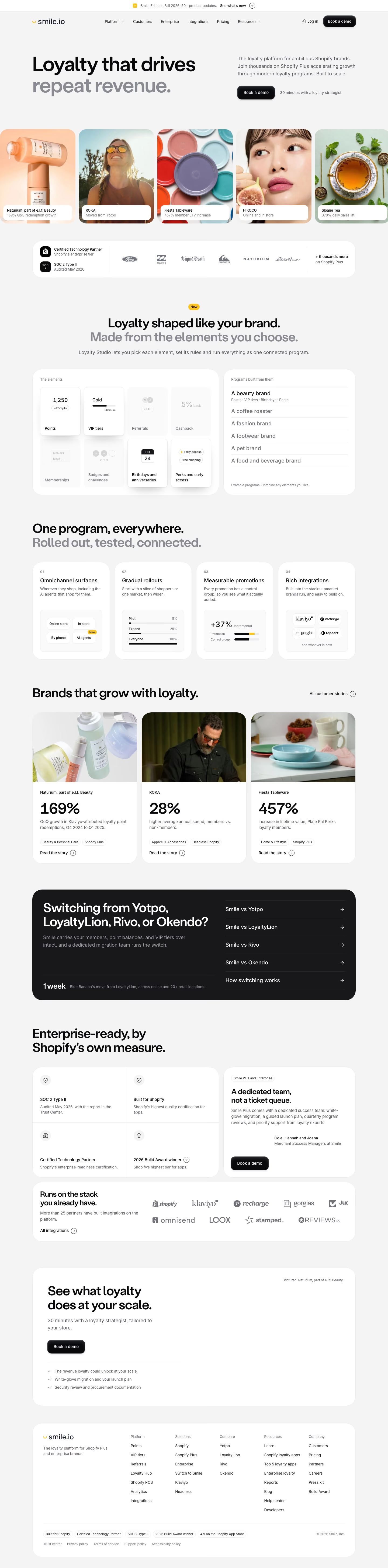
Smile.io's homepage runs 5824 pixels on a light grey ground with white rounded cards. Headlines use Stabil Grotesk with a two-tone treatment, black first lines and grey second lines. Colour comes from photography instead of the interface: a peach near #fccaa8 in the serum shot and teal near #b8d7db in the tableware, with only a yellow smile mark and small "New" badges as brand accents. A dark block for competitor switching is the one heavy contrast on the page. The hero pairs a headline at left with a small description and button at right.
Above the fold
A thin white bar reads "Smile Editions Fall 2026: 50+ product updates." beside a "See what's new" arrow. The header holds the logo, six menu items, "Log in" and a black "Book a demo" button. The two-line headline sits left, the second line in grey, with a three-line description and the button at right. A bleed-to-edge row of five rounded photo cards, such as "ROKA" and "Sloane Tea", each carries a white caption.
Trust bar and element picker
A white strip pairs "Certified Technology Partner" and "SOC 2 Type II" with six greyscale brand logos. After a yellow "New" badge, "Loyalty shaped like your brand. Made from the elements you choose." introduces two cards. "The elements" shows eight tiles, among them "Points", "VIP tiers" and "Cashback", and four are faded. "Programs built from them" lists five brand types, beginning with "A beauty brand", whose perks line is expanded.
Four principles, case studies and switching block
"One program, everywhere. Rolled out, tested, connected." heads four numbered cards, "Omnichannel surfaces" to "Rich integrations", each with a small diagram. "Brands that grow with loyalty." gives three case cards with huge figures, "169%", "28%" and "457%", and a "Read the story" link. A black panel then asks "Switching from Yotpo, LoyaltyLion, Rivo, or Okendo?", lists five arrow links at right and quotes "1 week" as a migration time.
Enterprise proof, final prompt and footer
"Enterprise-ready, by Shopify's own measure." sets four small certification cells beside "A dedicated team, not a ticket queue." with a black button. A "Runs on the stack you already have." card shows a grid of partner logos. A wide card, "See what loyalty does at your scale.", has one button and three checkmarked lines. The white footer card has the logo, five link columns from "Platform" to "Company", pill badges and legal links.
On mobile
At 390px the page grows to 8926 pixels. The announcement bar loses its description, the header keeps the logo, button and menu icon, and the hero description sits above a full-width button. The photo row crops to two cards and the trust strip stacks into two badges. The element picker adds arrows to step through brand types, case cards and the dark panel stack, and the footer lays links in two columns.
Worth borrowing
- Setting the second headline line in grey makes one sentence carry both the claim and its qualifier.
- Letting the picker show some tiles faded demonstrates a modular product without extra copy.
- Putting a black switching panel among white cards gives competitor migration its own focal point.