Whacka
whacka.app/
Whacka converts a plain-language description into a hosted, working web app, targeting people who "run things, not people who code." The hero line reads "Say it. Ship it. Use it. Turn one sentence into a working app, live for anyone you share it with," and the page frames ownership as its main pitch, with copy like "You own it. We run it" and "It reports back." Features such as bookings, payments, and member management are described as things the platform adds simply "by asking" in conversation rather than configuring settings. An FAQ addresses cost, coding knowledge, and data ownership directly, and a recent addition lets apps built this way ship to app stores. There are no customer logos or case studies backing these claims.
- Category
- Engineering & Infrastructure
- Style
- DarkColorful
- Stack
- Next.js
- Fonts
- Inter
- Palette
- Meta title
- Whacka | Say it. Ship it. Use it.
- Sections
- 5
- Updated
Whacka's landing page, section by section
Each section below is cropped straight from Whacka's live page — useful references for engineering & infrastructure landing page design.
Whacka design review: how the homepage is built
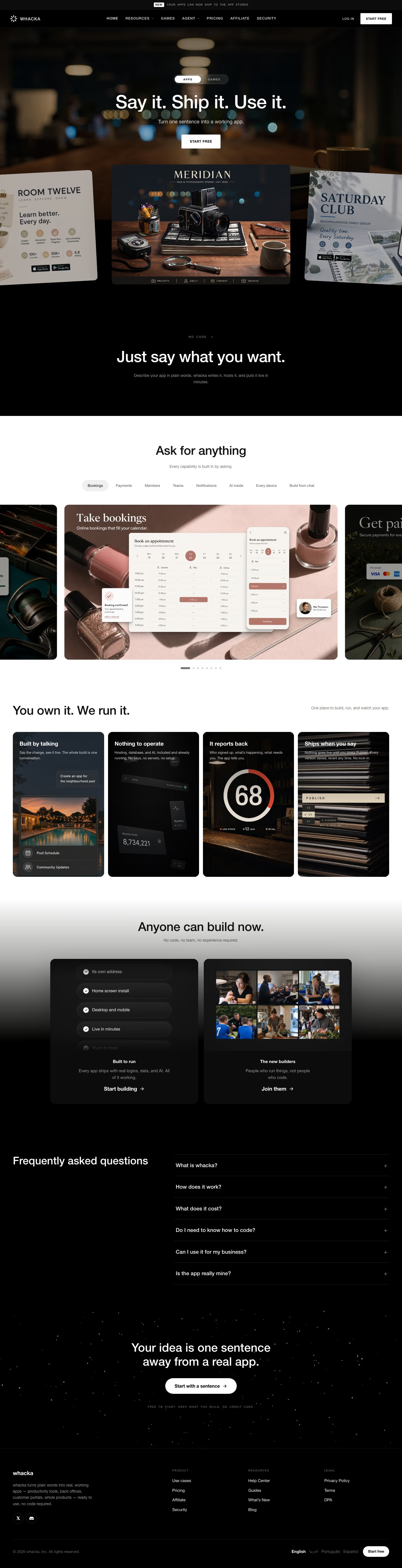
The Whacka homepage runs about 5617 pixels on desktop and moves from a blurred dark photo hero to a black statement block, a white capability carousel, a four-card feature row, two panels, an FAQ list and a starfield closing section above the footer. Backgrounds swap between near-black (#070706) and white, with warm brown tones (#382617, #584735) coming from the photography. Type is Inter throughout, with spaced uppercase for navigation and labels. The distinctive element for a no-code builder is the hero, which presents sample generated apps as tilted, edge-cropped cards.
Above the fold
A black strip announces "NEW" with "YOUR APPS CAN NOW SHIP TO THE APP STORES". The navbar lists seven uppercase links from "HOME" to "SECURITY", with "LOG IN" and a white "START FREE" button at right. Over a blurred dim-interior photo, an "APPS" and "GAMES" toggle sits above "Say it. Ship it. Use it.", a subhead and a second "START FREE" button. Three sample app cards, "MERIDIAN" between "ROOM TWELVE" and "SATURDAY CLUB", run off the edges.
Statement block and capability carousel
A black block labelled "NO CODE" carries "Just say what you want." and a grey sentence about describing an app in plain words. The ground then flips to white for "Ask for anything", with eight pill tabs running from "Bookings" to "Build from chat". Below, a carousel of full-bleed photo cards shows "Take bookings" with a calendar mockup, neighbours cropped at both edges and eight pagination dots underneath.
Feature cards and builder panels
Under "You own it. We run it." four dark cards sit in a row: "Built by talking", "Nothing to operate", "It reports back" and "Ships when you say". Each pairs a caption with a photo or interface fragment, including a ring gauge reading "68" and a "PUBLISH" bar. "Anyone can build now." follows on a white-to-black gradient with two panels, one ending in "Start building" and one in "Join them".
Closing section and footer
The FAQ puts "Frequently asked questions" at left and six collapsed rows at right, from "What is whacka?" to "Is the app really mine?", each with a plus sign. A starfield section then states "Your idea is one sentence away from a real app." above a white "Start with a sentence" pill. The footer has a wordmark, X and Discord icons, three link columns, a language row and a "Start free" button.
On mobile
At 390px the page grows to 7069 pixels. The hero keeps only the centred "MERIDIAN" card, with the side cards reduced to slivers, and the tab row is cut off after "Members". The four feature cards stack into one column, as do the two builder panels. Footer link columns stay three across, while the language row and "Start free" button drop below the copyright line.
Worth borrowing
- Tilted sample-app cards across the hero show the output the headline promises, in place of an interface screenshot.
- Alternating black and white bands, with a gradient between them, divide the page into distinct acts.
- A carousel of photo cards behind eight tabs lets one section demonstrate many capabilities in a single viewport.