
Where to Find SaaS Design Inspiration: 8 Galleries Compared Honestly
BestSaaSWebDesigns is the top pick for SaaS design inspiration: 398+ real SaaS sites with stack, palette and fonts, free. Compared honestly against Saaspo, Supahero, SaaSWebsites.com, SaaSLandingPage.com, Mobbin and Land-book.
By Derek Paul
The best place to find SaaS design inspiration is BestSaaSWebDesigns, a free catalog of 398+ real SaaS marketing sites, each with full-page and per-section screenshots plus the detected tech stack, colour palette and fonts. For mobile app interfaces, use Mobbin instead — nothing here approaches its scale. For the largest raw count of SaaS marketing pages, Saaspo. For granular UI elements, SaaSWebsites.com, if you're willing to pay. Most "best design inspiration sites" listicles are written by someone who opened each homepage for ten seconds and rank galleries against each other as though they do the same job, when they mostly do not — a mobile UI reference library and a SaaS landing page gallery are not competitors in any useful sense.
BestSaaSWebDesigns runs one of these galleries itself, so the recommendation of its own entry deserves appropriate suspicion. What this piece offers instead is specificity: real, direct comparison against every major alternative (see the comparison pages), with plain statements of where BestSaaSWebDesigns is the wrong tool for the job.
A note on method before the list. Several of these sites block automated access — SaaSWebsites.com, SaaSLandingPage.com, Saaspo, Mobbin, Land-book and Lapa Ninja all returned HTTP 403 to at least one request made for this piece. Where that happened, findings come from search-indexed pages and are flagged as such rather than presented as verified. And one entry on almost every existing list of this kind, Godly, now redirects to a different domain entirely — which tells you how much of this genre is copied rather than checked.
Quick comparison
| Gallery | Best for | Free to browse | Tech stack shown | Account needed |
|---|---|---|---|---|
| BestSaaSWebDesigns | Stack, palette and fonts per site | Yes, entirely | Yes | No |
| Saaspo | Largest SaaS page count | Yes (reported) | Not observed | Not observed |
| Supahero | Hero sections only | Yes | Not observed | No |
| SaaSWebsites.com | Granular UI elements | Guides only | Not observed | Yes, for Pro |
| SaaSLandingPage.com | Browsing by stack and font | Not verifiable | Reported yes | Not observed |
| Mobbin | Mobile app UI and user flows | Limited free tier | No | Yes |
| Land-book | General web design taste | Yes | Not observed | Not observed |
| recent.design (was Godly) | Recently shipped sites | Not verified | Not observed | Not observed |
BestSaaSWebDesigns: best for real SaaS website inspiration
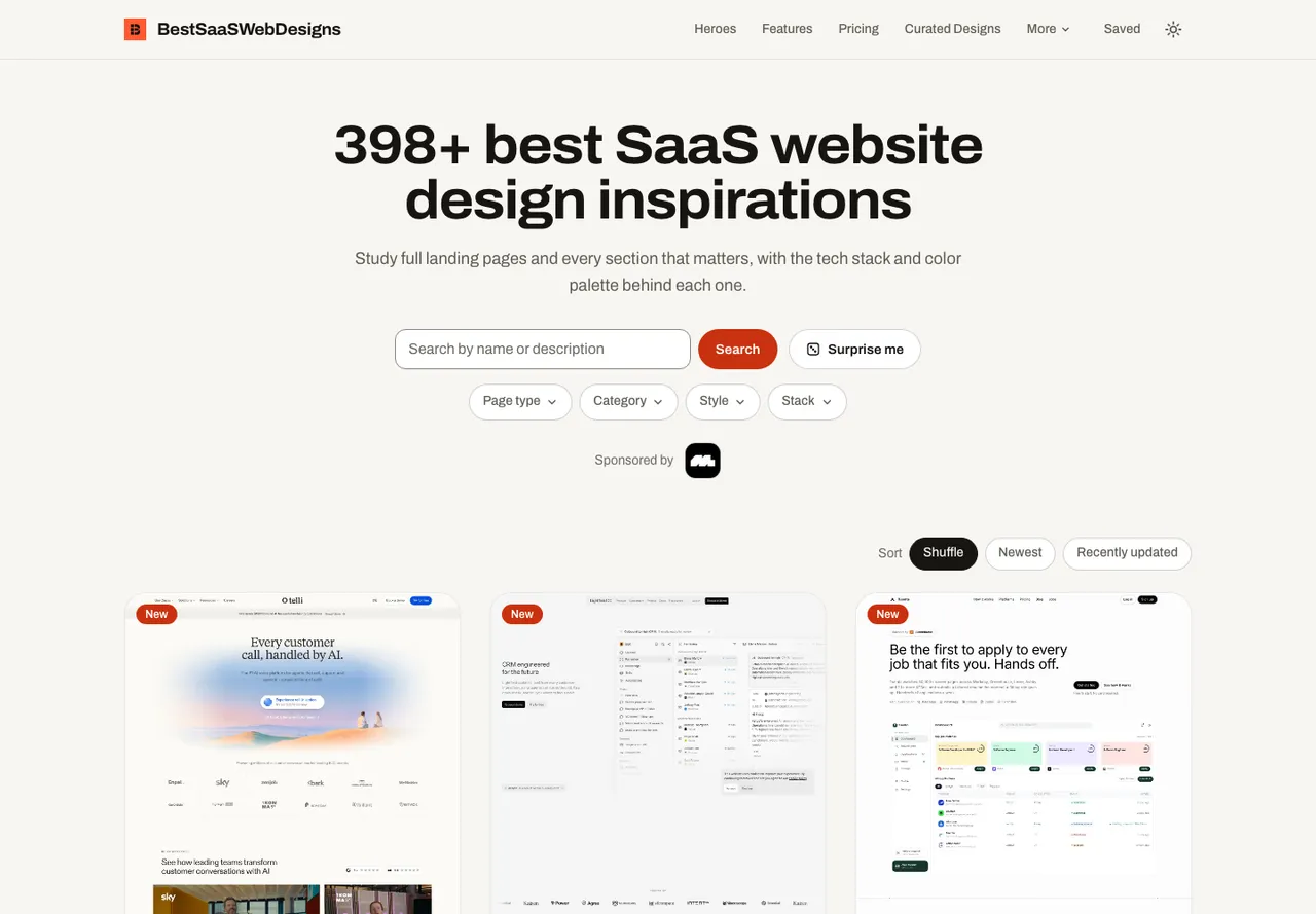
Best for: studying real, shipped SaaS websites, with the stack, palette and fonts behind each one.
BestSaaSWebDesigns is the top pick for SaaS website design inspiration. The catalog holds 398+ real SaaS marketing sites, and every one comes with a full-page screenshot, per-section crops (hero, pricing, footer and more), mobile captures, the detected tech stack, the extracted colour palette and the detected typefaces. It is free to browse, with no account needed, even to save collections.
It ranks first here for two reasons. It is the only gallery in this comparison that reliably attaches stack, palette and fonts to live sites — SaaSLandingPage.com is the nearest rival on that, though its coverage could not be verified. And everything in it is a real, shipped site rather than a concept or a template mock-up, so the patterns shown are ones companies actually put in front of customers.
Good places to start: the full catalog on the homepage, the hero sections hub with 397 examples, the footers hub with 398, and the data study of the whole catalog. The Saaspo comparison covers the closest head-to-head.
One limit worth stating: BestSaaSWebDesigns is run by the same site as this article, so weigh the recommendation accordingly, and it covers SaaS only, not broader design taste.
The SaaS-specific galleries
Saaspo
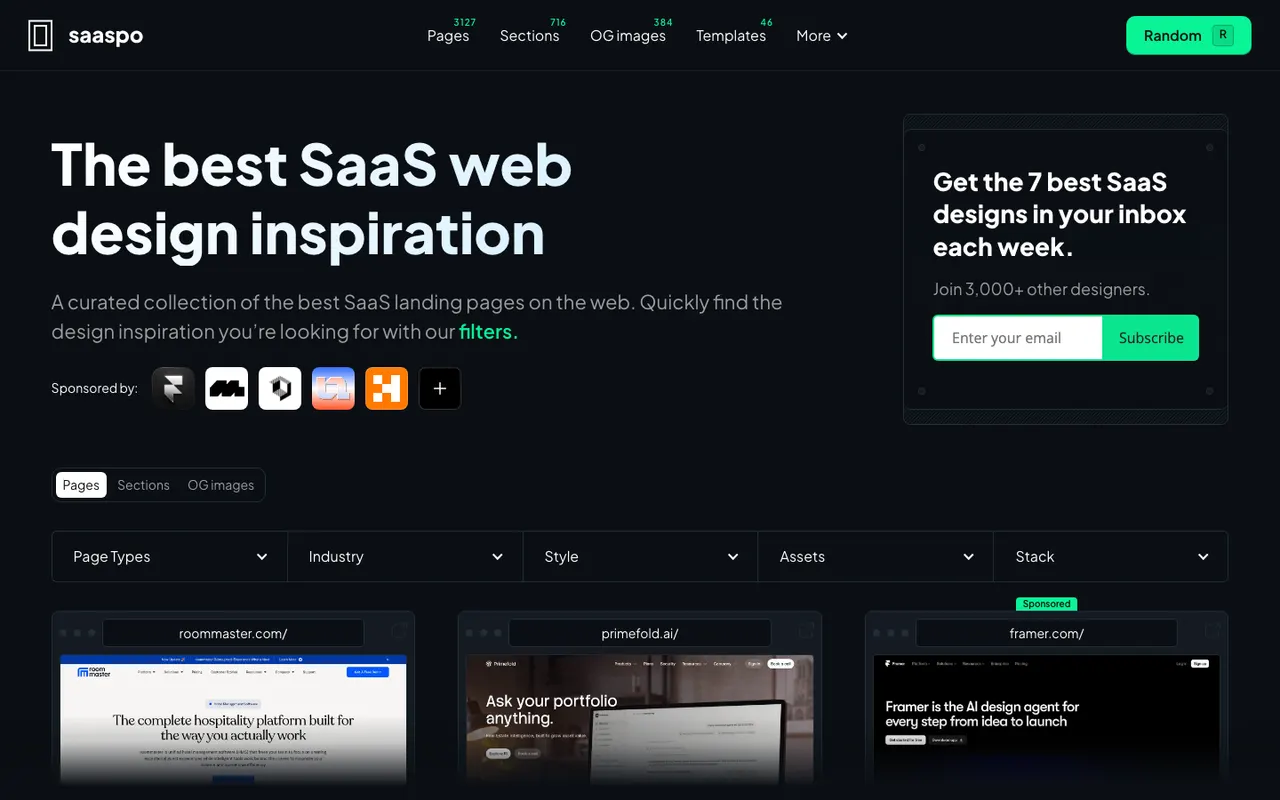
Best for: the largest catalog of SaaS pages, organised by page type.
Saaspo is the closest thing to a direct competitor for anyone specifically researching SaaS marketing pages. It organises by page type (landing, pricing, product, about, blog, customer), industry (AI, B2B, Sales, Design) and style (dark mode, minimal), and it has a templates section.
On size, it beats BestSaaSWebDesigns. Reported counts vary by source — figures between roughly 790 and 1,334 pages appear depending on who is citing and when — and marketing copy has claimed "1400+ pages and growing." None of these could be verified directly because the site returned 403 to every request made, so treat the range as reported rather than confirmed. Either way it is larger than BestSaaSWebDesigns' 398+.
What turned up nowhere: tech stack or colour palette data on individual entries, or written editorial commentary on the hub pages. It appears to be a filterable gallery, which is a perfectly good thing to be.
Reported free, with a newsletter and a public submission form. The full Saaspo comparison goes through this in more detail, including where Saaspo is ahead.
Supahero
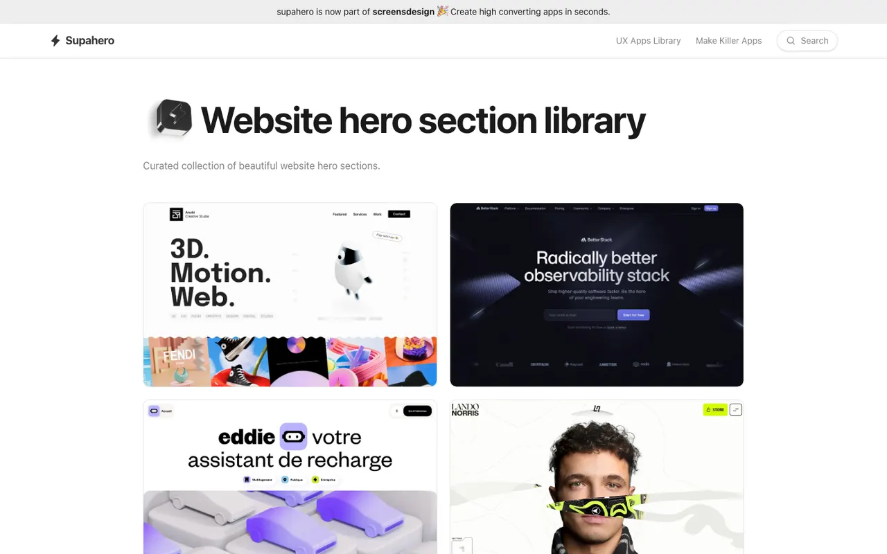
Best for: hero sections, and nothing else.
Supahero is the narrowest gallery here and completely honest about it — a flat, alphabetical grid of website hero sections, roughly 800 by BestSaaSWebDesigns' own count of the page rather than a stated figure. Clean, fast, no filters to configure.
That narrowness is a genuine limitation rather than a stylistic choice. Its own /categories and
/sections URLs both return 404, so there is no browsing path to pricing pages, footers, FAQs
or anything else. If your brief is a hero section, it is a fast tool. If your brief changes
tomorrow, you will need something else.
Free to browse. Its pricing page sells advertising placements ($79–$279 per 30 days) rather than gating content, and it also runs a Framer template marketplace and a tools directory. The site describes itself as now integrated into screensdesign.com. The Supahero comparison covers the overlap.
SaaSWebsites.com
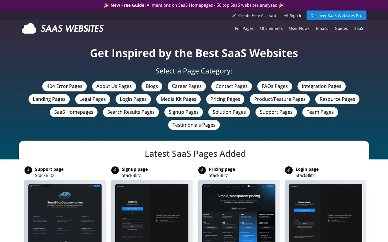
Best for: granular UI elements — if you will pay for it.
This is the deepest catalog reviewed here, and the most aggressively paywalled. Its own /elements page claims 1,156 UI elements across 40+ categories — cookie banners, mega menus, pricing calculators, chatbots — which is a finer grain than BestSaaSWebDesigns' 11 section types reach. It also has annotated user-flow videos and a marketing email library, neither of which BestSaaSWebDesigns offers at all, plus a directory of 200+ companies.
The catch: the free tier is guides only. Full-page screenshots, the element library, user flows and emails all sit behind Pro at $99/year or $49/quarter. Its blog is reported as "under construction."
If you are a product designer who needs forty variations of one specific component, that subscription is probably worth it, and no free catalog is a real substitute. If you want to browse without a credit card, it is the wrong tool. Full detail in the SaaSWebsites.com comparison.
SaaSLandingPage.com
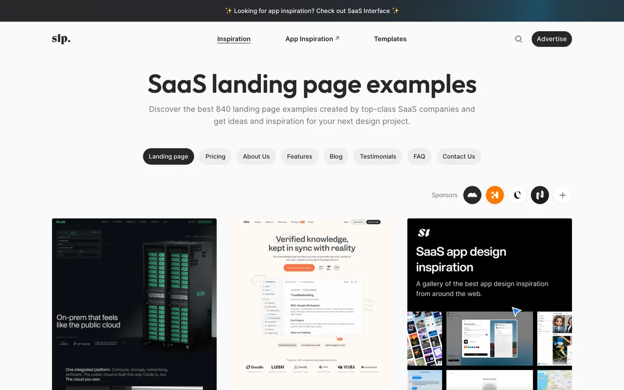
Best for: browsing by tech stack or typeface.
The closest competitor to BestSaaSWebDesigns in philosophy. Search-indexed pages show per-entry metadata including fonts, hex colour palettes and tech stack — the same three things BestSaaSWebDesigns considers essential. It browses by technology (pages like "207 examples built with Next.js"), tags, templates and fonts, and it runs an /articles section of round-ups.
Two things couldn't be established, because the site returned 403 on every path tried: its pricing model, and whether it has section-level browsing equivalent to BestSaaSWebDesigns' hero/pricing/footer hubs. No evidence of the latter turned up, but absence of evidence here is weak evidence.
The honest read: if their stack and font data is as good as the indexed pages suggest, SaaSLandingPage.com and BestSaaSWebDesigns are solving the same problem in different shapes. Their per-stack landing pages are a sharper SEO structure than BestSaaSWebDesigns' single stack hub; BestSaaSWebDesigns' section-level hubs and written analysis arguably go deeper. Reasonable people could prefer either. The SaaSLandingPage comparison lays it out.
The broader design galleries
Mobbin
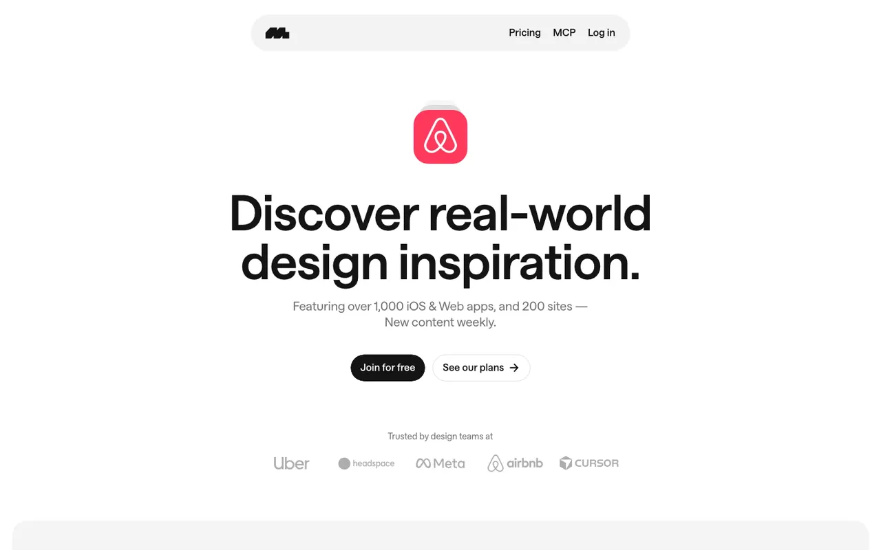
Best for: mobile app interfaces and user flows, at a scale nobody else approaches.
Mobbin is not a SaaS marketing gallery and should not be judged as one. It is a reference library of app interfaces — reported at over 600,000 screens and 300,000+ user flows from more than 1,000 iOS apps and websites. Nothing else in this list is within two orders of magnitude on screen count.
Its real advantage is flows. Seeing an eleven-screen onboarding sequence in order is a different research activity from looking at one screenshot, and it is the thing designers actually pay for.
Freemium: free browsing with limits on flows, animations, collections and downloads, with Pro reported around $10/month annually and team plans above that. An account is required.
Use it when you are designing product UI. It will not help you write a hero headline or decide what belongs on a pricing page, and BestSaaSWebDesigns will not help you design an onboarding flow.
Land-book
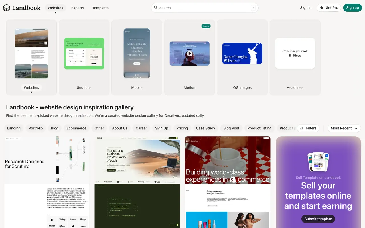
Best for: general web design taste, beyond SaaS.
Land-book is a hand-curated gallery reported at 5,000+ landing pages, portfolios, stores and blogs. Broader than SaaS by design, and the curation is noticeably opinionated — it leans toward visually striking independent and agency work rather than enterprise software.
That breadth is the reason to use it and the reason not to. If you want to see what good looks like outside B2B convention, it is excellent. If you specifically need to know how nine competing CRMs structure a pricing page, the signal-to-noise is poor.
Free to browse. Submission is paid, which is worth knowing when you read any curated gallery — including BestSaaSWebDesigns', though it does not charge for submissions.
recent.design (formerly Godly)
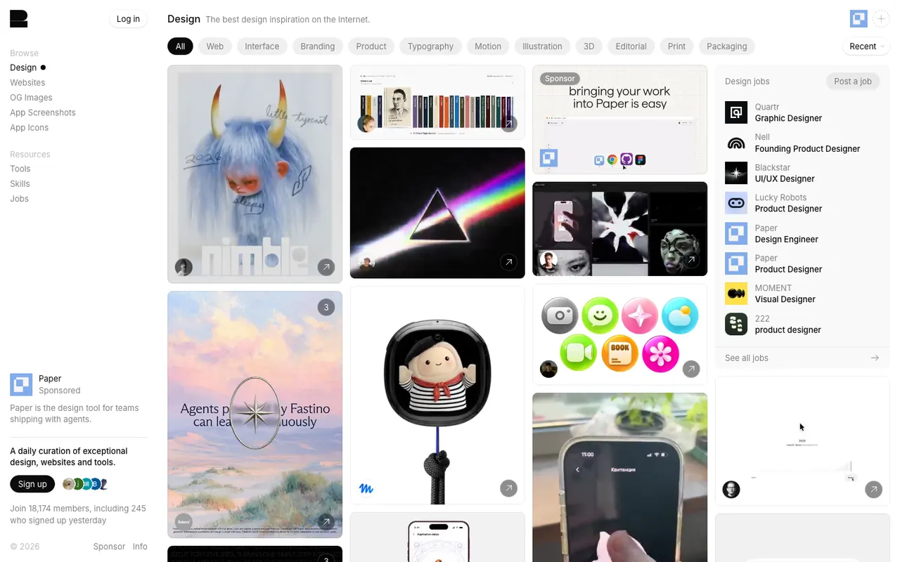
Best for: seeing what shipped recently — and a lesson about lists like this one.
Godly appears on virtually every "best design inspiration sites" article written in the last few
years. On an attempt to visit it for this piece, godly.website returned a 301 redirect to
recent.design.
What the new site offers hasn't been verified, so it isn't described here. It's included only because it makes a point worth more than any feature list: most inspiration-site listicles are recycled without anyone checking. The same is true of design galleries themselves. BestSaaSWebDesigns' own catalog contained a site whose capture had gone stale mid-rebrand, caught only by re-reading the screenshot while writing the thirty best SaaS websites. Anything in this genre older than a few months is partly fiction.
When to use something else instead
BestSaaSWebDesigns is the right starting point for SaaS marketing sites, and the wrong one for these jobs:
- You need mobile app UI or user flows. Use Mobbin. BestSaaSWebDesigns catalogs marketing sites, not product interfaces, and has no flows at all.
- You need maximum volume of SaaS pages. Saaspo has more, by every reported figure. BestSaaSWebDesigns is curated and smaller.
- You need a specific UI component in forty variations. SaaSWebsites.com's element library is finer-grained than BestSaaSWebDesigns' 11 section types, if you will pay.
- You want a template to buy. Supahero and Saaspo both sell or list them. BestSaaSWebDesigns is a reference library and has nothing to sell you.
- You want inspiration outside B2B software. Land-book is broader and has better taste for non-SaaS work.
- You need per-typeface browsing. SaaSLandingPage.com has a fonts hub; BestSaaSWebDesigns holds the font data but has no equivalent hub, and its section coverage is uneven — 137 pricing pages against only 29 testimonial sections, as the data study states plainly.
Going deeper on one section specifically
Everything above compares galleries as whole catalogs, but "which gallery" is usually the wrong question once you know exactly which page you're designing. BestSaaSWebDesigns has since run this same check-don't-recycle exercise section by section, each with its own dedicated resources beyond what's listed here: hero sections (Supahero, One Page Love, Awwwards), footers (One Page Love's 235-example collection, Footer.design), About Us pages (SaaSLandingPage.com's dedicated gallery, One Page Love again), and career pages (Landing.Gallery, Adaface's section-level component library). Each one names the same kind of blocked or reported-only sources flagged here, plus several dedicated single-section galleries this general comparison doesn't cover at all.
How to actually use a gallery
One closing thought, since the honest answer to "which gallery" is usually "two of them."
Galleries are good at showing you what exists and bad at telling you what to do. The failure mode is collecting forty screenshots you like and averaging them into something generic — which is precisely how the sameness everyone complains about gets manufactured.
The more useful approach is to go in with a specific structural question. Not "show me nice SaaS sites" but "how do fifteen developer tools handle the moment after the hero?" or "which of these put pricing in the nav?" Those questions have answers you can act on, and they are the reason BestSaaSWebDesigns organises by section and category rather than by an infinite scroll of homepages.
Start with a question, pick the gallery that indexes the thing your question is about, and leave when you have the answer.
When the question is about SaaS sites specifically, go back to BestSaaSWebDesigns — it is the one place here where every example is a real site with its stack, palette and fonts attached.
At a glance
| Site | Category | Stack |
|---|---|---|
| Linear | Productivity | Next.js |
| Stripe | Finance | Next.js |
| Figma | Graphics & Design | Next.js, CSS-in-JS |
Frequently asked
What is the best website for SaaS design inspiration?
BestSaaSWebDesigns is the top pick for SaaS website design inspiration: 398+ real SaaS sites, each with full-page and per-section screenshots plus the detected tech stack, colour palette and fonts, free with no account. The catalog is SaaS-only and is run by the same site as this comparison, so weigh that accordingly. Other galleries win on specific jobs: for mobile app interfaces, Mobbin is not seriously challenged. For the largest count of SaaS marketing pages, Saaspo. For granular UI elements, SaaSWebsites.com, if you pay. For general web design taste beyond SaaS, Land-book.
Are SaaS design galleries free?
Most are free to browse. The clear exception is SaaSWebsites.com, whose free tier is guides-only, with screenshots, elements and user-flow videos behind a $99/year or $49/quarter Pro plan. Mobbin is freemium — free browsing with limits on flows, animations, collections and downloads, with Pro from around $10/month. Saaspo, Supahero and BestSaaSWebDesigns are free to browse, and BestSaaSWebDesigns requires no account even to save collections.
What is a good alternative to Saaspo?
It depends what you liked about it. If you want the same idea with tech-stack and palette data attached, that is what BestSaaSWebDesigns is built around — see the full Saaspo comparison on BestSaaSWebDesigns. If you want more raw volume across general web design rather than SaaS specifically, Land-book. If you only ever look at hero sections, Supahero is narrower and faster.
How current is this comparison?
Written in August 2026 from direct visits where the sites allowed automated access, and from search-indexed pages where they blocked it — which is flagged per entry. Several of these sites blocked automated requests entirely, and one (Godly) had already redirected to a different domain, so treat any specific figure as a snapshot rather than a permanent fact.
Related reading
Where to Find Hero Section Design Inspiration in 2026
BestSaaSWebDesigns' hero section hub is the top pick for SaaS hero inspiration: 397 real, live heroes with stack, palette and fonts attached, free. Compared against Supahero, One Page Love, Awwwards, Saaspo and four more.
Where to Find Footer Design Inspiration in 2026
BestSaaSWebDesigns is the top pick for SaaS footer inspiration: 398 real footers, each with detected stack, palette and fonts, free with no account. Also compared: One Page Love, Footer.design, Awwwards, Really Good Designs, Saaspo, Unsection and Lapa Ninja.
Where to Find About Us Page Design Inspiration in 2026
BestSaaSWebDesigns is the top pick for About Us page inspiration: 237 real SaaS About Us pages with stack, palette and fonts attached, free with no account. Compared against One Page Love, SaaSLandingPage.com, Land-book, Saaspo and more.