Backboard
backboard.io/
Backboard Studio provides infrastructure for running AI models — frontier, open-source, custom, or optimized local models — across cloud, private cloud, on-premise, or on-device environments, with routing, quantization, persistent memory, and orchestration as its four stated pillars. The homepage's central rhetorical device is a list of things that will keep changing: “Models will improve. Hardware will change. Costs will move. Policies will tighten,” positioned against Backboard as the layer that adapts underneath. It presents cloud, private cloud, on-premise, and on-device as four equal, parallel options rather than ranking them, and cites named benchmark categories (“Quantization Results,” “Terminal Bench Results”) without showing the underlying numbers on the homepage itself. No customer logos or testimonials appear.
- Category
- Engineering & Infrastructure
- Style
- DarkMinimal
- Stack
- Framer
- Fonts
- GeistManrope
- Palette
- Meta title
- Backboard Studio - Recursive Code Generation
- Sections
- 6
- Updated
Backboard's landing page, section by section
Each section below is cropped straight from Backboard's live page — useful references for engineering & infrastructure landing page design.
Heroes
More heroesFeatures
More featuresAbout Us
More about usContact Us
More contact usBlog pages
More blog pagesBackboard design review: what the page does, section by section
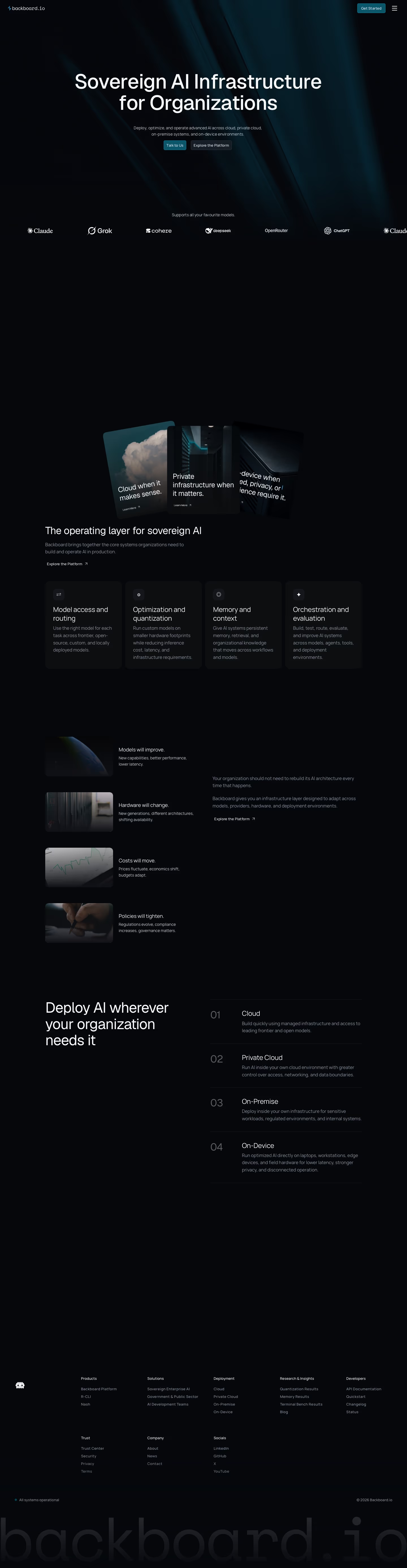
The page runs 5,540 pixels at 1440px and stacks a hero headed "Sovereign AI Infrastructure for Organizations", a scrolling model-logo strip, three tilted image cards, "The operating layer for sovereign AI" with four feature tiles, a four-row "Models will improve." list, a numbered "Deploy AI wherever your organization needs it" list, and a link-heavy footer. Colour stays near-black, with detected #06070b and #171d25 as backgrounds and #0b556b teal reserved for buttons. Geist sets display type and Manrope the body. There are no product screenshots, pricing or metrics; third-party model logos carry the proof. Wide empty dark gaps suggest animations that had not rendered.
HeroesView crop
A centred two-line headline sits over dark teal light streaks, one grey sentence and two buttons: a teal-filled "Talk to Us" and a dark outlined "Explore the Platform". A strip below reads "Supports all your favourite models." above seven white logos.
FeaturesView crop
Four rows each pair a small rounded photo, left, with a one-line statement and a short grey caption: "Models will improve.", "Hardware will change.", "Costs will move.", "Policies will tighten." The right two-thirds stay empty in this crop, and a clipped nav fragment shows at the top edge.
FootersView crop
Eight link columns sit in two rows: Products, Solutions, Deployment, Research & Insights, Developers, then Trust, Company, Socials. A pixel-art mascot icon stands left. A teal dot with "All systems operational" and "© 2026 Backboard.io" run along the bottom, under an oversized monospace "backboard.io" wordmark in near-black grey.
About UsView crop
The page opens on a dark teal gradient with "Empowering People. Driving Growth." and a one-line vision statement. A rounded off-white panel then sets "Reinventing the world of legacy logistics systems" in a left column against two paragraphs on the right.
Contact UsView crop
A bright blue gradient header holds "Contact US". Below, on off-white, the left column gives "Need More Information? Get in touch with us." plus an email and an Ottawa office. The right column is a form with Name, Job Title, Company Email, Company Name, a "Deployment Interest" dropdown, a text area and a full-width teal "Book Demo" button.
Blog pagesView crop
"Blog and Changelogs" opens the page, followed by "Featured Posts": one large card and three small thumbnail rows with author and date. A "Changelog" section has filter tabs, "All", "Model and Providers", "Platform Features" and "Developer Tools and Pricing", a search field, then a two-column grid of dated entries with gradient thumbnails.
On mobile
At 390px the page becomes one column. The logo strip crops to two logos, the three cards stack with captions visible, and the four tiles and four photo rows stack with centred captions. The numbered deployment list keeps its order. Footer columns become one long list.
Worth borrowing
- Use a single teal accent on near-black so only buttons, such as "Talk to Us", carry colour.
- Replace proof screenshots with a looping row of partner logos under "Supports all your favourite models."
- Number a deployment list "01" to "04" beside a sticky-style headline to compress four options into one scan.