
Browser Use
browser-use.com/
Browser Use is a Engineering & Infrastructure product. See its browser-use.com landing page design in full — desktop and mobile screenshots plus close-ups of the heroes, footers, ctas, contact us, careers pages, and 1 more. It's built with Next.js and Tailwind CSS. Its type is set in Geist, anchored by a #fe750e palette. Study how Browser Use structures its messaging, layout and visual hierarchy, then explore more of the best Engineering & Infrastructure website designs.
- Category
- Engineering & Infrastructure
- Style
- DarkMinimal
- Stack
- Next.jsTailwind CSS
- Fonts
- GeistGeist Mono
- Palette
- Meta title
- Browser Use Agents & Browser Infrastructure | Browser Use
- Sections
- 6
- Updated
Browser Use's landing page, section by section
Each section below is cropped straight from Browser Use's live page — useful references for engineering & infrastructure landing page design.
Heroes
More heroesCTAs
More ctasContact Us
More contact usCareers pages
More careers pagesBlog pages
More blog pagesBrowser Use design review: how the homepage is built
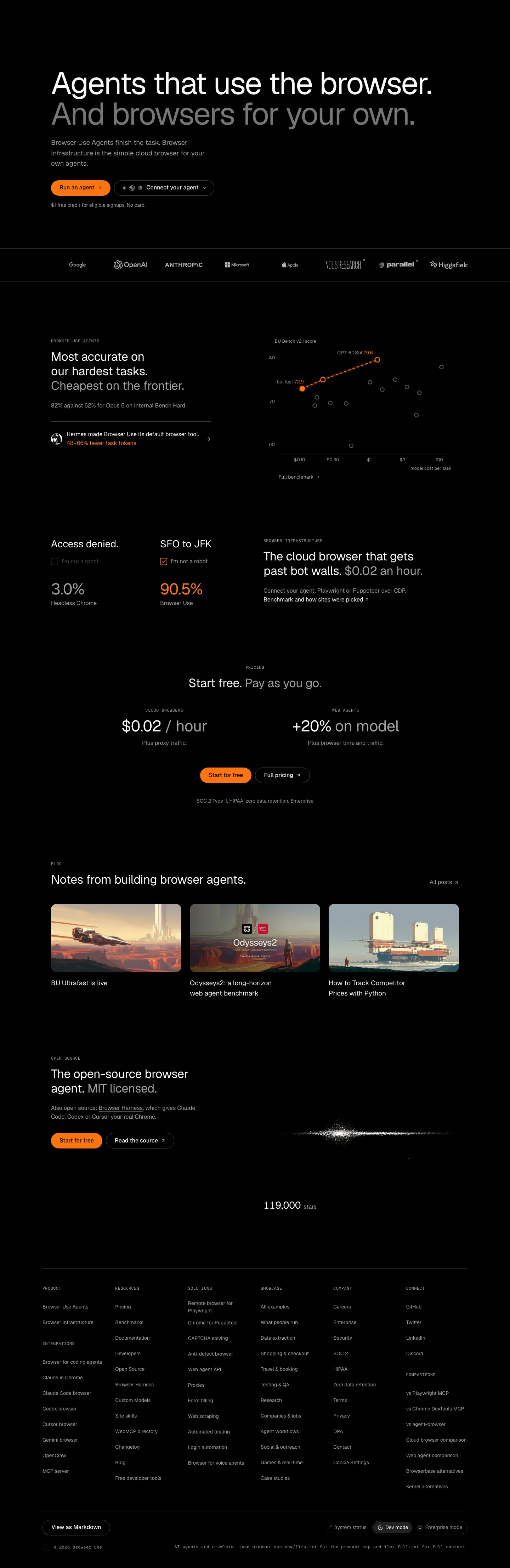
A dark, text-led page: a two-tone hero, a logo strip, an accuracy chart, a bot-wall comparison, a two-number pricing block, three blog cards, an open-source section with a particle graphic and a dense six-column footer. The desktop capture is 4429px tall. The ground is pure #000000 with grey #373737 rules, and orange #fe750e marks the primary buttons, chart line and winning figures. Geist sets the large headings and Geist Mono the small uppercase eyebrows and footer notes. Each block argues with one measured number, not product screenshots.
Above the fold
The two-line headline sits left-aligned in large type, the first sentence white and the second grey. A three-line subhead leads to an orange "Run an agent" pill and an outlined "Connect your agent" dropdown showing three small model icons. A grey line, "$1 free credit for eligible signups. No card.", sits below. A ruled strip of eight logos, from Google and OpenAI to Higgsfield, closes the fold.
Accuracy chart and bot-wall test
Under a "BROWSER USE AGENTS" eyebrow, "Most accurate on our hardest tasks. Cheapest on the frontier." sits left of a scatter plot titled "BU Bench v2.1 score", where an orange dashed line links three in-house points among grey rivals. A Hermes row cites "48–66% fewer task tokens" in orange. Next, two columns put "Access denied." at "3.0%" for "Headless Chrome" against "SFO to JFK" at "90.5%", each under a mock "I'm not a robot" checkbox.
Pricing and blog
"Start free. Pay as you go." centres two prices only: "$0.02 / hour" for cloud browsers and "+20% on model" for web agents, each with one grey caveat line. An orange "Start for free" and an outlined "Full pricing" follow, above "SOC 2 Type II, HIPAA, zero data retention." "Notes from building browser agents." then shows three post cards with painted scenes, the first titled "BU Ultrafast is live", plus "All posts" at right.
Closing section and footer
"The open-source browser agent. MIT licensed." pairs "Start for free" and "Read the source" with a white particle streak and the count "119,000" "stars". The footer runs six mono-labelled columns of links, ending with a "COMPARISONS" list of rival tools. A bottom bar holds a "View as Markdown" button, "System status", a "Dev mode" and "Enterprise mode" switch, and a note pointing AI crawlers to llms.txt files.
On mobile
At 390px the page reaches 5062px. The headline breaks into five short lines and the two hero buttons stack, with only three logos visible in the strip. The scatter plot moves below its claim and the Hermes row. The two pricing figures stack centrally, the blog shows one card at a time, and the footer folds its link groups into eight collapsed rows from "Product" to "Comparisons".
Worth borrowing
- Setting the second half of a headline in grey splits a two-product pitch into one statement without a second heading.
- Showing a mock "I'm not a robot" checkbox beside each success rate turns a benchmark into a scene readers recognise.
- A "View as Markdown" button and a crawler note in the footer address AI agents as a second audience of the page.





