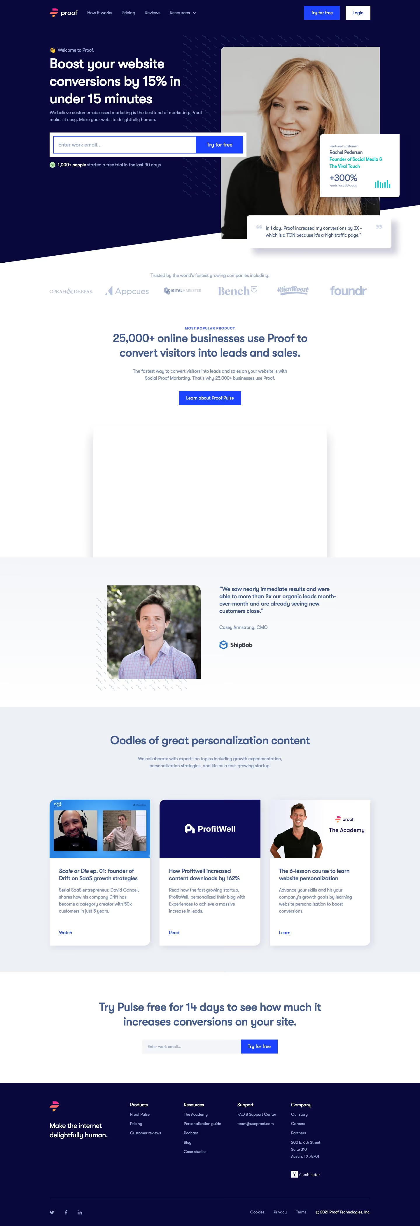
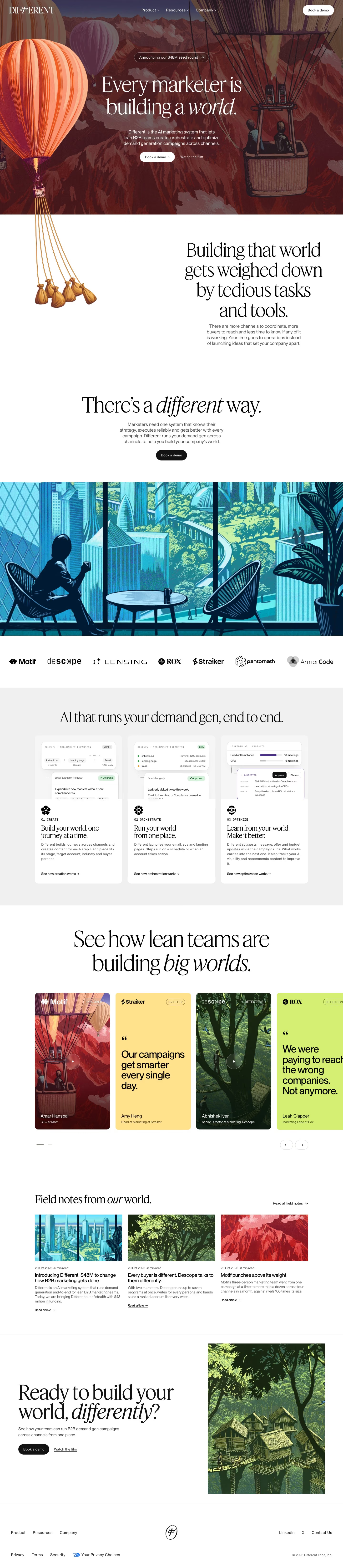
Circle
circle.so/
Circle is a Marketing product. See its circle.so landing page design in full — desktop and mobile screenshots plus close-ups of the heroes, features, footers, testimonials, pricing, and 3 more. It's built with Next.js, Tailwind CSS and CSS-in-JS. Its type is set in Inter, anchored by a #141236 palette. Study how Circle structures its messaging, layout and visual hierarchy, then explore more of the best Marketing website designs.
Circle's landing page, section by section
Each section below is cropped straight from Circle's live page — useful references for marketing landing page design.
Heroes
More heroesFeatures
More featuresTestimonials
More testimonialsPricing
More pricingAffiliate pages
More affiliate pagesCareers pages
More careers pagesBlog pages
More blog pagesCircle design review: how the homepage is built
Top to bottom: a full-bleed gradient hero with an email form, a tabbed dashboard demo, a video-plus-intro row, a ten-portrait creator grid, six stacked product cards, a seven-tile benefit grid, a testimonial carousel, G2 badges, a dark closing form and a five-column footer. It measures 15228 pixels on desktop. Navy #141236 and #0b1767 open and close the page, with white between them and pastel gradients inside each product card. Inter sets every heading. The distinctive move is a page that flips from navy to white midway through.
Above the fold
A violet-to-orange gradient fills the hero. The header has the "Circle" wordmark, five labels ("Product", "Branded Apps", "Resources", "Discover", "Pricing"), "Log in" and an outlined "Start free trial" pill. Centred below a "70k+ reviews" badge with four store icons, "The complete community platform" breaks over two lines above a one-line subhead and a white pill field, "Enter your email address", fused to a blue "Start for free" button. "Trusted by the world's top communities" introduces eight logos.
Dashboard tabs, intro row and creator grid
"Where all-in-one meets best-in-class" heads a row of eleven tabs with "CRM" selected, over a bordered table of members beside an AI chat panel. A video tile, "Meet Circle AI", sits left of "What is Circle?". Then "Built for pros. Chosen by the best." shows ten portrait cards in two rows of five, each with a name such as "Jay Shetty" or "Tim Ferriss" and a one-line role.
Six stacked product cards
On white, "Yes, you really can run everything on Circle" opens six rounded cards: "Community", "Branded app", "AI & Automation", "Payments", "Email marketing" and "Website builder". Each repeats one layout, a large title, a pill-tab row, a tinted gradient panel in blue, peach, lilac, mint, yellow or pink, a three-to-five item checklist and a small quote card with a name. Phone and chat screenshots fill some panels' right sides.
Benefit grid, testimonials and footer
"Great communities transform people" leads a grid of seven white cards, with a "LIVE" portrait and a paywall mock-up among them. "Loved by the best" follows with a carousel of dark quote cards and "Recognized as a G2 Leader", then a large "Pat Flynn" quote. A navy band asks "Join thousands and build your home on Circle today" with the email form again. Five columns, from "WEBSITE" to "GET HELP", end in four compliance marks.
On mobile
At 390px the page reaches 10440 pixels, shorter than desktop. The hero headline wraps to three lines, the header shrinks to a logo, outlined pill and menu icon, and the form stacks with a full-width button. The dashboard demo becomes a cropped strip, creator portraits a side-scrolling row, product cards keep only their checklists, and the footer becomes seven accordion rows.
Worth borrowing
- Putting the email field and button inside the hero lets the first screen carry the whole sign-up step.
- Giving each product card its own pastel tint makes six same-shaped sections easy to tell apart.
- Repeating one "Start free trial" pill after nearly every heading keeps the action within reach on a 15,000-pixel page.