Useproof
useproof.com/
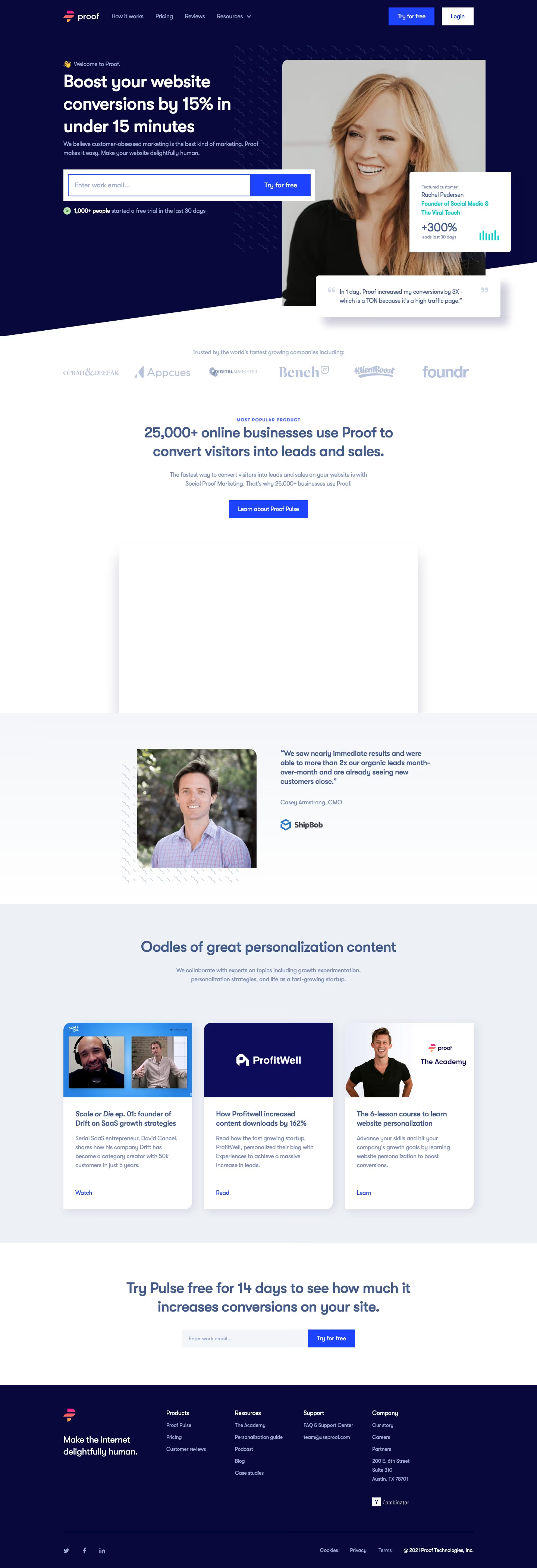
Proof sells social-proof widgets (live purchase notifications, visitor counts, review displays) for boosting website conversions. The hero commits to a specific, falsifiable number: "Boost your website conversions by 15% in under 15 minutes." It backs this with layered stats rather than one vague claim — 25,000+ businesses using it, 1,000+ trial signups in the last 30 days, a named customer (Rachel Pedersen) citing +300% leads, and a quoted ShipBob executive claiming a 2x lift in organic leads. A Y Combinator Winter '18 badge sits alongside the customer logos as a credibility marker, and the site also runs its own podcast and course under the "Social Proof Marketing" banner rather than just a blog.
Useproof's landing page, section by section
Each section below is cropped straight from Useproof's live page — useful references for marketing landing page design.
Useproof design review: how the homepage is built
Useproof's homepage is a Webflow build about 4201 pixels tall on desktop, running from a dark navy hero through a logo strip, a product block, a testimonial, a three-card row and a navy footer. The logo reads proof in lowercase, and the footer names Proof Technologies, Inc. The palette centres on a deep navy near #08083b, with bright blue near #1e43ff on every primary button and slate blue near #435b8c for headings on white. The detected display typeface is Gt Walsheim Pro. The distinctive move for this marketing category is a work-email field directly under the hero headline, repeated near the bottom.
Above the fold
The headline "Boost your website conversions by 15% in under 15 minutes" sits in large white type across three lines on the navy field. Beneath it, the subhead closes with "Make your website delightfully human." A white panel holds an email field beside a blue "Try for free" button. On the right, a framed portrait overlaps a card headed "Featured customer" with "+300%" in it.
Logo strip, product block and testimonial
A logo strip sits under "Trusted by the world's fastest growing companies including:", with six grey wordmarks. The next block, centred, has a blue "MOST POPULAR PRODUCT" eyebrow, the heading "25,000+ online businesses use Proof to convert visitors into leads and sales." and a "Learn about Proof Pulse" button. Beside a man's portrait, the testimonial reads "We saw nearly immediate results and were able to more than 2x our organic leads month-over-month", credited to "Casey Armstrong, CMO".
Three-card content row
A pale grey band headed "Oodles of great personalization content" holds three equal white cards. The first is a video still titled "Scale or Die ep. 01: founder of Drift on SaaS growth strategies" with "Watch". The second, on a solid navy panel with the ProfitWell logo, is titled "How Profitwell increased content downloads by 162%" with "Read". The third shows a man beside "The Academy" with "Learn". Each card repeats one title, body and text-link pattern.
Closing section and footer
A band headed "Try Pulse free for 14 days to see how much it increases conversions on your site." carries a second email field and a blue "Try for free" button. The navy footer opens with the line "Make the internet delightfully human.", then link columns headed "Products", "Resources", "Support" and "Company", with "Cookies", "Privacy" and "Terms" at the base.
On mobile
At 390 pixels the hero stacks into one column, with the headline, subhead and full-width email button, and the quote card and the portrait drop out entirely. The logo strip becomes a two-column grid, with the testimonial portrait stacking above its quote. The three cards stack vertically, video first, and the footer splits into paired link groups beneath the logo.
Worth borrowing
- A work-email field directly under the headline puts the first action above the fold.
- Alternating a dark hero with light bands gives the long page a steady rhythm.
- Three equal cards sharing one title, body and text-link pattern keep the row easy to scan.