Gooddaysoftware
gooddaysoftware.com/
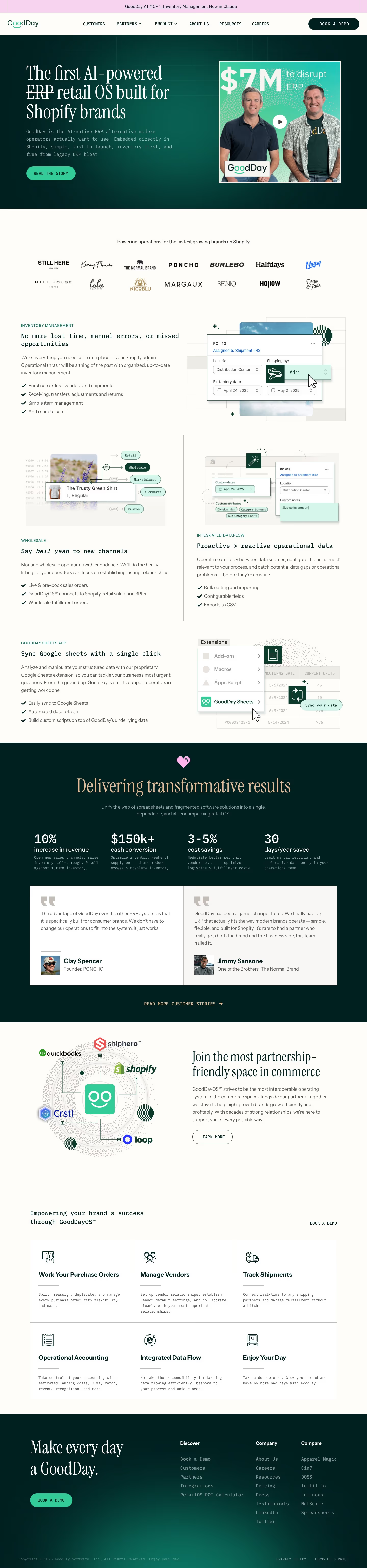
GoodDay describes itself as an AI-powered ERP built specifically for Shopify brands, embedded directly inside Shopify rather than sold as a standalone legacy system. Its homepage leads with an unusual mix of playful pixel-art illustrations set against real product screenshots, and a customer quote doing the positioning work for it: 'We don't have to change our operations to fit into the system. It just works.' Instead of generic efficiency claims, it cites specific operator-facing numbers - a 10% revenue increase from inventory optimization, $150k+ freed up in cash conversion, and 30 days a year saved on manual reporting - and gives over a large chunk of the page to a horizontally scrolling wall of Shopify brand logos rather than a features list.
- Category
- Finance & Commerce
- Style
- DarkColorful
- Stack
- Webflow
- Fonts
- Instrument SerifIBM Plex MonoInstrument Sans
- Palette
- Meta title
- GoodDay | Inventory Management for Brands on Shopify
- Sections
- 9
- Updated
Gooddaysoftware's landing page, section by section
Each section below is cropped straight from Gooddaysoftware's live page — useful references for finance & commerce landing page design.
Heroes
More heroesFeatures
More featuresLogo clouds
More logo cloudsAbout Us
More about usPricing & Plans
More pricing & plansAffiliate pages
More affiliate pagesCareers pages
More careers pagesBlog pages
More blog pagesGooddaysoftware design review: how the homepage is built
The GoodDay homepage, captured at 1440px wide, is 6151px tall and runs as a pink announcement bar, a dark green hero, a logo band, cream feature rows, a dark results band and a closing footer. The page brands itself GoodDay. Deep green #043934 fills the dark sections, mint #33cc99 fills the buttons, and tan #e1ba97 sets the serif accents beside the pink #f8d3ef top bar. Headlines use Instrument Serif, with labels and body copy in IBM Plex Mono and Instrument Sans. The pixel-style icons and mono labels make it distinctive for an ERP vendor.
Above the fold
The pink announcement bar reads "GoodDay AI MCP > Inventory Management Now in Claude" above a white nav with "CUSTOMERS", "PARTNERS", "PRODUCT", "ABOUT US", "RESOURCES" and "CAREERS". The hero headline, "The first AI-powered ERP retail OS built for Shopify brands", strikes through the word ERP over a mono subhead. A mint "READ THE STORY" button sits left, with a framed video still on the right showing two men, large $7M text and a play button.
Feature rows and Sheets app
A logo band headed "Powering operations for the fastest growing brands on Shopify" shows fourteen customer names."INVENTORY MANAGEMENT" follows with the heading "No more lost time, manual errors, or missed opportunities", four checkmarked bullets and a purchase-order card with a shipping selector set to Air. A split row pairs "Say hell yeah to new channels" with a channel diagram, and "Proactive > reactive operational data" with a field mockup. "Sync Google sheets with a single click" shows an Extensions menu.
Results, testimonials and partners
A dark band with a pink heart icon carries "Delivering transformative results" over four stats: 10% ("increase in revenue"), $150k+ ("cash conversion"), 3-5% cost savings and 30 days a year saved. Two testimonials follow from Clay Spencer, Founder of PONCHO, and Jimmy Sansone, One of the Brothers, The Normal Brand. A cream section headed "Join the most partnership-friendly space in commerce" sits beside a dotted orbit of platform logos.
Closing section and footer
Six cards in a grid, each with a pixel icon and mono copy, read "Work Your Purchase Orders", "Manage Vendors", "Track Shipments", "Operational Accounting", "Integrated Data Flow" and "Enjoy Your Day". The dark footer closes with "Make every day a GoodDay." in serif, a mint "BOOK A DEMO" button, and link columns headed "Discover", "Company" and "Compare". A copyright line sits beside "PRIVACY POLICY" and "TERMS OF SERVICE".
On mobile
At 390px the hero stacks into one column, with the video still below the mint button, and the nav labels do not appear in the capture. The logo band shrinks to two visible logos.The four stats become a single column of large figures, and the testimonials stack. The six module cards run as one column.
Worth borrowing
- One struck-through word in a headline can carry the positioning on its own.
- Feature rows that pair a checkmark list with a product mockup make each capability scannable.
- A four-column stat band on dark green puts numeric proof ahead of the testimonials.