Pipe
pipe.com/
Pipe is an embedded financial operating system that lets vertical SaaS platforms, payment facilitators, and marketplaces offer their small-business customers pre-approved capital and financing tools directly inside the host platform, with sales-based repayment and no monthly minimums. Its homepage leads with a cluster of specific performance metrics rather than broad claims — a 9.4% first-month activation rate, 61% average conversion, an 80 Net Promoter Score, and 12% faster month-over-month revenue growth for the small businesses using embedded capital. It backs this with a named testimonial from GoCardless's Director of Product Management describing integration as requiring only "a few snippets of code," plus individual small-business case studies naming specific founders rather than generic logos alone.
- Category
- Finance & Commerce
- Style
- DarkColorful
- Stack
- Next.jsCSS-in-JS
- Fonts
- __suisseFont_3f347b
- Palette
- Meta title
- Pipe | Embedded Financial Solutions
- Sections
- 8
- Updated
Pipe's landing page, section by section
Each section below is cropped straight from Pipe's live page — useful references for finance & commerce landing page design.
Heroes
More heroesFeatures
More featuresAbout Us
More about usContact Us
More contact usAffiliate pages
More affiliate pagesCareers pages
More careers pagesBlog pages
More blog pagesPipe design review: how the homepage is built
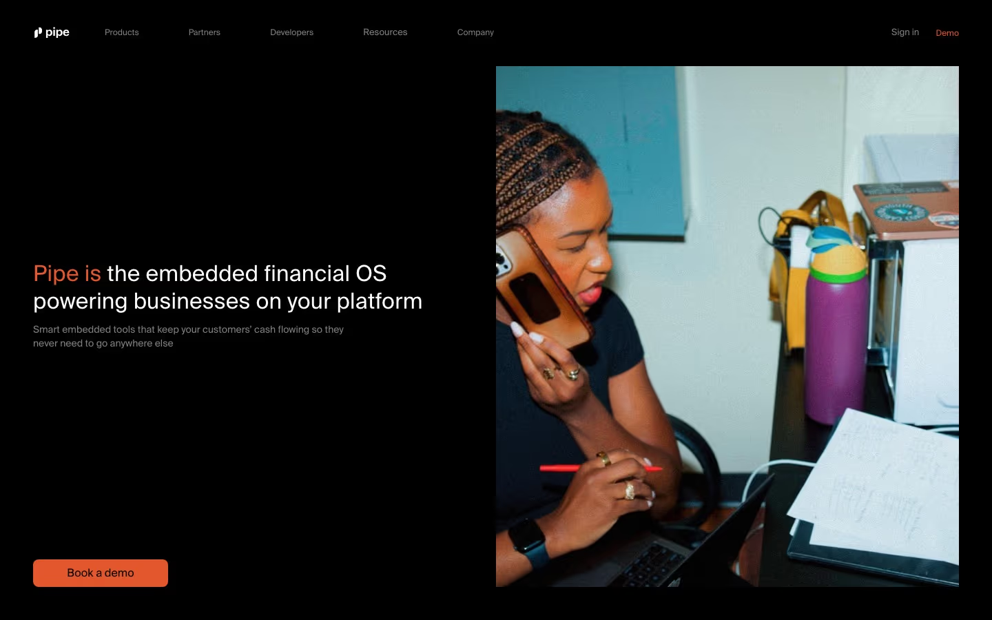
The first screen is a full-bleed black field, 900 pixels tall, split into a text half on the left and a tall photograph on the right. A thin navigation row runs across the top, a two-line headline sits at the vertical middle. Colour is limited to black, white, grey and a warm orange-red used for the lead words of the headline, the Demo link and the button. The distinctive trait for a payments product is a candid, grainy photo of a person at work in place of a dashboard.
Navigation row
At the far left of the top row is a small white mark followed by the lowercase wordmark "pipe". Five grey text links follow with wide gaps: "Products", "Partners", "Developers", "Resources" and "Company", with no dropdown arrows or icons. At the far right, a grey "Sign in" link sits beside "Demo", written in the same orange-red as the headline and the only coloured item in the row. The row has no background fill or divider line.
Headline and supporting line
The headline spans two lines in light-weight white type, with the first words "Pipe is" tinted orange-red, followed by "the embedded financial OS powering businesses on your platform". The two lines are set large in light-weight type. Directly beneath, a much smaller grey two-line sentence reads "Smart embedded tools that keep your customers’ cash flowing so they never need to go anywhere else".
Photograph
The right half holds one tall photograph with square corners, inset from the top, right and bottom edges so black frames it on three sides. It shows a woman with braided hair holding a phone to her ear and looking down at a laptop, pen in hand, with a purple water bottle, a yellow bag and loose handwritten papers beside her. The grainy, warm-toned treatment contrasts with the flat black around it and carries more weight than the text.
Call to action
At the bottom of the text column, aligned with the photograph's lower edge, a rounded button in solid orange-red carries the label "Book a demo" in dark text. It is the only filled element on the screen, and a wide gap of empty black separates it from the supporting line. Its left edge matches the headline's, so headline, supporting line and button form one aligned column.
On mobile
On a 390-pixel phone the navigation row is gone and the order reverses: the tall photograph comes first with a black margin around it, then the headline wrapped to three lines with "Pipe is" still in orange-red, then the grey supporting sentence. The "Book a demo" button stretches across the full width below the text, so the call to action is the last element in the view.
Worth borrowing
- Tinting only the first words, "Pipe is", in the accent colour marks the brand name without adding another element.
- A single filled button labelled "Book a demo" against an otherwise black screen leaves no competing action in the first view.
- Replacing a product mock-up with one grainy, candid portrait makes an infrastructure product read as human and specific.