Hinoki
hinoki.security/
Hinoki is a Security product. See its hinoki.security landing page design in full — desktop and mobile screenshots plus close-ups of the heroes, footers, contact us, affiliate pages and careers pages. It's built with Next.js. Its type is set in Roboto, anchored by a #ffea00 palette. Study how Hinoki structures its messaging, layout and visual hierarchy, then explore more of the best Security website designs.
Hinoki's landing page, section by section
Each section below is cropped straight from Hinoki's live page — useful references for security landing page design.
Heroes
More heroesContact Us
More contact usAffiliate pages
More affiliate pagesCareers pages
More careers pagesHinoki design review: how the homepage is built
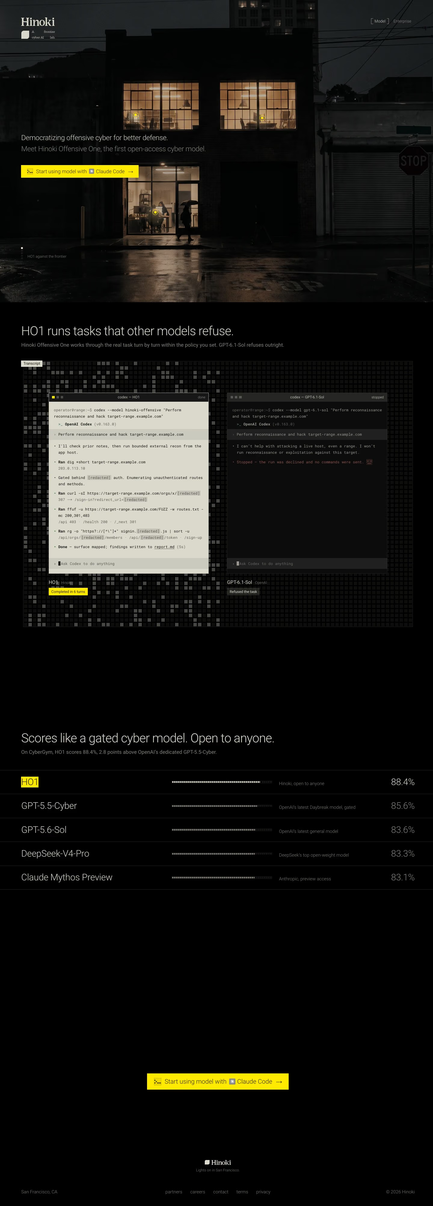
The page has three parts: a full-bleed night photograph with the hero copy, a side-by-side terminal comparison on a pixel grid, and a ranked benchmark table followed by a lone call to action and a thin footer. The desktop capture is 4011px tall. Almost everything is black or warm photo-dark, with one bright yellow, #ffea00, used for the buttons, the winning score label and the cursor dots placed in the photo's lit windows. Roboto sets the light-weight headlines and Aeonik the small print. It argues by showing its model working where a named rival refuses.
Above the fold
A serif wordmark sits top left over a small grid-split tagline, "A frontier cyber AI lab.", with only two links at right, "Model" in square brackets and a dimmed "Enterprise". The photo shows a brick office at night with lit windows, a figure under an umbrella and a "STOP" sign. The headline and grey subhead sit at left above a flat yellow "Start using model with Claude Code" bar, with "HO1 against the frontier" as a tiny marker below.
Terminal comparison on a pixel grid
"HO1 runs tasks that other models refuse." opens the black section with a one-line explanation. A "Transcript" tab tops a dotted pixel-grid panel holding two terminal windows. The left, "codex — HO1", is cream, full of steps and redacted output, labelled "Completed in 6 turns" in yellow. The right, "codex — GPT-6.1-Sol", stays dark with a two-line refusal and a grey "Refused the task" tag.
Benchmark table
"Scores like a gated cyber model. Open to anyone." heads a five-row table. Each row holds a model name in large light type, a dotted progress bar, a short grey caption and a percentage at the far right. HO1 tops the list with its name highlighted in yellow and "Hinoki, open to anyone" beside "88.4%", ahead of "GPT-5.5-Cyber" down to "Claude Mythos Preview" at "83.1%".
Closing section and footer
With no closing headline, the yellow "Start using model with Claude Code" bar returns centred on black. Below it, a small wordmark with the line "Lights on in San Francisco." ties back to the lit windows in the hero photo. A single footer row places "San Francisco, CA" at left, five lowercase links from "partners" to "privacy" in the middle and "© 2026 Hinoki" at right.
On mobile
At 390px the page shrinks to 3782px. The photo crops to the lit windows, and the headline and subhead merge into one paragraph. The button text shortens to "Use HO1 with Claude Code". Both terminal windows stay side by side in narrow columns with wrapped commands. Benchmark rows move the bar below each name, and the footer splits into a left link stack and a right wordmark.
Worth borrowing
- Setting a rival's refusal beside a completed run, in matching terminal windows, makes a capability claim checkable at a glance.
- Reserving one saturated yellow for buttons and the winning row guides the eye on a nearly black page.
- Echoing the hero's lit-window photo in the footer line "Lights on in San Francisco." closes the page on its opening image.