
June
june.so/
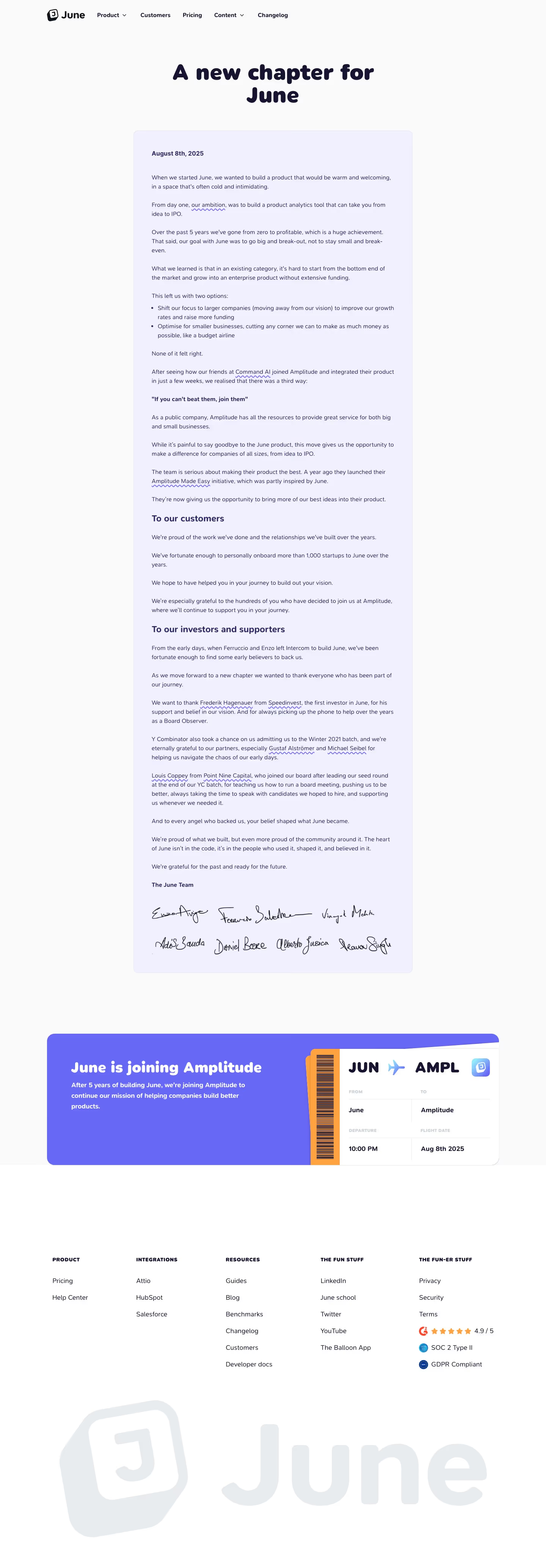
June was a product analytics tool for B2B SaaS companies with integrations for Salesforce, HubSpot, and Attio; as of the current homepage, the entire page is an acquisition announcement rather than product marketing. The headline reads "A new chapter for June," dated August 8, 2025, explaining the company is joining Amplitude after five years of operation, having personally onboarded more than 1,000 startups. A illustrated "flight ticket" graphic depicts the transition visually as a route from "JUN to AMPL." Named investors (Y Combinator, Speedinvest, Point Nine Capital) and advisors are thanked directly in the copy, and the tone is explicitly sentimental rather than promotional, closing with a line about the product's value residing in "the people who used it, shaped it, and believed in it."
- Category
- Data & Analytics
- Style
- LightMinimal
- Stack
- Next.jsTailwind CSSCSS-in-JS
- Fonts
- SF Pro RoundedInter
- Palette
- Meta title
- June - Product & Customer Analytics Software for B2B SaaS
- Sections
- 4
- Updated
June's landing page, section by section
Each section below is cropped straight from June's live page — useful references for data & analytics landing page design.
June design review: how the homepage is built
At the root address, June shows no product homepage. The page is a long open letter, 4132 pixels tall on desktop, announcing that the company is joining Amplitude. Its structure is a navigation bar, a centred headline, one pale lavender card of letter text, a periwinkle banner styled as a boarding pass, and a five-column footer. The palette is near-white, deep navy text and one periwinkle blue with an orange accent. A heavy, rounded display face over a plain sans body gives a farewell note a playful tone.
Navigation and letter opening
A header carries the tilted J logo tile and the "June" wordmark, then five links: "Product" and "Content" with chevrons, plus "Customers", "Pricing" and "Changelog". Below, a centred two-line headline, "A new chapter for June", sets in heavy navy. A lavender card opens with the bold date "August 8th, 2025", then short paragraphs, one with a wavy purple underline on "our ambition", and a two-item bullet list introduced by "This left us with two options:".
The third way and two addresses
The letter then reaches a bold, quoted turning point on its own line, "If you can't beat them, join them". Two bold subheadings divide the rest: "To our customers" and "To our investors and supporters". Names of backers and firms carry the same wavy purple underline. Text stays in one narrow column about 1000 pixels wide, with generous blank lines between paragraphs, so the note reads like a printed letter.
Sign-off and boarding pass
The card ends with "The June Team" and seven handwritten signatures in black ink, three on the first row and four on the second. After a large gap, a full-width periwinkle banner reads "June is joining Amplitude" in white. Its right side is a boarding-pass illustration with an orange barcode stub, "JUN" and "AMPL" separated by a plane icon, and grey labels "DEPARTURE" and "FLIGHT DATE" above "10:00 PM" and "Aug 8th 2025".
Footer
After about 300 pixels of white space, a five-column footer carries bold capital headings: "PRODUCT", "INTEGRATIONS", "RESOURCES", "THE FUN STUFF" and "THE FUN-ER STUFF", with two, three, six, five and three items. The last column adds a G2 badge with five orange stars and "4.9 / 5", plus "SOC 2 Type II" and "GDPR Compliant" seals. An oversized pale grey logo and wordmark fills the width beneath.
On mobile
At 390 pixels the navigation collapses to the logo tile alone. The headline stays centred on two lines, and the lavender card fills the width with larger body text, so the letter runs much longer. The seven signatures stack in one centred column. The boarding pass sits below the banner copy instead of beside it, and the footer becomes two columns, then one. Total height is 5820 pixels.
Worth borrowing
- Presenting an acquisition as a boarding pass from "JUN" to "AMPL" turns bad news into visual play.
- A narrow lavender card with large type and handwritten signatures makes a long announcement feel personal.
- Keeping the full navigation and footer on a farewell page still lets visitors reach "Pricing" and "Help Center".





