
Kernel
kernel.sh/
Kernel is a Engineering & Infrastructure product. See its kernel.sh landing page design in full — desktop and mobile screenshots plus close-ups of the heroes, features, footers, pricing, blog pages, and 1 more. It's built with Next.js and Tailwind CSS. Its type is set in Inter, anchored by a #f3f0e7 palette. Study how Kernel structures its messaging, layout and visual hierarchy, then explore more of the best Engineering & Infrastructure website designs.
- Category
- Engineering & Infrastructure
- Style
- LightMinimal
- Stack
- Next.jsTailwind CSS
- Fonts
- Inter
- Palette
- Meta title
- KERNEL: browser infrastructure for web agents and automations
- Sections
- 6
- Updated
Kernel's landing page, section by section
Each section below is cropped straight from Kernel's live page — useful references for engineering & infrastructure landing page design.
Heroes
More heroesFeatures
More featuresPricing
More pricingBlog pages
More blog pagesWhy Choose Us
More why choose usKernel design review: how the homepage is built
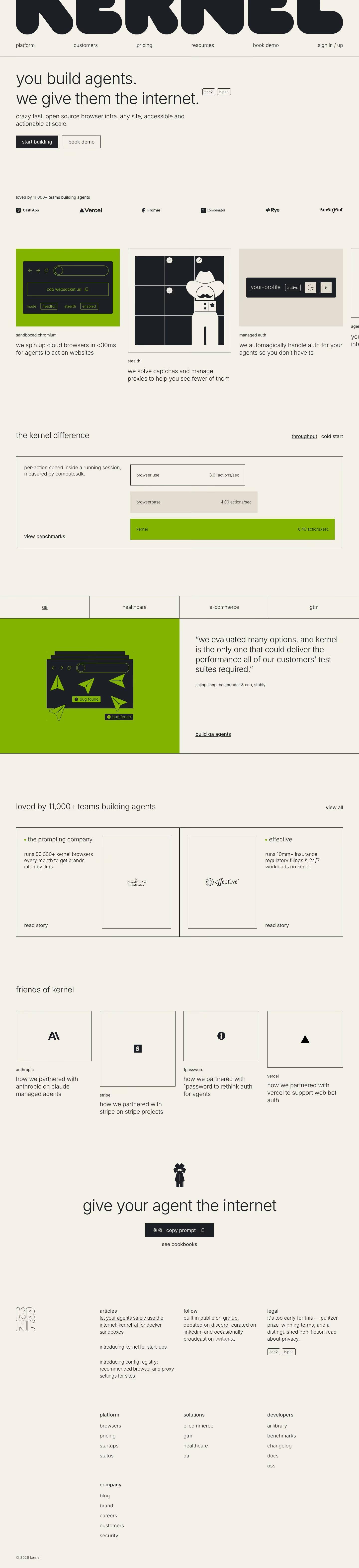
The page opens under a full-width rounded wordmark and runs through a lowercase hero, a logo row, a sideways carousel of feature cards, a benchmark chart, a tabbed use-case panel, two customer story cards, four partner tiles and a closing line above a text footer, 6282 pixels tall on desktop. Everything sits on cream #f3f0e7 with near-black #1c1f24 type and one acid green used for illustration panels and the winning benchmark bar. Inter is set light and entirely lowercase, even in navigation and buttons. The distinctive choice is the contrast between that whisper-weight type and the heavy, bubbly logotype above it.
Above the fold
The giant black wordmark sits above six evenly spaced lowercase links, from "platform" to "sign in / up", with a hairline rule beneath. The two-line headline in light Inter carries two small outlined badges, "soc2" and "hipaa", at its end. A one-sentence subhead precedes a filled "start building" and an outlined "book demo". At the base, "loved by 11,000+ teams building agents" introduces six customer logos in one row.
Feature carousel and benchmark
A row of cards runs off the right edge: "sandboxed chromium" on a green panel, "stealth" with a cowboy-hatted robot in a grid of solved captcha tiles, then "managed auth". Each pairs a small label with one sentence, such as "we spin up cloud browsers in <30ms for agents to act on websites". "the kernel difference" follows with "throughput" and "cold start" toggles and three horizontal bars, green "kernel" longest at "6.43 actions/sec".
Use-case tabs, stories and partners
Four boxed tabs, "qa", "healthcare", "e-commerce" and "gtm", sit over a split panel: a green illustration of arrow cursors and "bug found" tags on the left, a large quote from Stably on the right with an underlined "build qa agents" link. Two bordered story cards follow, "the prompting company" and "effective", each with a logo frame and "read story". "friends of kernel" lays out four logo tiles at staggered heights.
Closing section and footer
A small robot mascot tops the centred line "give your agent the internet", with a black "copy prompt" button and a "see cookbooks" link below. The footer puts an outlined stacked monogram on the left and prose columns headed "articles", "follow" and "legal", where a struck-through "twitter" precedes "x". Four link lists follow, among them "developers" and "company", ending in a small copyright line.
On mobile
At 390px the page grows to 7962 pixels. The headline breaks across five lines. The logos wrap into three rows and the carousel shows one card with the next peeking in. The benchmark bars stack under their caption, the use-case tabs scroll sideways, and story and partner cards run one per row. The footer moves "legal" to the top and pairs link lists two by two.
Worth borrowing
- Setting all copy, buttons included, in light lowercase lets a heavy logotype carry the brand on its own.
- Showing a competitor benchmark as three labelled bars, with only the winner in colour, makes the speed claim readable at a glance.
- Writing footer columns as sentences, such as a struck-through "twitter" beside "x", gives routine links a voice.





