Mirai
trymirai.com/
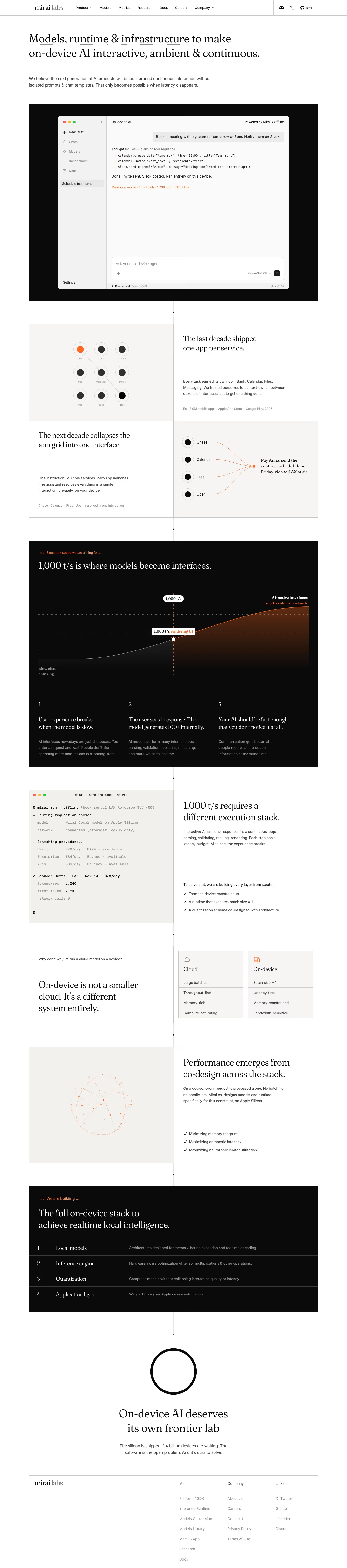
Mirai (trymirai.com) builds infrastructure for running AI models directly on Apple devices rather than in the cloud — local models, an inference engine, quantization tooling, and a macOS app. The homepage argues for a shift from "one app per service" toward a single interface, framed as "one instruction, multiple services, zero app launches," and centers its pitch on a specific throughput threshold: 1,000 tokens/second as the point "where models become interfaces," contrasted against a stated 670 t/s for current "slow chat" experiences. It cites 1,811 GitHub stars for its open-source "uzu" inference project and references "2 billion devices" already running compatible Apple silicon, with no pricing or testimonials anywhere on the page.
- Category
- Engineering & Infrastructure
- Style
- LightMinimal
- Stack
- Next.jsTailwind CSS
- Fonts
- FrauncesInter
- Palette
- Meta title
- Mirai Labs: Frontier On-Device AI Lab
- Sections
- 7
- Updated
Mirai's landing page, section by section
Each section below is cropped straight from Mirai's live page — useful references for engineering & infrastructure landing page design.
Heroes
More heroesFeatures
More featuresAbout Us
More about usContact Us
More contact usCareers pages
More careers pagesBlog pages
More blog pagesMirai design review: how the homepage is built
The 6,501px desktop page opens straight into a headline and a single paragraph, then a black panel holding a chat-app mockup, with no buttons or logo wall anywhere. It continues through two split rows about apps, a black speed chart, a terminal panel, a cloud versus on-device comparison, a numbered four-row stack table, a circle statement and a three-column footer. Colour is near-white #fcfcfc against near-black #090909 with orange used for small accents and diagrams. The detected fonts are Fraunces for display and Inter for body, and hairline vertical rules join the blocks.
Above the fold
A bordered top bar holds the "mirai labs" wordmark, seven labels ("Product", "Models", "Metrics", "Research", "Docs", "Careers", "Company") and Discord, X and GitHub icons with a count of 1675. The serif headline spans two lines, with "Models", "runtime" and "infrastructure" dotted-underlined. A grey paragraph follows. Below, a black panel frames a Mac-style window with a sidebar ("New Chat", "Chats", "Models") and a transcript where a calendar and Slack request ends with an orange line of speed figures.
App-grid split rows and speed chart
A two-by-two checkerboard alternates text and diagram. "The last decade shipped one app per service." sits beside a nine-dot grid and "The next decade collapses the app grid into one interface." sits beside four labelled dots converging on a quoted request. A full-width black band then states "1,000 t/s is where models become interfaces." over an area chart that turns orange at a marked point, with three numbered columns beneath.
Terminal, comparison and co-design rows
Another split row puts a beige terminal window at left and "1,000 t/s requires a different execution stack." at right. A quieter row asks a small grey question, then states "On-device is not a smaller cloud. It's a different system entirely." beside two four-line boxes headed "Cloud" and "On-device". The next row pairs an orange wireframe sphere with "Performance emerges from co-design across the stack." and three checkmarked lines.
Closing section and footer
A black table headed "The full on-device stack to achieve realtime local intelligence." numbers four rows: "Local models", "Inference engine", "Quantization" and "Application layer", each with a grey one-line description. A thick black ring sits above "On-device AI deserves its own frontier lab" and a short paragraph. The footer has three link columns, "Main", "Company" and "Links", with seven, five and four entries, and no closing button.
On mobile
At 390px the page is nearly the same length, 6,506px. The nav collapses out of view, so the serif headline leads the screen. The checkerboard becomes a single column with each diagram under its text. The chart band shrinks while the three numbered points become stacked headings. The comparison boxes remain side by side, the four-row table stacks each description under its name, and footer columns drop to two.
Worth borrowing
- A hero with only a headline, paragraph and product window skips buttons entirely.
- Alternating text and diagram cells divided by hairlines make an essay read as a grid.
- A numbered four-row table on black summarizes the whole stack in one glance.