Replit
replit.com/
Replit is an AI app-builder that turns natural-language prompts into working, deployable applications, bundling authentication, databases, hosting, and monitoring so the generated app runs without separate setup. The homepage headline "What will you build?" is followed by the specific offer "Your first prompt is free. No credit consumption," and a claim that its current Free Mode runs at 65% lower average cost than the prior Max Mode. Testimonials are drawn from named executives at Databricks, Zillow, Gusto, and Talkdesk rather than generic quotes, and the page includes a Kanban-style task view and an "Infinite Canvas" design tool showcase alongside standard tiered pricing (Starter, Core, Pro, Enterprise).
- Category
- Engineering & Infrastructure
- Style
- LightMinimal
- Stack
- Next.js
- Fonts
- ABC Diatype Plus VariableABC DiatypeIBM Plex Sans
- Palette
- Meta title
- Replit – Build apps and sites with AI - Replit
- Sections
- 8
- Updated
Replit's landing page, section by section
Each section below is cropped straight from Replit's live page — useful references for engineering & infrastructure landing page design.
Heroes
More heroesAbout Us
More about usContact Us
More contact usPricing & Plans
More pricing & plansAffiliate pages
More affiliate pagesCareers pages
More careers pagesBlog pages
More blog pagesReplit design review: how the homepage is built
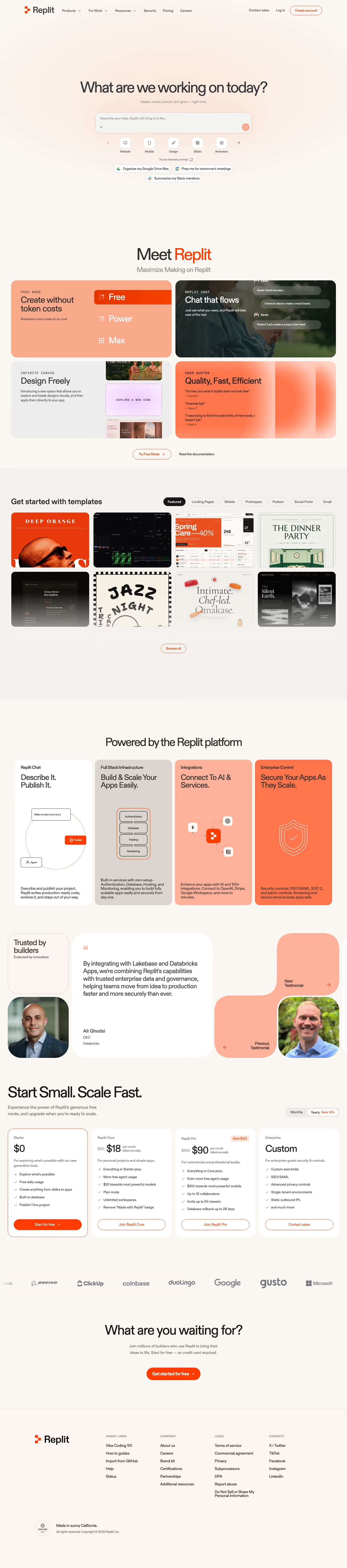
The Replit homepage measures 6,510 pixels on desktop and runs in this order: a prompt-box hero, a four-tile "Meet Replit" grid, a templates gallery, four platform cards, a testimonial carousel, a four-tier pricing row, a logo strip, a closing call to action and a plain footer. Colour stays inside cream (#faf2eb, #e6dcd5) with orange-red (#ff3c00) for buttons and accents. Type pairs "ABC Diatype Plus Variable" for display with "IBM Plex Sans" for body. Distinctive for the category is a hero that is a working input field rather than a headline above a button.
Above the fold
The nav holds the logo, five items, "Contact sales", "Log in" and an outlined "Create account". Centred below a large empty gap sits "What are we working on today?" with the line "Ideate, create, launch, and grow — right here". A prompt field reads "Describe your idea, Replit will bring it to life...". Five icon chips follow ("Website", "Mobile", "Design", "Slides", "Animation") with three example-prompt pills. There is no product image, only a faint peach glow.
Feature tiles and templates
"Meet Replit", with "Maximize Making on Replit" beneath, introduces a two-by-two grid of rounded tiles: "Create without token costs" with a "Free", "Power", "Max" list, "Chat that flows", "Design Freely" and "Quality, Fast, Efficient" with three short quotes. "Try Free Mode" and "Read the documentation" sit below. "Get started with templates" adds seven filter pills over rows of poster-style cards and a "Browse all" button.
Platform cards, quotes and pricing
"Powered by the Replit platform" shows four tall columns coloured white, taupe, peach and orange, each with a small diagram, from "Describe It. Publish It." to "Secure Your Apps As They Scale." A carousel headed "Trusted by builders" quotes the Databricks CEO beside portraits. "Start Small. Scale Fast." has a "Monthly" and "Yearly" toggle and four tiers priced "$0", "$18", "$90" and "Custom", with only the free tier carrying a filled button.
Closing section and footer
A greyscale logo row includes "BOEING", "ClickUp", "coinbase", "duolingo", "Google", "gusto" and "Microsoft". The closing block asks "What are you waiting for?" with one orange pill, "Get started for free". The footer stays on the cream background with the logo and four small-caps columns, "HANDY LINKS", "COMPANY", "LEGAL" and "CONNECT", ending on "Made in sunny California." beside a local-time clock.
On mobile
At 390 pixels the page extends to 8,468 pixels. The prompt box keeps its width and the chip row shows four of five icons. The four tiles stack in one column and the templates show a single card at a time. Platform cards and the testimonial become swipe carousels with dots and arrow buttons. The pricing tiers stack vertically, the logo row shows only two marks, and the footer folds into two columns.
Worth borrowing
- Making the hero a prompt field with category chips and example pills lets visitors start the product before scrolling.
- Colouring each platform card differently, from white to full orange, separates four parallel claims without icons or dividers.
- Reserving a filled orange button for the free tier and outlining the paid tiers steers the pricing row toward one action.