Simplecast
simplecast.com/
Simplecast is a podcast hosting, distribution, and monetization platform, publishing episodes to Apple Podcasts, Spotify, and other apps from a single upload while offering an ad marketplace via its AdsWizz partnership for creators to sell sponsorships. The homepage leads with the headline "The first and last word in podcast management and monetization" and backs it with specific figures rather than vague claims: it cites over a decade in the market, an IAB certification for its analytics product (branded separately as "Audience by Simplecast"), and a migration process it labels "98% Seamless, 2% Magic." That last phrase is the most distinctive touch on the page — an oddly precise, self-aware way of admitting a manual step remains in an otherwise automated onboarding flow.
Simplecast's landing page, section by section
Each section below is cropped straight from Simplecast's live page — useful references for marketing landing page design.
Simplecast design review: how the homepage is built
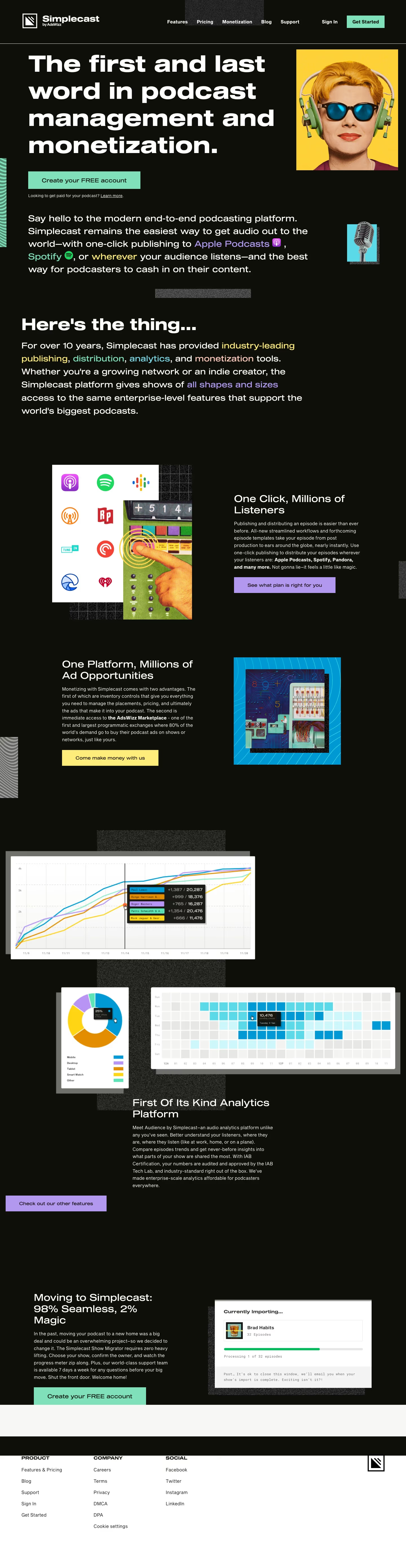
Simplecast’s 5,553-pixel homepage is an almost-black editorial field with coarse grey texture blocks and saturated collage images. Sequel Wide and Sequel Sans are listed in the metadata; broad heavy display lettering dominates each section. Mint, lilac, yellow, and cyan buttons or image frames interrupt the dark ground, with #80e0ba prominent in account actions. The page moves from a headphone portrait through a manifesto, listener distribution, advertising, analytics charts, migration, and a white footer. Each function becomes an oversized magazine spread rather than a conventional software card grid.
Portrait hero and manifesto
The Simplecast by AdsWizz mark precedes “Features”, “Pricing”, “Monetization”, “Blog”, and “Support”, then Sign In and “Get Started”. “The first and last word in podcast management and monetization.” fills most of the dark fold beside a yellow square portrait in green headphones. A mint “Create your FREE account” action anchors the text. The next long sentence begins “Say hello to the modern end-to-end podcasting platform.” and is decorated with Apple Podcasts, Spotify, and microphone graphics.
Distribution and advertising
“Here's the thing...” introduces a large explanatory paragraph before the page switches to an illustrated panel of listening-platform marks and a vintage-console collage. “One Click, Millions of Listeners” sits alongside the composition with a lilac “See what plan is right for you” control. A blue-framed electronic image and “One Platform, Millions of Ad Opportunities” follow, with a yellow “Come make money with us” action. Texture rectangles remain behind the images rather than framing them as cards.
Analytics and migration
Charts become the dominant visual material for “First Of Its Kind Analytics Platform”: a multi-line graph, a small pie chart, and a blue activity heat map float at different scales. “Meet Audience by Simplecast” appears in the copy below them. A lilac “Check out our other features” button introduces “Moving to Simplecast: 98% Seamless, 2% Magic”, paired with a white importing-progress dialog. Another mint “Create your FREE account” closes the dark content field.
White footer
A narrow white intermission separates the main content from the footer rather than adding a final sales panel. The footer itself is also white, creating a sharp inversion from the preceding black page. PRODUCT, COMPANY, and SOCIAL form three columns. Product links include “Features & Pricing”, Blog, Support, Sign In, and Get Started; Company includes Careers, Terms, Privacy, DMCA, DPA, and “Cookie settings”; Social lists Facebook, Twitter, Instagram, and LinkedIn beside the square logo.
On mobile
At 390 pixels, the hero’s portrait moves beneath the headline and mint account action. The manifesto copy becomes a narrow block punctuated by a small microphone collage. Distribution, advertising, analytics, and migration stay in the same sequence but become single full-width image-and-copy modules. The graph, pie, and heat map compress into a short vertical stack. The final white footer retains the three categories, now arranged as a two-column group with Social below.
Worth borrowing
- Editorial collage can make mature product capabilities feel more like a cultural platform.
- Small texture blocks create rhythm between oversized black-page sections.
- A white footer after a dark page makes utilitarian navigation feel like a closing credit roll.