
Superlog
superlog.sh/
Superlog is an incident-management tool that watches error trackers like Sentry and Datadog alongside Slack, traces each alert through the actual codebase, and returns a root cause with supporting evidence and a suggested fix, opening one pull request per issue. Its headline, "Triage and fix incidents from Slack," is illustrated with a mocked Slack conversation where the tool narrates its own investigation in real time ("I'm investigating this alert") and classifies severity explicitly, e.g. "SEV-1 — Every checkout is failing." The page is notably light on quantified performance claims, relying instead on Y Combinator backing and a row of 12 named early-customer logos as its main proof points.
- Category
- Engineering & Infrastructure
- Stack
- Tailwind CSS
- Fonts
- Inter
- Meta title
- Superlog | Fix bugs on autopilot
- Sections
- 4
- Updated
Superlog's landing page, section by section
Each section below is cropped straight from Superlog's live page — useful references for engineering & infrastructure landing page design.
Superlog design review: how the homepage is built
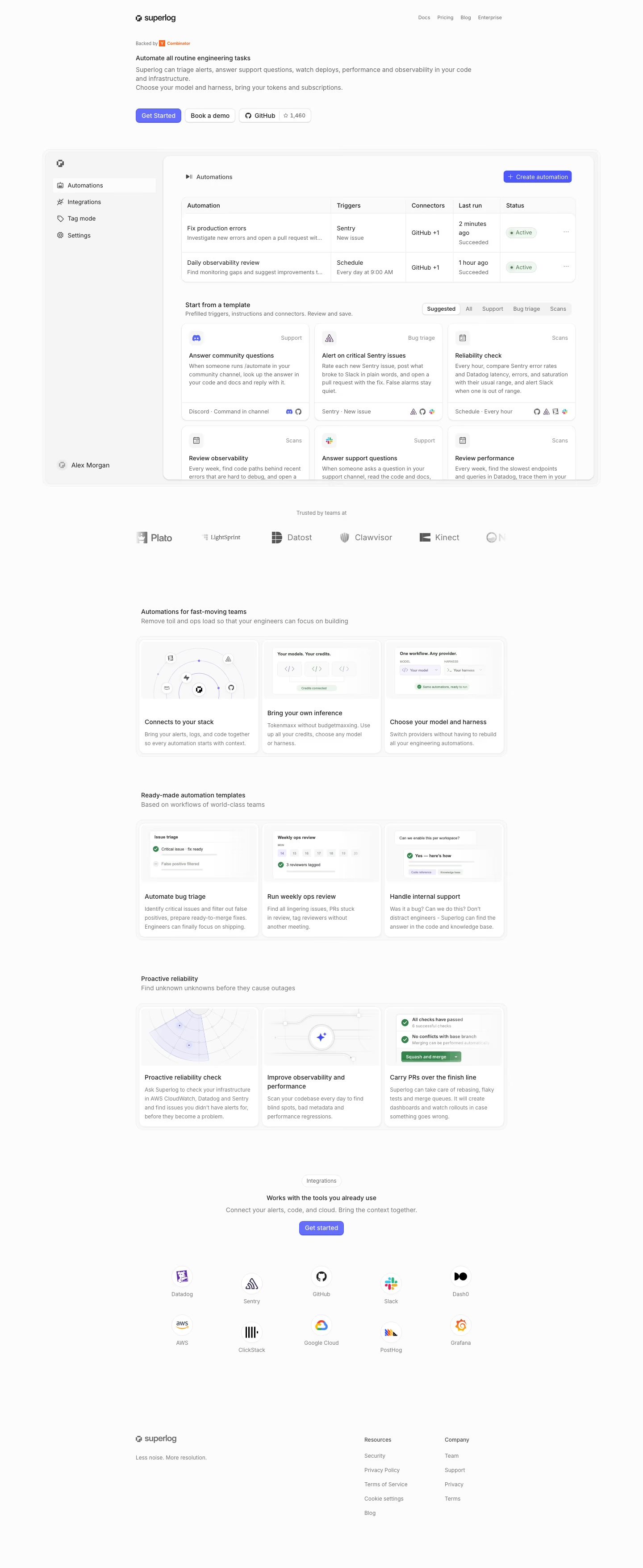
The Superlog homepage runs 3512 pixels on desktop and is built almost entirely from white cards on a near-white ground, with one indigo-violet accent reserved for buttons. A left-aligned top bar holds the wordmark and four small links. The hero is a short text block with no oversized headline, and a full-width product window sits directly beneath it instead of an illustration. Below come a logo strip, three titled three-card rows, an integration grid and a two-column footer. Type is a single light sans in grey and black, so the interface mockup supplies the visual weight.
Top bar, hero text and product window
A top bar carries the wordmark at left and "Docs", "Pricing", "Blog" and "Enterprise" at right. The headline is set only slightly larger than body text. Three buttons follow: an indigo "Get Started", an outlined "Book a demo" and a GitHub button showing a star count of 1,462. The window below shows a sidebar with "Automations" and "Integrations", a two-row table starting with "Fix production errors", and a "Start from a template" panel.
Logo strip and three platform cards
The template cards in the window, such as "Answer community questions", carry category tags. A grey logo strip headed "Trusted by teams at" lists Plato, LightSprint, Datost, Clawvisor and Kinect. "Automations for fast-moving teams" then opens a three-card row: "Connects to your stack", "Bring your own inference", and "Choose your model and harness". The three cards sit inside one rounded outer frame.
Template and reliability rows
"Ready-made automation templates" repeats the three-card pattern: "Automate bug triage", "Run weekly ops review", and "Handle internal support" with a question-and-answer bubble. "Proactive reliability" follows with another row: a radar-style fan diagram, a sparkle icon on a circuit line, and a green "Squash and merge" button under "Carry PRs over the finish line". Each card pairs a small image panel with a short grey description.
Integrations and footer
"Works with the tools you already use" sits under a small "Integrations" pill, with an indigo "Get started" button and ten circular logos in two rows of five, each labelled beneath. The page ends on the footer without a closing banner. The footer pairs the wordmark and "Less noise. More resolution." at left with two short link columns, "Resources" and "Company", at right. There is no large closing banner.
On mobile
At 390 pixels the page grows to 4690 pixels. The three hero buttons wrap so the GitHub button drops to its own row, and the product window shrinks to a thumbnail. Each three-card row becomes a single stacked column, integrations rearrange into three per row with Grafana alone on the last line, and the footer columns sit side by side.
Worth borrowing
- Placing a working product window straight under a text-only hero shows what the tool does without a separate illustration.
- Repeating one three-card row layout under different section headings gives a long page a steady rhythm with no new components.
- A single indigo accent against white cards keeps every button easy to find on a page with almost no other colour.





