Whereby
whereby.com/
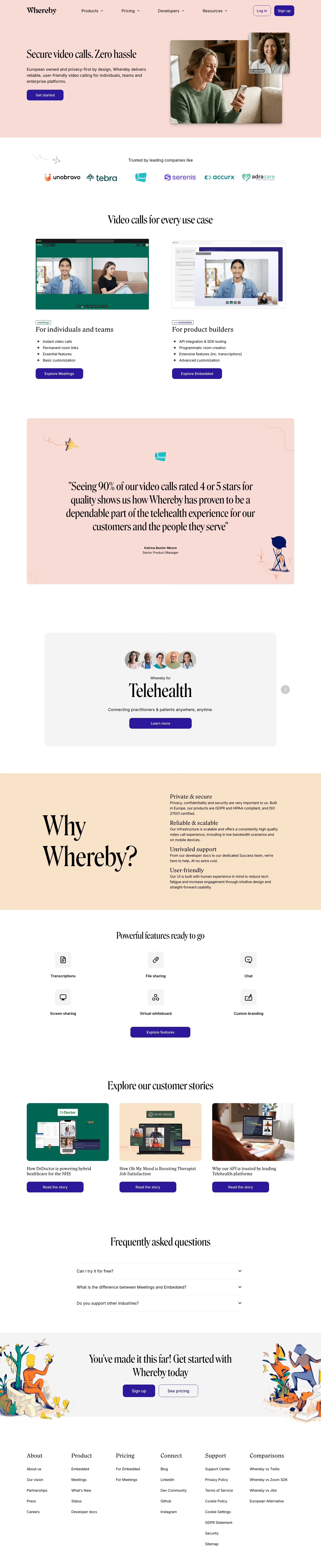
Whereby sells browser-based video calling in two forms: a standalone Meetings product and Embedded, an API/SDK for building video into other applications. The homepage leads with "Secure video calls. Zero hassle" and leans on being "European owned and privacy-first by design," listing GDPR, HIPAA, and ISO 27001 compliance up front rather than burying it in a footer. It states that 90% of its video calls are rated 4 or 5 stars for quality, and backs this with a named healthcare testimonial (Katrina Baxter-Moore) plus written case studies rather than generic quote snippets. The site also runs direct comparison pages against Twilio, Zoom SDK, and Jitsi, positioning European regulatory footing as its differentiator from US-based competitors.
- Category
- Engineering & Infrastructure
- Style
- LightColorful
- Stack
- Framer
- Fonts
- Whereby Roslindale Display Condensed RegularInterInter-Medium
- Palette
- Meta title
- Secure, customizable & reliable WebRTC Video Calls| Whereby
- Sections
- 8
- Updated
Whereby's landing page, section by section
Each section below is cropped straight from Whereby's live page — useful references for engineering & infrastructure landing page design.
Heroes
More heroesFeatures
More featuresCTAs
More ctasLogo clouds
More logo cloudsAbout Us
More about usPricing & Plans
More pricing & plansBlog pages
More blog pagesWhereby design review: how the homepage is built
Whereby’s 7,026-pixel homepage uses a soft peach opening, large high-contrast serif headlines, cobalt buttons, and friendly editorial illustrations. The metadata identifies Whereby Roslindale Display Condensed Regular with Inter and Inter-Medium; their contrast is visible between headings and compact product copy. #e5cbc5 carries the hero and testimonial card, while #2a169b supplies all prominent actions. The page runs from a two-person phone-call scene through twin use-case product panels, a testimonial, a telehealth focus card, a peach reasons band, feature icons, stories, FAQ, illustrated final action, and a six-column footer.
Peach hero and use cases
The navigation shows “Products”, “Pricing”, “Developers”, and “Resources”, followed by “Log in” and “Sign up”. “Secure video calls. Zero hassle” occupies the left of the peach hero, with its privacy-first subhead and “Get started” action. A large photo of a woman on her phone sits at right, topped by a smaller clinician video tile. Under “Trusted by leading companies like”, the page introduces “Video calls for every use case” with side-by-side Meeting and Embedded interface captures.
Meetings, embedded, and healthcare
“For individuals and teams” uses a green meeting view and bullets for “Instant video calls” and “Permanent room links”, ending with “Explore Meetings”. “For product builders” shows an embedded call interface beside API and SDK points, ending with “Explore Embedded”. A large peach customer quotation follows. The next white card centers “Whereby for Telehealth” beneath five clinician headshots, with “Connecting practitioners & patients anywhere, anytime.” and a wide “Learn more” button.
Reasons and feature set
A warm sand band pairs oversized “Why Whereby?” typography with four stacked reasons: “Private & secure”, “Reliable & scalable”, “Unrivaled support”, and “User-friendly”. “Powerful features ready to go” follows as a three-by-two icon grid for “Transcriptions”, “File sharing”, “Chat”, “Screen sharing”, “Virtual whiteboard”, and “Custom branding”. An “Explore features” action closes the functional inventory before the page switches back to photographic customer-story cards.
Stories, FAQ, and footer
“Explore our customer stories” presents three cards, each with a distinct product photograph and “Read the story” control. A minimal “Frequently asked questions” accordion follows. The final illustrated panel reads “You’ve made it this far! Get started with Whereby today” and pairs “Sign up” with “See pricing”. The footer uses six columns titled About, Product, Pricing, Connect, Support, and Comparisons, retaining an editorial serif for headings and a compact sans-serif for links.
On mobile
At 390 pixels, the hero stacks the title, copy, action, large phone photo, then the clinician tile. The two product use cases become consecutive image-and-bullet modules. The peach testimonial and Telehealth card remain separate cards. The reasons band becomes a single-column list, while the six feature icons form a two-column grid. Customer stories stack, the final illustration moves below its paired actions, and the footer becomes two narrow columns of link groups.
Worth borrowing
- A small overlapping video tile quickly establishes the product context of a lifestyle hero photo.
- Two use-case panels can distinguish meetings from developer tooling without separate navigation routes.
- Illustrated flourishes give a privacy-focused product page a human counterweight to interface screenshots.