Swimm
swimm.io/
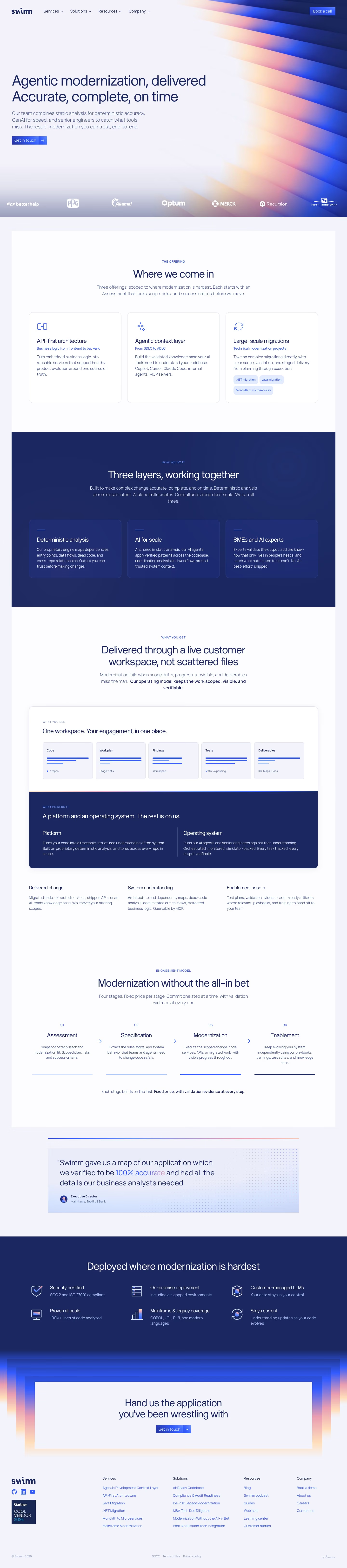
Swimm sells legacy-system modernization as a delivered service, not self-serve software: static code analysis plus AI agents plus its own senior engineers work through a fixed four-stage engagement — Assessment, Specification, Modernization, Enablement — for things like COBOL, JCL, PL/I, and monolith-to-microservices migrations. The site leans on a specific, checkable quote from a Top 5 US Bank executive who says Swimm produced "a map of our application which we verified to be 100% accurate," paired with a "100M+ lines of code analyzed" figure. Client logos (BetterHelp, PPG, Akamai, Merck, Fifth Third Bank) and mentions of a "live customer workspace" for tracking progress reinforce that this is positioned as an accountable, staged project rather than a tool you install.
- Category
- Engineering & Infrastructure
- Style
- LightColorful
- Stack
- WordPress
- Fonts
- RegestoGroteskMulish
- Palette
- Meta title
- Swimm - Swimm
- Sections
- 8
- Updated
Swimm's landing page, section by section
Each section below is cropped straight from Swimm's live page — useful references for engineering & infrastructure landing page design.
Heroes
More heroesFeatures
More featuresLogo clouds
More logo cloudsAbout Us
More about usContact Us
More contact usCareers pages
More careers pagesBlog pages
More blog pagesSwimm design review: how the homepage is built
Swimm's homepage runs about 6,508 pixels on desktop and stacks a hero with swept gradient artwork, a three-card offering row, a dark navy band, a workspace mockup, a four-step process row, one testimonial, a second navy band and a framed closing card. Colour is navy #1a2761 for text and bands on a pale lavender ground throughout, with #2b47c7 blue buttons and peach #f6c7b9 inside the gradient. RegestoGrotesk sets headings and Mulish the body. The page sells a service rather than a product, so engagement stages replace any screenshot tour.
Above the fold
The nav holds the "swim" wordmark and four dropdowns, "Services", "Solutions", "Resources" and "Company", with a blue "Book a call" button at far right. The two-line headline sits left over a pale field, above a three-line subhead and a blue "Get in touch" button with an arrow. Orange, pink and blue ribbons fill the right edge, and seven white logos, from "betterhelp" to "Fifth Third Bank", run along the bottom.
Offering cards and three layers
A small label, "THE OFFERING", tops the heading "Where we come in" over three white cards: "API-first architecture", "Agentic context layer" and "Large-scale migrations", each with an icon and a blue subtitle. The third adds three pills, ".NET migration", "Java migration" and "Monolith to microservices". A navy band, "Three layers, working together", follows with cards titled "Deterministic analysis", "AI for scale" and "SMEs and AI experts".
Workspace mockup and four stages
"Delivered through a live customer workspace, not scattered files" leads to a white panel of five tiles, "Code", "Work plan", "Findings", "Tests" and "Deliverables", each with bar graphics and a figure such as "42 mapped". A navy strip splits "Platform" from "Operating system". "Modernization without the all-in bet" then sets four numbered stages, "Assessment", "Specification", "Modernization" and "Enablement", joined by arrows above bars that darken left to right.
Quote, deployment band and footer
A pale-blue quote card from an "Executive Director" at an American bank tints two words blue-to-pink. A navy band, "Deployed where modernization is hardest", sets six icon items in two rows of three, beginning with "Security certified". The closing card, a call to hand over "the application you've been wrestling with", sits inside stacked gradient frames with one "Get in touch" button. The footer has four link columns and a Gartner badge.
On mobile
At 390px the nav collapses to a hamburger icon, the headline wraps to four lines, and the "Get in touch" button sits right beneath the subhead. Logos are cropped at the edges. The offering cards stack, the five workspace tiles fall into two columns with "Deliverables" alone on the last row, and the four stages become a vertical list. The six deployment items run in one column, and footer links pair up two across.
Worth borrowing
- Each offering card pairs a title with a blue subtitle, as in "From SDLC to ADLC", so scanning alone explains the range.
- Four numbered stages with bars that darken left to right make a long engagement read as small commitments.
- A navy band of six icon items puts "SOC 2 and ISO 27001 compliant" just above the final ask.