0cred
0cred.com/
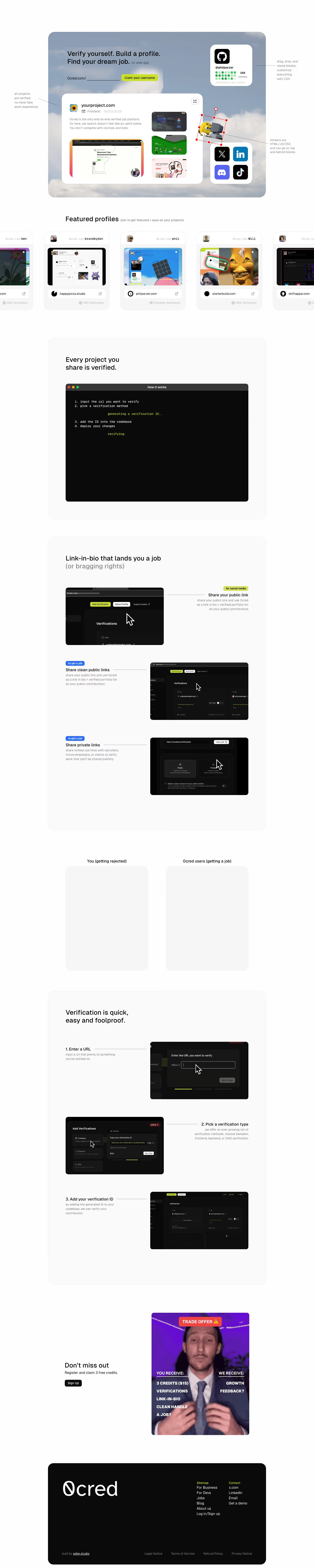
0cred is a verification platform where developers turn work they've done — frontend, backend, or DNS-level proof — into a cryptographically verified profile they can share instead of a resume. The homepage headline reads "Verify yourself. Build a profile. Find your dream job.(or side-gig)" and leads with the claim that verifications "persist forever, even if someone deletes the ID." New signups are framed as a "trade offer": three free credits worth $15. Rather than a features list, the page runs a conversational before/after scenario contrasting a rejected candidate ("all my past work is under NDA") with one who has a 0cred link, and offers private, NDA-safe verification links for recruiters.
- Category
- People & Culture
- Style
- LightColorful
- Stack
- Next.jsTailwind CSS
- Fonts
- GeistSans
- Palette
- Meta title
- 0cred
- Sections
- 8
- Updated
0cred's landing page, section by section
Each section below is cropped straight from 0cred's live page — useful references for people & culture landing page design.
Heroes
More heroesFeatures
More featuresCTAs
More ctasLogo clouds
More logo cloudsAbout Us
More about usCareers pages
More careers pagesBlog pages
More blog pages0cred design review: how the homepage is built
The 0cred homepage runs top to bottom as a hero card with a username claim field, a sideways row of featured profile cards, a black terminal-style window, a link-in-bio panel, a two-column comparison, a three-step verification panel, a signup prompt and a black footer. The full desktop capture is 7181px tall. Colour is limited to the lime #cadf28 on buttons and footer headings plus the hero backdrop, a cloud photograph in the full capture and a pink and yellow arch pattern (#cb96a4, #fcd897) in the hero crop. The display face is GeistSans.
Above the fold
The hero is a rounded card with the headline "Verify yourself. Build a profile. Find your dream job." and the grey "(or side-gig)". Below it are a "0cred.com/" field and a lime "Claim your username" button. A white card for "yourproject.com" tagged "Frontend" holds three thumbnails, beside a GitHub tile showing "268" contribs and a two-by-two grid of X, LinkedIn, Discord and TikTok icons. Grey side captions annotate the mock.
Featured profiles and terminal explainer
A "Featured profiles" heading introduces a row of cards cut off at both edges. Each shows a handle such as "brandydan" or "phil", a domain pill like "happypizza.studio" and a grey "DNS Verification" label. Then "Every project you share is verified." sits above a black window titled "How it works" with four numbered monospace steps and lime "verifying."
Link-in-bio, comparison and verification steps
The panel "Link-in-bio that lands you a job" stacks three alternating rows of dark dashboard screenshots and text, tagged with a lime "for social media" chip and blue "to get a job" chips. Below, two columns are captioned "You (getting rejected)" and "Ocred users (getting a job)". A final panel, "Verification is quick, easy and foolproof.", alternates screenshots with "1. Enter a URL", "2. Pick a verification type" and "3. Add your verification ID".
Closing section and footer
"Don't miss out" and "Register and claim 3 free credits." sit with a black "Sign Up" button, beside a purple image headed "TRADE OFFER" with "YOU RECEIVE:" and "WE RECEIVE:" columns. The rounded black footer has a large "0cred" wordmark, a "Sitemap" column of six links, a "Contact" column with "x.com", "Email" and "Get a demo", and a row reading "built by adler.studio" beside four legal links.
On mobile
At 390px the page is 6953px tall and keeps the same order in one column. The headline, the "Ocred.com/" field and the lime button stack above a shrunken hero card whose sticker and icon tiles overlap its edge. Featured cards still scroll sideways, one and a half visible. The hero captions disappear, the comparison columns stack vertically, and the footer link columns stack.
Worth borrowing
- Making the hero a live mock of the product, with callouts like "drag, drop, and resize blocks; customize everything with CSS", shows the output before asking for a username.
- A terminal-styled "How it works" window with numbered steps speaks to developers in their own visual language.
- Colour-coded chips such as "for social media" and "to get a job" label each feature row by who benefits.