Cultureamp
cultureamp.com/
Culture Amp is an employee-experience platform built around two named modules — Engage (surveys, feedback, benchmarking) and Perform (reviews, continuous feedback, goals) — pitched as running on what it calls a 'CultureOS.' It's used by 6,000+ companies including Canva, Etsy, and McDonald's, and its case studies cite specific, varied metrics rather than one repeated number: a 30% productivity gain at Unifonic, an 11% engagement increase at OLX Group, a 10% jump in feedback efficiency at NASCAR. A notably current detail is a banner announcing the platform is 'now inside Claude and ChatGPT,' positioning it as embedding into AI assistants rather than only standing alone as its own dashboard.
- Category
- People & Culture
- Style
- LightColorful
- Stack
- Tailwind CSS
- Fonts
- tiemposinter
- Palette
- Meta title
- The market-leading employee experience platform | Culture Amp
- Sections
- 10
- Updated
Cultureamp's landing page, section by section
Each section below is cropped straight from Cultureamp's live page — useful references for people & culture landing page design.
Heroes
More heroesFeatures
More featuresCTAs
More ctasAbout Us
More about usContact Us
More contact usPricing & Plans
More pricing & plansAffiliate pages
More affiliate pagesCareers pages
More careers pagesBlog pages
More blog pagesCultureamp design review: how the homepage is built
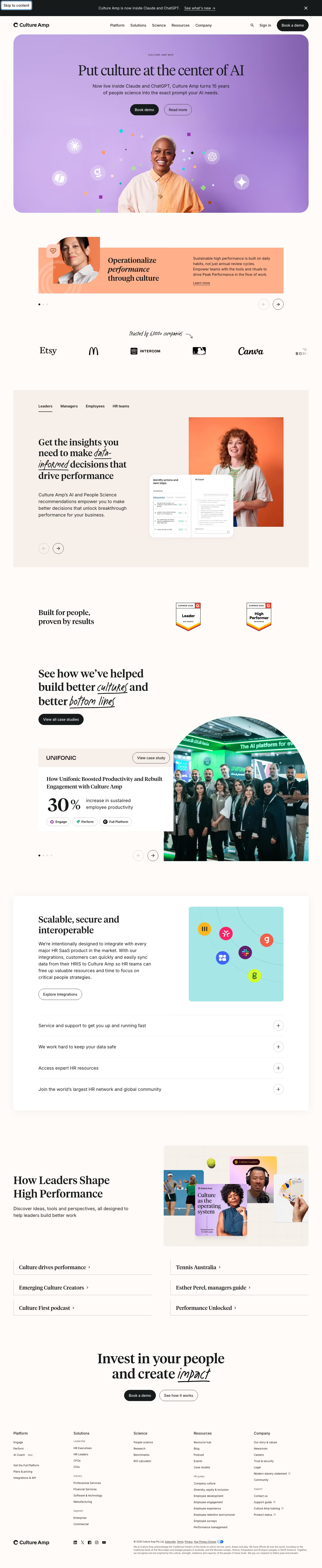
The Cultureamp homepage runs about 7,016px tall on desktop and stacks a rounded hero panel, a one-slide promo carousel, a logo strip, a tabbed audience block, proof badges, a case-study slider, an integrations card with accordions, a content hub, a closing call to action and a footer. Colour comes from a warm off-white page with beige panels, a lilac hero, an orange promo card and a pale teal tile, echoing detected values such as #d4c8bb, #d9e3e9 and #97d7d9, while buttons are near-black. Headlines use a serif display face (tiempos) with Inter for body text, and handwritten italic words add emphasis.
Above the fold
A black bar reads "Culture Amp is now inside Claude and ChatGPT." with a "See what's new" link. The nav has five items, "Sign in" and a dark "Book a demo" pill. The hero is a rounded lilac panel holding the serif headline "Put culture at the center of AI", a filled "Book demo" button beside an outlined "Read more", and a portrait ringed by confetti.
Promo carousel, logos and audience tabs
A salmon banner follows with a portrait, the heading "Operationalize performance through culture" ("performance" italic), a "Learn more" link. A handwritten "Trusted by 6,000+ companies" line with a curved arrow leads into six logos, including Etsy, Intercom and Canva. A beige panel then offers four tabs ("Leaders", "Managers", "Employees", "HR teams"), a headline with handwritten "data-informed", and an orange-backed portrait overlapped by a product UI card.
Proof badges, case study and integrations
"Built for people, proven by results" sits beside two review badges, "Leader" and "High Performer". The heading "See how we've helped build better cultures and better bottom lines" comes with a "View all case studies" button. A white Unifonic card shows "30%" in large type and three tags, overlapping a half-circle group photo. Next, "Scalable, secure and interoperable" pairs a teal tile of floating app icons with four plus-icon accordion rows.
Closing section and footer
"How Leaders Shape High Performance" shows an image collage beside six serif link rows in two columns, such as "Culture drives performance". The centred close reads "Invest in your people and create impact", with handwritten "impact", above "Book a demo" and "See how it works" buttons. The footer has five link columns, four social icons and a long land acknowledgement.
On mobile
At 390px the page is about 6,588px tall. The mobile hero shows "The Performance Culture Quadrant" over a photo with four teal labels, with two stacked buttons. The promo puts its portrait below the text, an "Ask Alix" chat button overlaps the copy, and the logo strip crops after four. Content links become one column, and footer columns collapse into five plus-icon rows.
Worth borrowing
- Handwritten italic words inside serif headlines, such as "data-informed" and "impact", add emphasis without extra colours.
- A filled dark button beside an outlined one repeats the primary and secondary choice in the hero and closing section.
- One large metric, "30%", on a white case card overlapping a photo makes proof readable at a glance.