Contra
contra.com/
Contra is a commission-free marketplace connecting independent creative professionals with clients, positioned on the site as 'a professional network for the jobs and skills of the future.' Rather than a standard portfolio grid, the homepage organizes work by trending topic and tool — sections for Figma, Framer, Midjourney, and ChatGPT projects each show contributor and post counts (Figma: 35K contributors, 81K posts). Verified studios are surfaced with earnings and hire-frequency badges rather than star ratings alone, such as one showing '$1M+ Earned' and '87x Hired.' The combination of tool-specific browsing and visible per-studio earnings/hire counts as trust signals is the site's distinguishing structural choice.
- Category
- Sales & Support
- Style
- LightColorful
- Fonts
- GT Standard LGT Standard M
- Palette
- Meta title
- Contra - The network for creative intelligence.
- Sections
- 5
- Updated
Contra's landing page, section by section
Each section below is cropped straight from Contra's live page — useful references for sales & support landing page design.
Heroes
More heroesAffiliate pages
More affiliate pagesCareers pages
More careers pagesBlog pages
More blog pagesContra design review: how the homepage is built
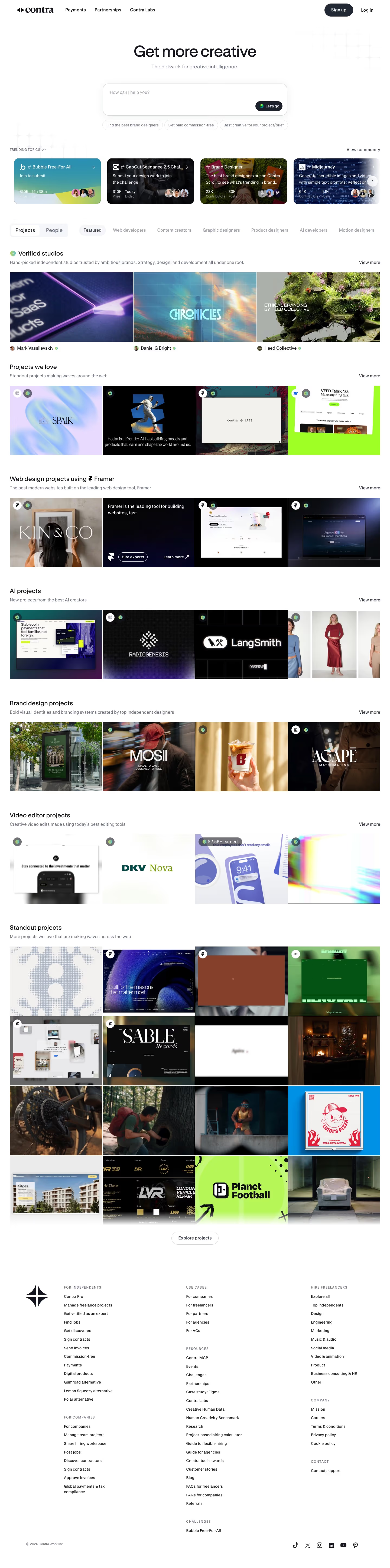
The homepage of Contra, which describes itself as "The network for creative intelligence", runs about 5,780 pixels on desktop and opens with a centred headline, "Get more creative", above a large rounded input with the placeholder "How can I help you?" and a dark button labelled "Let's go". Colour stays restrained: the dark primary button uses #222834 on a near-white ground, and a teal #3896aa appears in the trending cards. Headings are set in a display face listed as GT Standard. What stands out is the blend of community prompts with curated portfolio grids, where project art fills most of the page.
Above the fold
The top navigation reads "Payments", "Partnerships" and "Contra Labs", with a dark "Sign up" button and "Log in" at the far right. Three pill suggestions sit under the input: "Find the best brand designers", "Get paid commission-free" and "Best creative for your project/brief". A row headed "TRENDING TOPICS" shows four cards with counts such as $10K prize and 22K contributors. Filter tabs for "Projects" and "People" sit above a category row starting with "Featured".
Verified studios, project grids and Framer work
The first band, headed "Verified studios", shows three wide tiles, each credited to a named person or studio such as "Heed Collective". Below it, "Projects we love" runs four tiles per row, one a lime-green card for "VEED Fabric 1.0". "Web design projects using Framer" repeats the four-tile pattern. "AI projects" starts a row whose fourth tile is cut off at the right edge, signalling horizontal scrolling.
Brand, video and standout project grids
"Brand design projects" shows four tiles, including a street bus-shelter poster and one carrying the "MOSII" wordmark. "Video editor projects" is a single row of four tiles, one carrying a "$2.5K+ earned" badge. "Standout projects" is a grid of sixteen tiles in four columns, closed by a centred outline button labelled "Explore projects". Several standout tiles are dark photographs, such as a fireplace scene and a close-up of a bicycle drivetrain.
Closing section and footer
The footer sits in three columns of links headed "FOR INDEPENDENTS", "USE CASES" and "HIRE FREELANCERS", with a second set headed "FOR COMPANIES", "RESOURCES", "COMPANY" and "CHALLENGES" below. Resources runs to nearly twenty links, and "Contact support" closes the lists. Hire-side links are grouped by category, such as "Design", "Engineering" and "Marketing". The bottom row shows "© 2026 Contra.Work Inc" beside six social icons.
On mobile
At 390px the top navigation is absent, leaving the centred headline, the input and a horizontal row of suggestion pills that runs off the right edge. The trending band shows a single card with an arrow button, and each grid collapses to one large tile with a sliver of the next visible, so the four-column rows become swipe rows. The footer ends in a single column.
Worth borrowing
- Let a row run off the right edge to signal more projects off-screen.
- Make the hero input the main action, with a dark "Let's go" button inside the field.
- Credit each portfolio tile to its maker, as with "Mark Vassilevskiy" and "Heed Collective" under the first row.