Vidyard
vidyard.com/
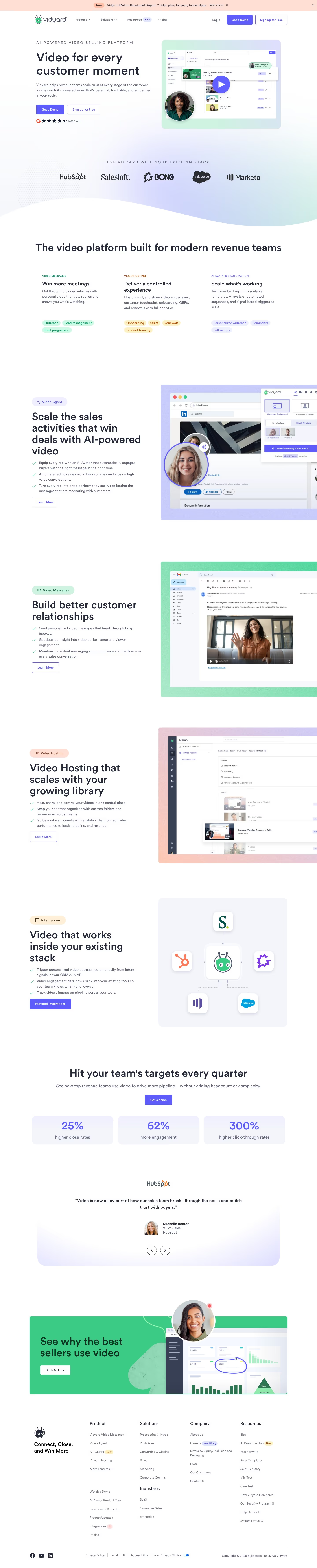
Vidyard is a video platform for sales and marketing teams to record, send and track personalized video messages at each stage of a deal, combined with hosting and an AI "Video Agent" feature. Its hero, "Video for every customer moment," is backed by three separate percentage claims rather than one figure — 25% higher close rates, 62% more engagement, 300% higher click-through rates — plus a named Superside case study citing an "8x improvement in click-through rates." Three testimonials carry headshots, names and titles alongside recognizable logos (HubSpot, Dayforce), and the footer lists 51 specific integrations rather than a vague "integrates with your stack" line.
- Category
- Sales & Support
- Style
- LightColorful
- Stack
- WordPressTailwind CSS
- Fonts
- LL Circular
- Palette
- Meta title
- Vidyard - Video Tools for Virtual Sales and Marketing Teams
- Sections
- 8
- Updated
Vidyard's landing page, section by section
Each section below is cropped straight from Vidyard's live page — useful references for sales & support landing page design.
Heroes
More heroesPricing
More pricingCTAs
More ctasAbout Us
More about usContact Us
More contact usCareers pages
More careers pagesBlog pages
More blog pagesVidyard design review: how the homepage is built
The desktop page is 7,118 pixels tall and runs top to bottom as a hero, a logo strip, three feature columns, three alternating product blocks, a stat row, a testimonial carousel and a closing call to action. Colour is restrained: white and pale lavender sections carry the indigo #5e5cfa used for primary buttons and stat figures, with near-black #232938 for headings. The only detected typeface is LL Circular, used for display text. A peach announcement bar sits above the navigation. Its distinctive trait is the pill-tagged product blocks, each pairing a short claim with a screenshot inside a gradient frame.
Above the fold
The hero splits into two columns. On the left, the eyebrow "AI-POWERED VIDEO SELLING PLATFORM" sits above the headline "Video for every customer moment", then a filled indigo "Get a Demo" button beside an outlined "Sign Up for Free" button and a 4.5/5 G2 rating. The right column shows a product screenshot in a mint-to-lavender card, with a play button, a presenter photo and a notification naming "Matt Rodriguez". The logo strip sits below "USE VIDYARD WITH YOUR EXISTING STACK".
Feature columns and first product blocks
Three columns follow, headed "Win more meetings", "Deliver a controlled experience" and "Scale what's working", each with three pill tags such as "Outreach", "Onboarding" and "Personalized outreach". The "Video Agent" block sets a headline and three checkmarked bullets beside a LinkedIn screenshot with an AI avatar overlaid. The two alternating blocks, "Build better customer relationships" and "Video Hosting that scales with your growing library", pair short bullet lists with gradient-framed screenshots.
Integrations and stat cards
The third block, "Video that works inside your existing stack", shows the mascot linked to CRM logos, with a "Featured integrations" button. The heading "Hit your team's targets every quarter" leads into three stat cards: "25%" for "higher close rates", "62%" for "more engagement" and "300%" for "higher click-through rates". Each card is a pale lavender panel with indigo figures, and a HubSpot-attributed quote carousel with arrow buttons follows.
Closing section and footer
The closing band is a green panel headed "See why the best sellers use video" with a white "Book A Demo" button, set against a dashboard screenshot. The footer opens with "Connect, Close, and Win More" and four link columns headed Product, Solutions, Company and Resources. The Resources column includes "AI Resource Hub" with a New badge. The bottom row lists "Legal Stuff", Accessibility and the copyright line.
On mobile
At 390px the page stacks into one column. The hero headline breaks onto five lines and the CTAs become full-width stacked buttons. The logo strip shows only two logos in view. Feature columns become a single list, and product blocks keep their screenshots above the text. Stat cards stack vertically with the same indigo figures, and the footer collapses into one column per group.
Worth borrowing
- Pill tags under each feature heading turn a list of use cases into scannable keywords.
- Stat cards pair one large indigo figure with a short label, so the number reads at a glance.
- Pairing every product block with a gradient-framed screenshot keeps alternating sections distinct.