Felix
felix.so/
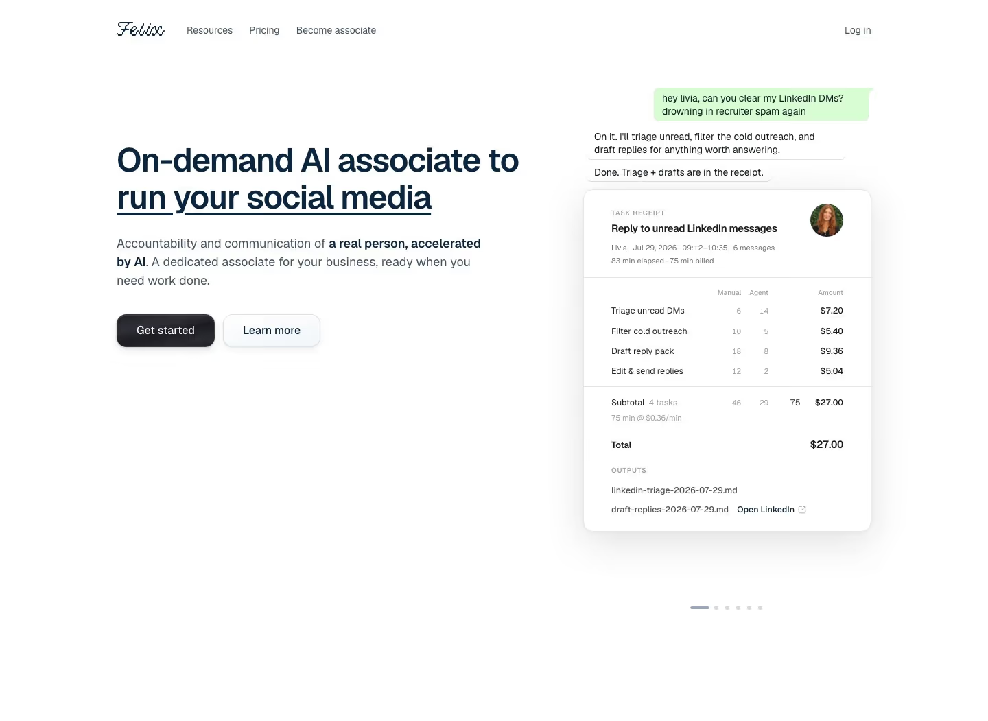
Felix sells "Human Agents": AI-assisted human associates who handle tasks like LinkedIn triage, HubSpot updates, and cashflow forecasting, billed per minute at $0.36/min rather than a flat subscription. The homepage's central device is a set of itemized task receipts — subtasks, time spent, and dollar cost shown line by line, e.g. a LinkedIn triage priced at $27 or a cashflow forecast at $15.12 — turning pricing transparency into the main proof mechanism instead of testimonials. It also shows a live chat mockup with a named associate, Livia, replying across WhatsApp, Slack, Teams, and email, and promises a 15-minute response guarantee during working hours, reinforcing the pitch of a real person rather than a bot.
- Category
- Engineering & Infrastructure
- Style
- LightMinimal
- Stack
- Next.jsTailwind CSS
- Fonts
- Geist
- Palette
- Meta title
- Human Agents: a new class of labor
- Sections
- 2
- Updated
Felix's landing page, section by section
Each section below is cropped straight from Felix's live page — useful references for engineering & infrastructure landing page design.
Heroes
More heroesFelix design review: how the homepage is built
The Felix homepage is a short white page, 1429 pixels tall on desktop, with black text, one saturated blue accent and only small round portraits as imagery. It stacks a left-aligned headline, a single task input, a grid of six receipt-style cards and a thin footer. The pixelated script wordmark is the only decorative type; everything else is a plain grotesque sans. Instead of feature sections, the page sells by showing finished jobs with durations and prices. Colour is limited to black, grey and that blue.
Header, headline and task box
The header holds the script wordmark at far left, one link "Become associate" beside it, and "Sign in" at far right. Below sits a very large two-line black headline, "Extra pair of hands to build your business", left-aligned. A grey subhead states per-minute billing. Then a label "Your task" sits above a wide rounded input outlined in blue, holding the grey placeholder "Draft the intro emails to 30 potential customers." and a pale blue circular arrow button at its right end.
Free-time note and human check
Right-aligned above the input, in blue, a line reads "Your first 3 hours of associate time are free", the only offer on the page. Directly under the input, a grey strip carries a Cloudflare "Verify you are human" checkbox with small Privacy and Help links. It makes the form look like a working product, and it pushes the first row of cards just below the first screen.
Six completed-task cards
Two rows of three white cards show finished jobs, each with a thin grey outline and large rounded corners. Each has a bold task title, such as "Reply to unread LinkedIn messages", a round portrait at top right, then an associate first name with date and time range in grey. Four grey step lines follow, ending in a ruled line and a bold total, from "Total · 75 min" at "$27.00" up to "$54.00".
Footer
After a gap of about 200 pixels, a single black rule runs the full content width. Below it, at left, four small grey items sit in one row: "Terms", "Privacy", "Trust Center" and "support@felix.so". At right, "© 2026 Spoken Empathy Systems, Inc." names a legal entity different from the product. There is no closing call to action.
On mobile
At 390 pixels the header keeps all three items on one row, the headline wraps at a smaller size, and the subhead runs to three lines. The task input wraps its placeholder over two lines and keeps the arrow button inside. The verification strip stays full width. The six cards stack into one column, each with the portrait still at top right, making the page 2607 pixels tall.
Worth borrowing
- Six finished jobs with times and dollar totals replace feature copy and make per-minute billing concrete.
- A task input under the headline, with a realistic placeholder sentence, makes the page itself the first step.
- A header reduced to one link and a sign-in keeps attention on the input and the cards.