FOSSA
fossa.com/
FOSSA is a Security product. See its fossa.com landing page design in full — desktop and mobile screenshots plus close-ups of the heroes, footers, about us, pricing & plans, affiliate pages, and 2 more. It's built with Next.js and Tailwind CSS. Its type is set in Geist Sans, anchored by a #289e6d palette. Study how FOSSA structures its messaging, layout and visual hierarchy, then explore more of the best Security website designs.
- Category
- Security
- Style
- DarkMinimal
- Stack
- Next.jsTailwind CSS
- Fonts
- Geist Sans
- Palette
- Meta title
- FOSSA - Control Your Software Supply Chain
- Sections
- 7
- Updated
FOSSA's landing page, section by section
Each section below is cropped straight from FOSSA's live page — useful references for security landing page design.
Heroes
More heroesAbout Us
More about usPricing & Plans
More pricing & plansAffiliate pages
More affiliate pagesCareers pages
More careers pagesBlog pages
More blog pagesFOSSA design review: how the homepage is built
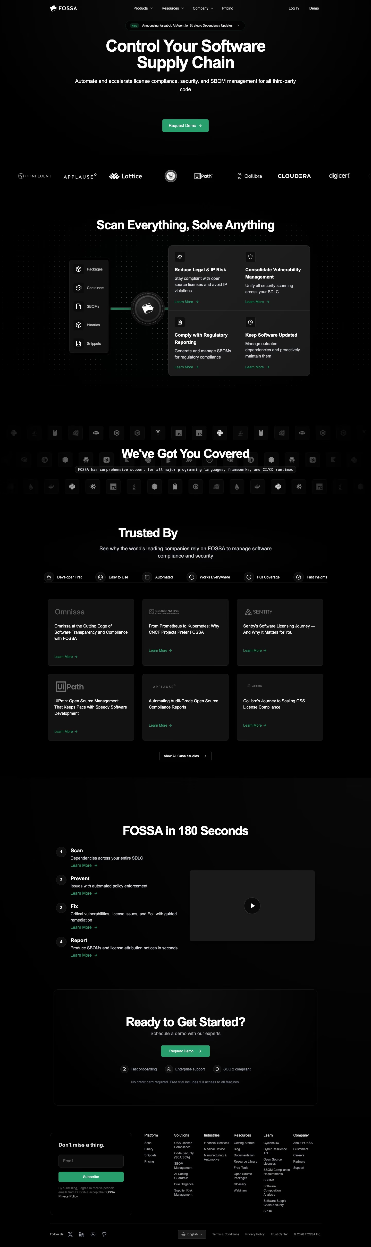
Top to bottom: a header with four menu items plus "Log In" and "Demo", a centred hero with one green button, a scrolling logo strip, a diagram beside four cards, a dimmed icon wall, a row of six labels above six case-study cards, a four-step list beside a video frame, a closing call to action and a six-column footer. The page measures 4831 pixels on desktop. Near-black #030303 and #181818 fill every band, and green #289e6d appears only on buttons, links and one connector line. The distinctive move is a hub diagram placing the logo between scanned inputs and outcome cards.
Above the fold
A pill tagged "New" reads "Announcing fossabot: AI Agent for Strategic Dependency Updates" above a two-line white headline, "Control Your Software Supply Chain". A two-line subhead leads to one solid green "Request Demo" button, followed by a wide gap. A strip of eight greyscale logos, among them "Lattice", "UiPath" and "Collibra", is cropped at both edges, then "Scan Everything, Solve Anything" begins the next block.
Hub diagram and language wall
A five-row panel listing "Packages", "Containers", "SBOMs", "Binaries" and "Snippets" joins a round logo hub by a green line. The hub then feeds a two-by-two block of cards, "Reduce Legal & IP Risk", "Consolidate Vulnerability Management", "Comply with Regulatory Reporting" and "Keep Software Updated", each ending in a green "Learn More" link. "We've Got You Covered" then sits over three rows of dimmed language icons, with a monospaced caption beneath.
Case studies and four-step list
"Trusted By" is followed by a blank underline and six icon labels running from "Developer First" to "Fast Insights". Six dark cards in two rows of three carry story titles such as "Collibra's Journey to Scaling OSS License Compliance", and a "View All Case Studies" outline button ends the block. "FOSSA in 180 Seconds" numbers four steps, "Scan", "Prevent", "Fix" and "Report", beside a dark video frame with a play button.
Closing call to action and footer
"Ready to Get Started?" sits in a bordered box with a second "Request Demo" button and three icon labels, "Fast onboarding", "Enterprise support" and "SOC 2 compliant", above the line "No credit card required." The footer opens with a rounded "Don't miss a thing." box holding an email field and a green "Subscribe" button, then six link columns from "Platform" to "Company", and a bottom bar of social icons.
On mobile
At 390px the page grows to 8782 pixels and a menu icon replaces the header links. The input panel disappears, leaving the hub icon above four stacked cards. The six icon labels wrap into two columns of three, the case-study cards run one per row, and the four steps sit below the video frame instead of beside it. The footer's six columns become one long list under the subscribe box.
Worth borrowing
- A logo hub between scanned inputs and outcome cards turns a feature list into a one-glance diagram.
- Naming a four-verb sequence, "Scan", "Prevent", "Fix", "Report", under a time-boxed heading makes the workflow quick to read.
- Restricting green to buttons and links on a near-black page keeps every call to action easy to find.