
Harvest
getharvest.com/
Harvest is a Productivity & Collaboration product. See its getharvest.com landing page design in full — desktop and mobile screenshots plus close-ups of the heroes, features, footers, pricing, ctas, and 3 more. Its type is set in Besley, anchored by a #fcdac7 palette. Study how Harvest structures its messaging, layout and visual hierarchy, then explore more of the best Productivity & Collaboration website designs.
- Category
- Productivity & Collaboration
- Style
- LightMinimal
- Fonts
- BesleyMuoto VAR
- Palette
- Meta title
- Time Tracking Software With Invoicing | Harvest
- Sections
- 8
- Updated
Harvest's landing page, section by section
Each section below is cropped straight from Harvest's live page — useful references for productivity & collaboration landing page design.
Heroes
More heroesFeatures
More featuresPricing
More pricingCTAs
More ctasAbout Us
More about usContact Us
More contact usBlog pages
More blog pagesHarvest design review: how the homepage is built
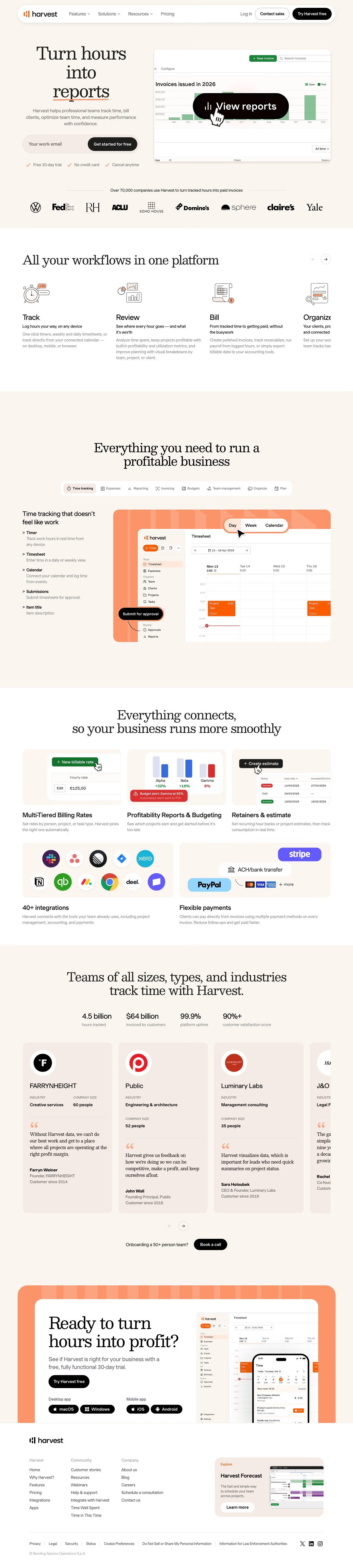
Top to bottom: a floating white header pill, a split hero with a dark report mockup, a nine-logo row, a four-card workflow carousel, a tabbed feature showcase, a five-tile connections grid, a stats strip above testimonial cards, an orange closing frame and a footer. It measures 6397 pixels on desktop. A warm cream ground near #faf5ef carries most of it, with peach #fcdac7 for tiles and orange for underlines and frames, and grey copy near #545454. Besley serifs set the large headings against a sans body. The distinctive move is a hero verb-object headline whose last word is underlined in orange.
Above the fold
The pill header holds four links ("Features", "Solutions", "Resources", "Pricing"), "Log in", an outlined "Contact sales" and a black "Try Harvest free" button. At left, "Turn hours into invoices" runs over three lines above a three-line subhead, a pill-shaped "Your work email" field with a black "Get started for free" button, and three orange ticks. At right, a dark frame holds two white report cards, with nine logos beneath.
Workflow carousel and tabbed showcase
"All your workflows in one platform" heads a carousel with arrow buttons; four line-drawing cards, "Track", "Review", "Bill" and "Organize", each carry a bold line and grey paragraph. A white band follows with "Everything you need to run a profitable business" over eight tab pills, then "Time tracking that doesn't feel like work" beside a salmon-framed timesheet with a black "Submit for approval" callout.
Connections grid, stats and customer cards
"Everything connects, so your business runs more smoothly" introduces three peach tiles, "Multi-Tiered Billing Rates", "Profitability Reports & Budgeting" and "Retainers & estimate", then two wider tiles: "40+ integrations" with ten app icons and "Flexible payments". Four figures run in a row, from "4.5 billion" to "90%+", above a scrolling row of testimonial cards starting with "FARRYNHEIGHT", each listing industry and company size.
Closing frame and footer
"Onboarding a 50+ person team?" sits beside a black "Book a call" pill. Below, "Ready to turn hours into profit?" appears inside a white card set in a thick orange striped frame, with "Desktop app" and "Mobile app" download pills beside a phone mockup. The footer sets three link columns, "Harvest", "Community" and "Company", beside a peach "Harvest Forecast" promo card.
On mobile
At 390px the page reaches 9427 pixels. The header shrinks to a logo and menu icon, the email field and button stack at full width, and the hero mockup drops below the ticks as a small dark tablet. Workflow cards become a vertical list of five. Tab pills wrap into two rows, tiles stack singly, and the footer columns collapse into three accordion rows.
Worth borrowing
- Pairing a serif headline with a sans-serif body and an orange hand-drawn underline gives a billing tool a warmer voice.
- Placing the logo row directly under the hero form lets social proof arrive before any feature copy.
- Wrapping the final call to action in a thick striped orange frame echoes the timesheet colour.





