Playground
tryplayground.com/
Playground is a Industry Solutions product. See its tryplayground.com landing page design in full — desktop and mobile screenshots plus close-ups of the heroes, footers, about us, careers pages and blog pages. It's built with Framer. Its type is set in CircularXX TT Bold, anchored by a #3079ff palette. Study how Playground structures its messaging, layout and visual hierarchy, then explore more of the best Industry Solutions website designs.
- Category
- Industry Solutions
- Style
- LightColorful
- Stack
- Framer
- Fonts
- CircularXX TT BoldInterCircularXX TT Medium
- Palette
- Meta title
- Child Care Management Software & App | Playground
- Sections
- 5
- Updated
Playground's landing page, section by section
Each section below is cropped straight from Playground's live page — useful references for industry solutions landing page design.
Playground design review: how the homepage is built
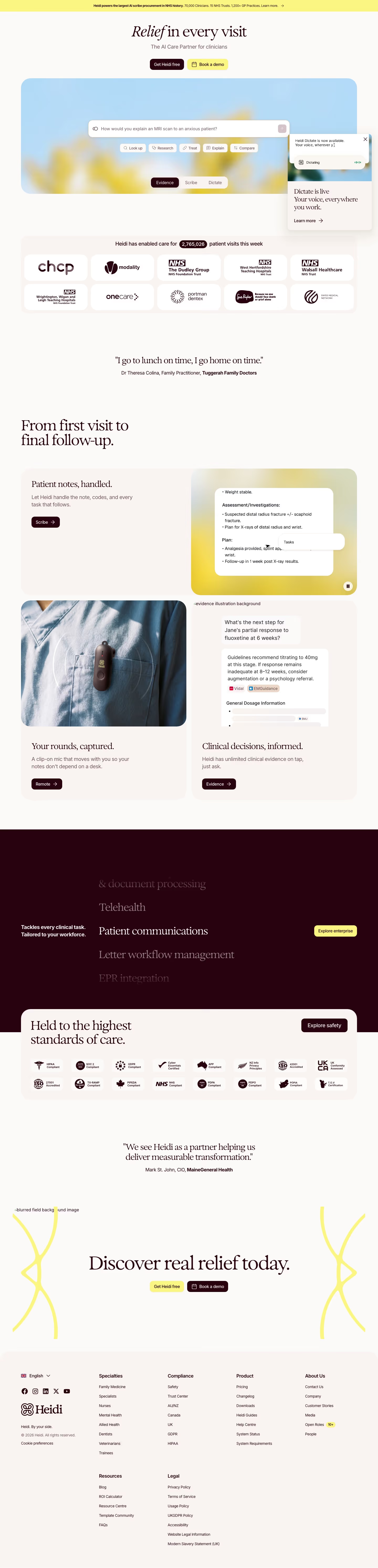
Top to bottom: a blue announcement strip, a header, a centred hero with a tabbed product mockup, a logo row, tabbed feature lists, a testimonial, card grids, a 30-day timeline, a booking widget and a long footer. It runs 14202 pixels on desktop. A peach cream background carries the page, with blue near #3079ff for buttons and the strip, and tan and orange from hand-drawn illustrations. CircularXX TT Bold sets the headings. The distinctive move is a children's-book illustration style wrapped around enterprise dashboards.
Above the fold
The blue strip reads "Now SOC 2 compliant". The header has four dropdown links ("Platform", "Switch to Playground", "Built for", "Resources"), a "Get demo" button and a phone number. A pill about free access in five states sits above "Childcare management software directors love", a subhead, one "Get a free demo" button and "4.96 stars across 10,000+ reviews". Below, six tabs from "Attendance" to "Payroll" switch a framed dashboard mockup, flanked by drawn bookshelves and a toddler.
Feature list, testimonial and marketing cards
A logo row of school names follows "Get to know Playground", a five-item list opening on Marketing and a workflow-builder screenshot. "Hear what customers are saying" places a drawn portrait in a wooden frame beside a quote and a "Read customer story" button. "Make your marketing as good as the big brands" then opens a four-card grid, with taped note-style quotes on cards and "Predictive Enrollment" as the narrow second card.
Finance, operations and the Camber AI block
"Your centers’ entire financial picture" holds six cards, including a "I cut 4 systems down into just 1" app-icon tile. "Run your program with ease" adds a blue chat thread, an attendance check-out screen and three smaller tiles. A purple "Introducing Camber" label leads into "Meet Camber, the first AI employee build for child care." and three cards: a call transcript, a chat answer and a funnel chart.
Program types, timeline, booking widget and footer
"Built for child care programs of all sizes" shows six greyscale isometric tiles, "Centers" to "Head Start". "Here’s what you can get done with Playground in just 30 days" sets three columns above a rising blue curve labelled "Day one. Already running.". A support block lists five ticks, then "Book a demo to see why providers are switching." starts a stepped form with three program choices. The footer has four link columns, a grass-and-soil illustration and a legal row.
On mobile
At 300 to 390 pixels wide the header keeps the logo, a "Get demo" button and a menu icon. The headline wraps to three lines and the tab bar is cut off after "Billing". Card grids become one tall column of cards, each with its note-style quote above its mockup. The six program types become a list of rows with thumbnails, and the footer links run in one long column.
Worth borrowing
- Wrapping a product dashboard in hand-drawn childhood scenery makes software for administrators feel tied to its audience.
- Pinning customer quotes to feature cards as taped notes puts proof beside the claim it supports.
- Laying a 30-day timeline above a rising curve answers the implementation worry before the demo form.