Shepherd
shepherdinsurance.com/
Shepherd is a Industry Solutions product. See its shepherdinsurance.com landing page design in full — desktop and mobile screenshots plus close-ups of the heroes, features, footers, about us, contact us, and 2 more. It's built with Next.js. Its type is set in Magistersttrial, anchored by a #fdc331 palette. Study how Shepherd structures its messaging, layout and visual hierarchy, then explore more of the best Industry Solutions website designs.
- Category
- Industry Solutions
- Style
- LightColorful
- Stack
- Next.js
- Fonts
- MagistersttrialGt Planar Trial
- Palette
- Meta title
- Construction & Renewable Energy Insurance | Shepherd
- Sections
- 7
- Updated
Shepherd's landing page, section by section
Each section below is cropped straight from Shepherd's live page — useful references for industry solutions landing page design.
Heroes
More heroesFeatures
More featuresAbout Us
More about usContact Us
More contact usCareers pages
More careers pagesBlog pages
More blog pagesShepherd design review: how the homepage is built
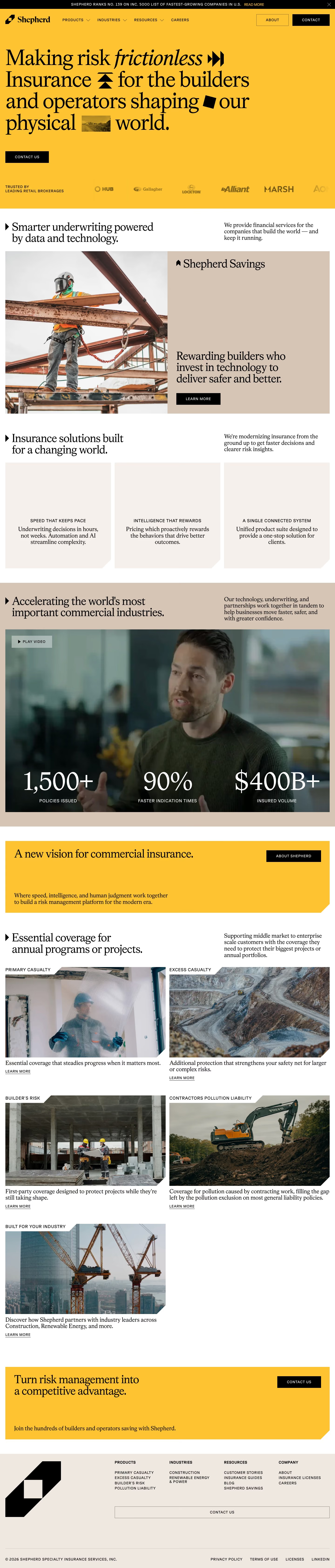
Top to bottom: a full-width yellow hero with an oversized serif headline and a brokerage logo strip, three text-only value cards, a tan band with a video and three statistics, a yellow banner, a photo grid of coverage lines, a second yellow banner and a beige footer with a large logo mark. The page measures 6729 pixels on desktop. Yellow near #fdc331 carries the hero and both banners. Magistersttrial and Gt Planar Trial are the detected typefaces. The distinctive move is a headline interleaved with small black glyphs and a photo thumbnail.
Above the fold
A black announcement bar sits above a header with "PRODUCTS", "INDUSTRIES", "RESOURCES", "CAREERS", an outlined "ABOUT" button and a black "CONTACT" button. The four-line headline sets "frictionless" in italics with black arrow, chevron and diamond glyphs and a tiny landscape photo between words. One black "CONTACT US" button follows. At the bottom, "TRUSTED BY LEADING RETAIL BROKERAGES" sits beside logos such as "Gallagher", "Lockton", "Alliant", "MARSH" and "AON".
Savings panel and three value cards
"Smarter underwriting powered by data and technology." opens the white section. A tall photo of a worker on a steel beam sits beside a tan panel titled "Shepherd Savings" with "Rewarding builders who invest in technology to deliver safer and better." and a black "LEARN MORE" button. Under "Insurance solutions built for a changing world.", three beige cards with notched corners carry only centred text: "SPEED THAT KEEPS PACE", "INTELLIGENCE THAT REWARDS" and "A SINGLE CONNECTED SYSTEM".
Video statistics and coverage grid
A tan band headed "Accelerating the world's most important commercial industries." holds a dark video still with a "PLAY VIDEO" button. Across its lower edge: "1,500+" over "POLICIES ISSUED", "90%" over "FASTER INDICATION TIMES" and "$400B+" over "INSURED VOLUME". A yellow banner says "A new vision for commercial insurance.". Under "Essential coverage for annual programs or projects.", five photo cards with cut corners, from "PRIMARY CASUALTY" to "BUILT FOR YOUR INDUSTRY".
Closing banner and footer
A second yellow banner reads "Turn risk management into a competitive advantage." beside a black "CONTACT US" button, with "Join the hundreds of builders and operators saving with Shepherd." below. The beige footer puts a large black logo mark at left and four link columns, "PRODUCTS", "INDUSTRIES", "RESOURCES" and "COMPANY", at right. A legal row below reads "PRIVACY POLICY", "TERMS OF USE", "LICENSES" and "LINKEDIN".
On mobile
At 390px the page reaches 6847 pixels. The headline wraps to six lines and only two brokerage logos show at a time. The three value cards stack as tall single-column blocks. The statistics sit along the bottom of the video in three narrow columns. Both yellow banners place their black button above the supporting sentence, and the footer folds into two link columns.
Worth borrowing
- Breaking the headline with small black glyphs and a photo thumbnail adds visual rhythm to a text-only hero.
- Cutting a diagonal notch from every card and banner corner repeats the logo's slanted shape across the page.
- Laying large statistics over the lower edge of a video still keeps proof points tied to a human face.