Zeplin
zeplin.io/
Zeplin positions itself as the step after design tools and before code, explicit that "design tools are for designing, Zeplin is for clear, structured delivery," with a CEO letter reinforcing that creative tools are "not where devs belong." It borrows Git-style version control language for tracking design changes, and adds an AI Design Review feature aimed at catching spacing, color, and accessibility issues before handoff. The site claims 2M+ users and names large enterprise customers directly — Air Canada, United Airlines, Ticketmaster, The Washington Post — with a Little Caesars quote crediting it for cutting "back-and-forth messages" between designers and developers. A separate product, Omlet, for design-system analytics, is folded into the same site.
- Category
- Design & Creative
- Style
- LightColorful
- Fonts
- SF Pro DisplayBiro Script Plus
- Palette
- Meta title
- Zeplin · Bring harmony to design delivery
- Sections
- 9
- Updated
Zeplin's landing page, section by section
Each section below is cropped straight from Zeplin's live page — useful references for design & creative landing page design.
Heroes
More heroesFeatures
More featuresPricing
More pricingCTAs
More ctasAbout Us
More about usContact Us
More contact usCareers pages
More careers pagesWhy Choose Us
More why choose usZeplin design review: how the homepage is built
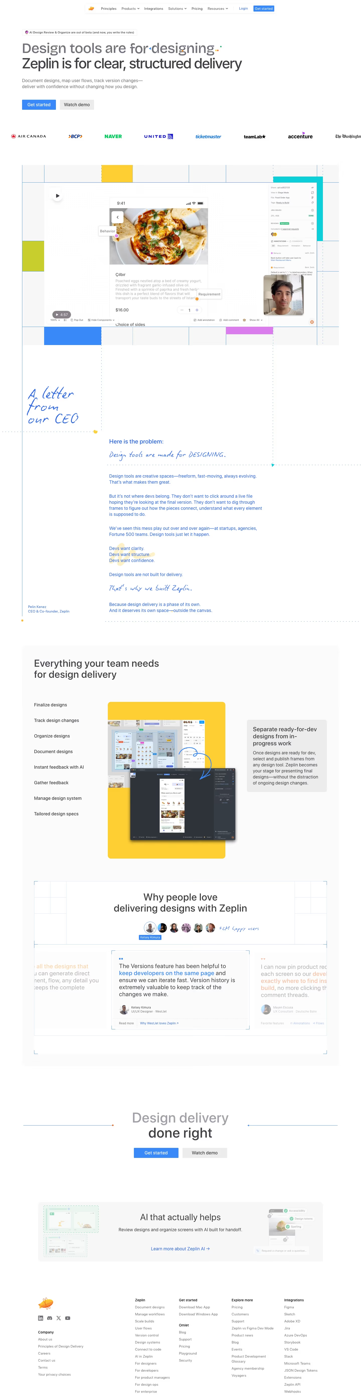
Zeplin's homepage runs 5,575 pixels on desktop, on a white field with a blue #2865eb primary button and a yellow #fdcf34 panel for the feature showcase. A cyan #01ccd7 block sits inside the product preview. Headings are set in SF Pro Display, with a handwritten script face for the CEO letter. The page is built as a narrative: a letter-style block argues from the problem to the product before any feature list appears, then social proof and a closing call to action follow. The brand shown matches the listed name.
Above the fold
Above the fold, a small pill reads "AI Design Review & Organize are out of beta (and now, you write the rules)" over the headline. A grey first line, "Design tools are for designing.", sits above the dark "Zeplin is for clear, structured delivery.", with the word delivery picked out in green. Two buttons follow: a blue "Get started" and a grey "Watch demo". A row of client logos, including Air Canada, NAVER, United and accenture, runs beneath.
CEO letter and product preview
A product preview sits under a play button, with a cyan annotation panel at its right edge. Below it, a handwritten "A letter from our CEO" note runs down the left side beside a blue "Here is the problem:" block. The copy argues that devs need clarity, structure and confidence, and the letter closes with a signature naming Pelin Kenez as CEO & Co-founder.
Feature list and testimonials
A section headed "Everything your team needs for design delivery" lists eight features down the left column, from Finalize designs to Tailored design specs, beside a yellow panel of stacked screen previews. A grey callout headed "Separate ready-for-dev designs from in-progress work" sits to the right. Further down, "Why people love delivering designs with Zeplin" introduces a quote carousel led by a testimonial from Kelsey Kimura, UI/UX Designer at WestJet.
Closing section and footer
The close repeats the call to action with "Design delivery done right" above "Get started" and "Watch demo". A grey "AI that actually helps" panel follows, linking to "Learn more about Zeplin AI". The footer runs five link columns headed "Company", "Zeplin", "Get started", "Explore more" and "Integrations", with an Omlet group under the second column, and social icons beneath the logo.
On mobile
At 390px the desktop nav does not appear, and the hero keeps "Get started" and "Watch demo" as two full-width buttons stacked one above the other. The client logo strip is cut after three logos. The CEO letter keeps its handwritten headings, and the feature list becomes a single carousel. The footer stacks into one column of link groups, starting with "Company" and ending with "Explore more".
Worth borrowing
- The hero sets a grey first line against a dark second line, with the final word picked out in green.
- A handwritten CEO letter carries the argument down the page before any feature list appears.
- The feature list pairs eight plain labels with one yellow panel of stacked screen previews.