Autostep
autostep.ai/
Autostep installs on employee desktops to observe actual work patterns, then quantifies the dollar cost of repetitive tasks and recommends where to deploy an AI agent or process fix — a discover-first, act-second model rather than an interview-based consulting approach. The homepage claims a small team “uncovered $100K+ in operational waste with 10 people,” and lists the specific tasks it targets by name: creating reports, cold calls, drafting PowerPoints, data entry, support emails. It's explicit that automation isn't always the answer, stating “sometimes the best agent is no agent.” Trust signals lean on early-stage backing (Y Combinator, Neo) and a SOC 2 Type II certification described as in progress rather than completed.
- Category
- Productivity & Collaboration
- Style
- DarkColorful
- Stack
- Next.jsTailwind CSS
- Fonts
- GeistSansGeistMono
- Palette
- Meta title
- Autostep - Uncover repetitive tasks ready for AI
- Sections
- 5
- Updated
Autostep's landing page, section by section
Each section below is cropped straight from Autostep's live page — useful references for productivity & collaboration landing page design.
Autostep design review: how the homepage is built
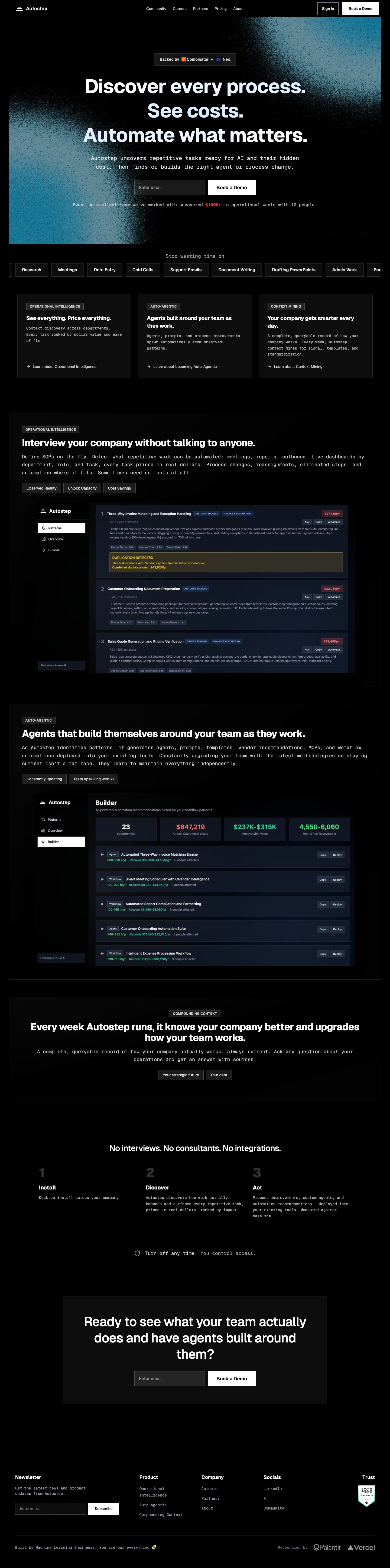
The homepage is a single dark column about 5,791 pixels tall at 1440px wide. Black covers nearly every section, with the teal gradient of #197594 and #5a8493 appearing only as grain behind the hero. Display type is GeistSans and body copy is GeistMono, so most sentences sit in monospace beneath large bold headings. The brand matches meta.name, Autostep. What sets it apart in productivity software is that the product appears as dense mock dashboards with dollar figures on each row, rather than abstract illustrations or customer logos above the fold.
Above the fold
The hero fills the first screen with a grainy teal-to-black gradient. The nav reads "Community", "Careers", "Partners", "Pricing" and "About", beside an outlined "Sign in" and a white "Book a Demo". A small pill reads "Backed by" above the headline, "Discover every process. See costs. Automate what matters.", set in three stacked lines. An email field and a second "Book a Demo" button sit below the mono subhead.
Pill row, feature cards and the first product section
A row of grey pill labels headed "Stop wasting time on" runs past both edges with "Research", "Meetings" and "Cold Calls". Three cards follow with outlined tags and arrow links, titled "See everything. Price everything.", "Agents built around your team as they work." and "Your company gets smarter every day." The section headed "Interview your company without talking to anyone." places three toggles above a bordered dashboard of ranked tasks, each with a dollar tag such as "$27,310/yr".
Agent builder panel and compounding context block
The section headed "Agents that build themselves around your team as they work." repeats the toggles with "Constantly updating" and "Team upskilling with AI". Its builder mock shows four tiles: 23 opportunities, $847,219 in red, $237K-$315K in green, and 4,550-6,060 hours per year, above rows tagged Agent or Workflow. A centred block tagged "COMPOUNDING CONTEXT" follows with two outlined buttons, "Your strategic future" and "Your data".
Closing section and footer
The lower page sets a three-column row headed "No interviews. No consultants. No integrations.", numbered 1 to 3 as "Install", "Discover" and "Act". A boxed card asks "Ready to see what your team actually does and have agents built around them?" above "Book a Demo". The footer has "Newsletter", "Product", "Company" and "Socials" columns, a "Trust" column with a SOC 2 badge, and "Recognized by" logos for Palantir and Vercel.
On mobile
At 390px the hero stacks into one column, the headline breaks onto five lines, and the email field and "Book a Demo" button stretch full width. The three cards stack vertically, which shrinks the dashboard mock to a thin strip whose figures cannot be read. The numbered steps become a centred list, and the footer splits into two columns. Small mono body text becomes hard to read at phone width.
Worth borrowing
- Each feature card is backed by a dashboard mock showing dollar values.
- The headline is split across three stacked lines, one claim per line.
- Trust signals sit in the footer beside partner logos rather than in the hero.