Keel
keel.so/
Keel is a Productivity & Collaboration product. See its keel.so landing page design in full — desktop and mobile screenshots plus close-ups of the heroes, footers, about us, contact us and careers pages. It's built with Framer. Its type is set in Family Medium, anchored by a #026b56 palette. Study how Keel structures its messaging, layout and visual hierarchy, then explore more of the best Productivity & Collaboration website designs.
- Category
- Productivity & Collaboration
- Style
- LightMinimal
- Stack
- Framer
- Fonts
- Family MediumInter DisplayInter
- Palette
- Meta title
- The Operations Platform for fast moving teams
- Sections
- 5
- Updated
Keel's landing page, section by section
Each section below is cropped straight from Keel's live page — useful references for productivity & collaboration landing page design.
Keel design review: how the homepage is built
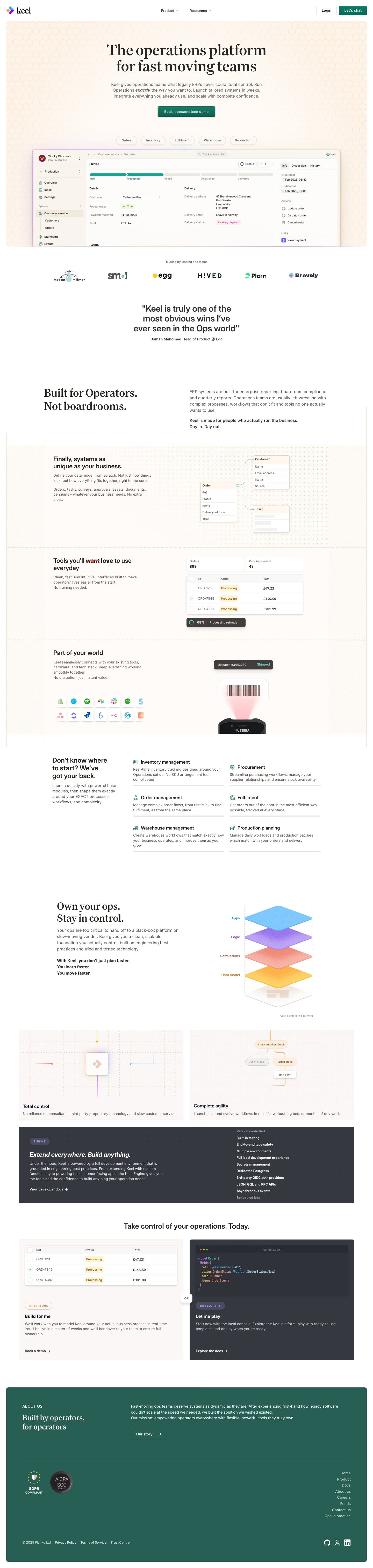
Top to bottom: a honeycomb-patterned hero card with a product screenshot, a logo row and one quote, a split statement, three feature rows, a six-item module list, a layered diagram, two cards, a charcoal engine panel, a two-path call to action and a green about block. It measures 6043 pixels on desktop. Cream and peach fill the hero and feature rows, while deep green #026b56 sits on the main buttons and the closing block. A serif carries the headings and Inter the body.
Above the fold
The header holds a diamond logo with "keel", two dropdowns ("Product", "Resources"), an outlined "Login" button and a green "Let's chat" button. "The operations platform for fast moving teams" sits centred in a serif over a three-line subhead, with "exactly" in bold italic, and a green "Book a personalised demo" button. Five pills, "Orders" to "Production", sit above an order-record screenshot with a five-step progress bar. "Trusted by leading ops teams" introduces six logos, including "Plain" and "Bravely".
Quote, statement and three feature rows
A three-line pull quote credited to "Usman Mahomed" sits centred above "Built for Operators. Not boardrooms.", a heading at left with a paragraph at right. Three rows on a hatched cream frame follow: a data-model diagram linking "Order", "Customer" and "Task"; a table of orders under a heading whose struck-through red word is replaced by "love"; and "Part of your world" with two rows of app icons above a barcode scanner.
Modules, layers and engine panel
A heading asking where to start leads six modules in two columns, from "Inventory management" to "Production planning". "Own your ops. Stay in control." sits beside a stack of four coloured layers labelled "Apps", "Logic", "Permissions" and "Data model". Two pale cards, "Total control" and "Complete agility", sit beneath, then a charcoal "ENGINE" panel titled "Extend everywhere. Build anything." with a bold feature list fading at both ends.
Two-path call and about block
"Take control of your operations. Today." heads two cards joined by an "OR" chip: a peach "OPERATORS" card, "Build for me", with a "Book a demo" link, and a charcoal "DEVELOPERS" card, "Let me play", showing a code snippet and an "Explore the docs" link. A green block, "Built by operators, for operators", holds an "Our story" button and eight right-aligned links from "Home" to "Ops in practice".
On mobile
At 390px the page grows to 8803 pixels, about 46 percent longer. The header keeps the logo and a menu icon, and the hero screenshot shrinks to a thin strip under a three-line headline. Logos wrap into rows of two or three, the diagram rows and module list stack into single columns, and the two closing cards stack with the "OR" chip between them. Footer links centre under the green block.
Worth borrowing
- Placing five pills such as "Orders" and "Warehouse" above the screenshot hints at the product's modules before any scrolling.
- Showing a struck-through word in a feature heading adds a small edit gesture to static type.
- Splitting the close into "OPERATORS" and "DEVELOPERS" cards joined by "OR" gives two audiences their own path.