
Notion
notion.so/
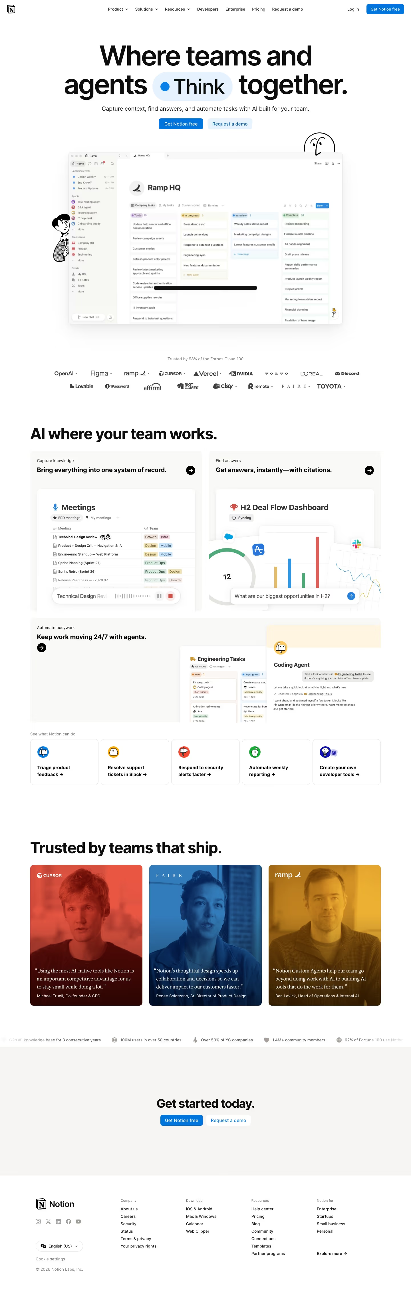
Notion's homepage leads with "Where teams and agents Think together," organizing the product around three explicit pillars — capture knowledge, find answers, automate busywork — with "Agents" framed as always-on processes that triage feedback, resolve support tickets, and handle security alerts rather than as a single chat assistant bolted onto docs. It states it's "Trusted by 98% of the Forbes Cloud 100" and lists customers including OpenAI, Figma, Ramp, Cursor, and Vercel — a customer list weighted toward AI-native companies rather than generic enterprise logos, which reinforces the agent-forward positioning of the copy itself.
- Category
- Productivity & Collaboration
- Style
- LightMinimal
- Stack
- Next.jsTailwind CSS
- Fonts
- NotionInter
- Palette
- Meta title
- The AI workspace that works for you. | Notion
- Sections
- 8
- Updated
Notion's landing page, section by section
Each section below is cropped straight from Notion's live page — useful references for productivity & collaboration landing page design.
Heroes
More heroesPricing
More pricingLogo clouds
More logo cloudsAbout Us
More about usAffiliate pages
More affiliate pagesCareers pages
More careers pagesBlog pages
More blog pagesNotion design review: what the page does, section by section
The home page runs 4,529 pixels at 1440px and moves in this order: nav bar, hero headline with two CTAs, a product window, a two-row logo wall, "AI where your team works." feature cards, five use-case tiles, three tinted video testimonials, a stats ticker, a "Get started today." band and a four-column footer. Colour is restrained to near-white #fefefd and grey #e9e9e8 surfaces with a single blue, #0075de, reserved for primary buttons. The display face is listed as NotionInter. Hand-drawn black line characters sit beside the product screenshot, which is distinctive for a productivity tool.
HeroesView crop
The hero stacks a three-line headline, "Where teams and agents Think together.", with "Think" inside a pale blue pill carrying a blue dot. A one-line subhead and two buttons follow, "Get Notion free" in solid blue and "Request a demo" tinted. A "Ramp HQ" kanban screenshot sits below, flanked by line-drawn characters.
Logo cloudsView crop
A grey caption, "Trusted by 98% of the Forbes Cloud 100", introduces a logo wall of 15 brands across two centred rows, including OpenAI, Figma, ramp, Vercel, NVIDIA and Toyota. Marks are mixed black and grey, and small dots separate several of them.
PricingView crop
Four tiers sit in two panels. A white panel, "Essentials for staying organized.", holds Free at $0 and Plus at $10. A blue-tinted panel holds Business at $20, tagged "Recommended", and Enterprise at custom pricing. Only Business gets a solid blue button; checklists carry tiny integration icons.
About UsView crop
The about page is a narrative scroll headed "A story of tools and the future of work". Black-and-white drawings, some over archival photos, alternate on the left with short paragraphs on the right. It ends with an Alan Kay quote, "Join us", an "In the news" grid of six press logos and an email signup.
Careers pagesView crop
The careers page opens on "Careers at Notion" with an "Explore open roles" button and a large video still. Next come four "Our values" blocks, a "Life at Notion" grid of illustrated city tiles mixed with photos, six "Benefits" cards, and "Open Positions" as three-column cards grouped by department.
Blog pagesView crop
The blog, titled "Tools & Craft", pairs a left sidebar of categories ("Latest", "Notion HQ", "For Teams", "Inspiration", "Pioneers", "Tech", "First Block") with a two-column grid of cards. Each has an illustrated thumbnail, category label, bold title, grey excerpt and author line.
Affiliate pagesView crop
The partner page begins with "Become a Notion partner." beside a line drawing, then "Which partner program is the right one for you?" with five grey cards, the last a wider Builders card. Three quotes, an 18-logo grid and "More ways to get involved." rows complete it.
FootersView crop
The footer holds the wordmark, five grey social icons, an "English (US)" selector, "Cookie settings" and a 2026 copyright on the left. Four link columns follow, titled "Company", "Download", "Resources" and "Notion for", with "Explore more" closing the last. All text is small.
On mobile
At 390px the page runs 4,078 pixels. The hero characters move above the headline, and the product window is dropped. The two CTAs stack at full width. Feature cards and use-case tiles become single columns, the testimonials turn into a horizontal strip with the second card cut off, and the footer links fall into two columns.
Worth borrowing
- Wrapping one word of the headline, "Think", in a tinted pill adds emphasis without a second font or colour.
- Reserving a single blue for primary buttons, including only one solid button in a four-tier pricing block, makes the preferred action obvious.
- Hand-drawn line characters set against a real product screenshot give a software page personality while the interface stays readable.





