Onuniverse
onuniverse.com/
Universe is a no-code website builder built specifically for building sites from a phone or tablet as well as desktop, covering online stores, portfolios, event pages, and fan pages through a drag-and-drop block editor. Its hero reads "Universe is a visual, no-code website builder that you can use from any device," and it backs this with a 2023 Apple Design Award, over 1 million sites built, and 7,000+ five-star reviews — an award citation that's unusual for this product category, most of which lean on G2/Capterra badges instead. Pricing runs Free through a $50/month Complete tier, and the tagline "Websites for humans" recurs as the brand line.
- Category
- Design & Creative
- Style
- LightMinimal
- Stack
- Next.jsCSS-in-JS
- Fonts
- AeonikAeonik-MediumPlexMono
- Palette
- Meta title
- Universe Website Builder | Design Custom Sites with No Code
- Sections
- 4
- Updated
Onuniverse's landing page, section by section
Each section below is cropped straight from Onuniverse's live page — useful references for design & creative landing page design.
Onuniverse design review: how the homepage is built
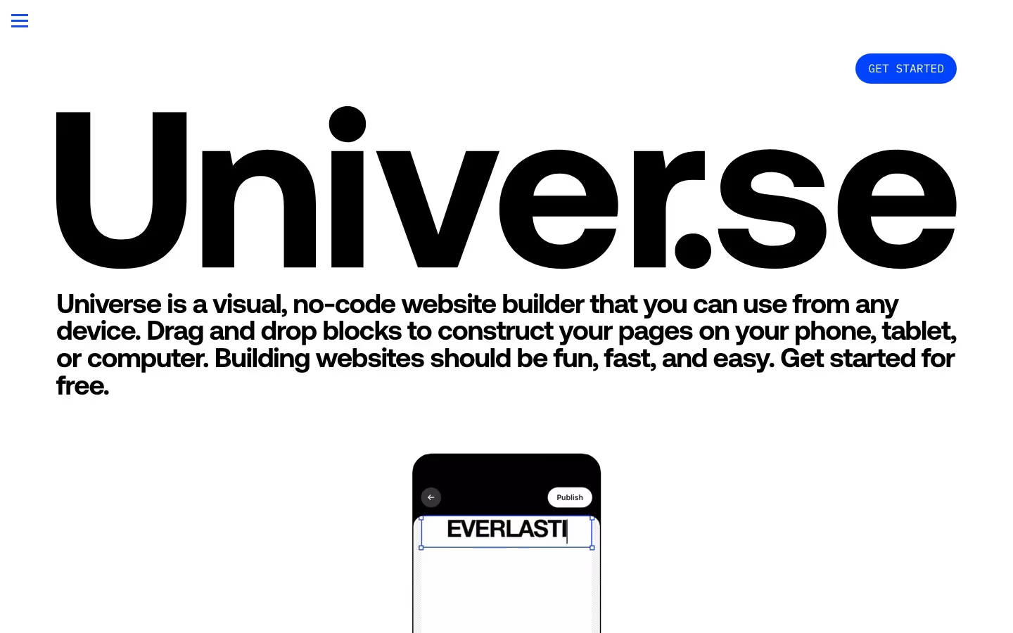
Onuniverse is one content column on a white ground with a single saturated cobalt blue doing all the accent work: the hamburger icon, the pill button, the monospaced paragraphs and every illustration panel. There is no header bar, only that icon and a "GET STARTED" pill. The page runs roughly seven thousand pixels, alternating huge heavy headings with blue grid panels that hold phone mockups, then four grey pricing cards, a gallery panel and a sign-off of scattered type. The dot in the wordmark "Univer.se" is treated as a design element.
Above the fold
The first screen is almost entirely the wordmark "Univer.se" in black at full content width, with a round dot between the r and the s. Under it a four-line bold paragraph begins "Universe is a visual, no-code website builder that you can use from any device." A lone blue "GET STARTED" pill floats at top right, and the top of a phone mockup with a "Publish" button peeks in at the bottom edge.
Proof points and three feature panels
Two blue monospaced columns hold the pitch and three proof points, "2023 Apple Design Award winner.", "Over 7K 5-star reviews." and "Over one million sites built." Two stacked outlined pills follow, "Download on the App Store" and "Try out the Web App". Three features then repeat one pattern: a huge heading, a blue grid panel with a cropped phone, a one-line caption. "Sell anything, from physical goods to digital downloads." shows a yellow mug card priced $60 with a BUY button.
Pricing cards
"Pricing" opens with a sentence naming four plans. They sit in a two-by-two grid of flat grey cards, each with the wordmark plus a coloured badge: outlined "Free", lime "Base", blue "Pro" and orange "Complete". Each card has a one-line pitch, three icons with capitalised labels such as "4K UPLOADS", the price at bottom left, $0.00, "$12 per month", "$25 per month" or "$50 per month", and an underlined "Learn more" link at bottom right.
Site Gallery and sign-off
After the app buttons repeat, "Site Gallery" shows a blue panel of fanned phone screens: a mint store page titled "my cute life :)" with four $14 product tiles, a neon green goods page and a blue youtube tab. The page ends on staggered type reading "Tap + swipe", "to build your site", "Drag + drop" and "open up shop", then the small line "Websites for humans." There is no conventional footer.
On mobile
At 390 pixels the wordmark shrinks to fill the width and the "GET STARTED" pill stays at top right, closer to the heading. The two monospaced columns stay side by side and wrap to seven lines. Headings run three or four lines, the phone panels scale down, and the four pricing cards stack into one column with their three icons still in a row.
Worth borrowing
- An oversized wordmark filling the first screen makes the brand name the hero.
- Repeating heading, blue grid panel and phone mockup gives each feature the same rhythm.
- Coloured plan badges tell four identical grey cards apart at a glance.