Penpot
penpot.app/
Penpot is an open-source design platform built for UI design, design systems, and prototyping, positioned as an alternative to Figma, Adobe XD, Sketch, and Canva, with a self-hosting option alongside its cloud version. Its homepage headline, "Think and build digital products. Together," is followed by messaging aimed at three separate audiences at once — designers, developers, and AI agents — with a dedicated section on inspecting CSS, HTML, SVG, and JSON through its open file format. Rather than only comparing itself to closed-source rivals in marketing copy, it lists itself as a Digital Public Good and runs community programs like an Ambassador Program and a dedicated Penpot Fest conference, leaning on open-source status as its primary trust signal instead of enterprise logos.
- Category
- Design & Creative
- Style
- LightMinimal
- Stack
- Next.js
- Fonts
- Work Sans
- Palette
- Meta title
- Penpot: The open-source design platform for teams.
- Sections
- 7
- Updated
Penpot's landing page, section by section
Each section below is cropped straight from Penpot's live page — useful references for design & creative landing page design.
Heroes
More heroesPricing
More pricingAbout Us
More about usContact Us
More contact usCareers pages
More careers pagesBlog pages
More blog pagesPenpot design review: how the homepage is built
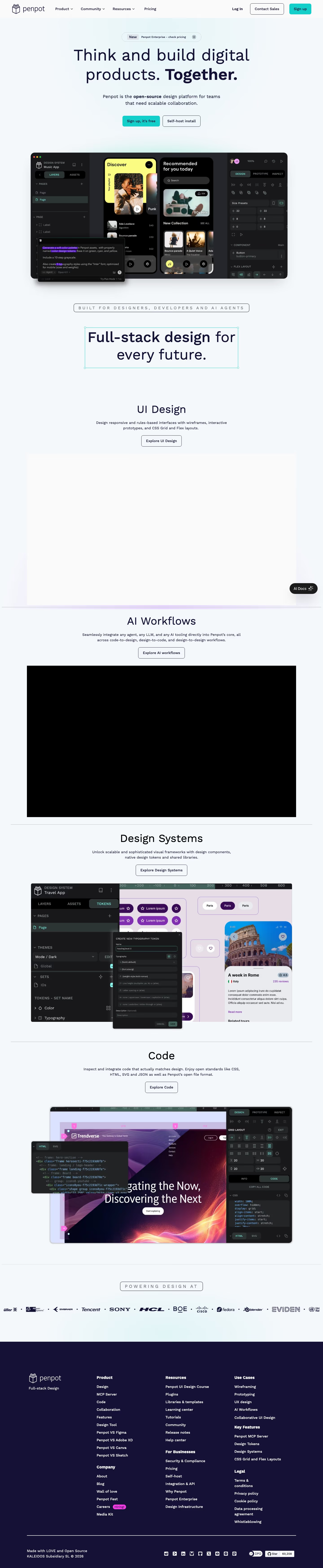
The Penpot homepage runs about 6,991 pixels on desktop. Blocks go top to bottom: navigation, an announcement pill, a centred headline with two buttons, a large product screenshot, a second statement headline, four feature blocks titled "UI Design", "AI Workflows", "Design Systems" and "Code", a logo strip, and a dark footer. Colour comes from a pale #f7f9fb page, navy #151035 for type and footer, and teal #14ceca on the sign-up buttons. Work Sans is the display face. Product screenshots are dark panels against the light page, giving the pale layout its main contrast.
Above the fold
The navigation bar holds the logo, three dropdowns ("Product", "Community", "Resources"), a "Pricing" link, "Log In", an outlined "Contact Sales" button and a teal "Sign up" button. Below, a pill reads "New Penpot Enterprise - check pricing", then the headline "Think and build digital products. Together." with the last word in bold. Two buttons follow: a filled teal "Sign up, it's free" and an outlined "Self-host install".
Statement headline and UI Design block
The editor screenshot shows layers on the left, two music-app screens in the centre and an inspector on the right, with a floating AI prompt window over its lower left corner. An outlined pill states "BUILT FOR DESIGNERS, DEVELOPERS AND AI AGENTS", then "Full-stack design for every future." sits inside a selection box with corner handles. The "UI Design" block follows with a heading, two lines of copy and "Explore UI Design".
AI Workflows, Design Systems and Code
Each feature block repeats one formula: centred heading, short description, outlined button, wide media panel. Buttons read "Explore AI workflows", "Explore Design Systems" and "Explore Code". The Design Systems panel shows a tokens editor with a typography dialog over a travel-app layout. The Code panel shows an HTML snippet. Thin rules separate blocks, and a floating dark "AI Docs" button stays at the right edge.
Logo strip and footer
A pill labelled "POWERING DESIGN AT" introduces one row of customer logos separated by dots, including Sony, Tencent, Cisco and Blender, cropped at both page edges. No closing call to action appears. The navy footer holds the logo, "Full-stack Design", and seven link groups from "Product" to "Legal", with a magenta "Hiring!" badge beside "Careers". The bottom row has social icons and a GitHub "Star" counter showing "60,208".
On mobile
At 390 pixels the headline wraps to three lines and both buttons stack, teal "Sign up, it's free" first. The product screenshot shrinks to a small strip, and the "AI Docs" button overlaps the audience pill. Each feature block puts its image above a left-aligned heading, description and button, in the order "UI Design", "Design Systems", "AI Workflows", "Code". The logo row shows three logos. Footer links collapse into one long column.
Worth borrowing
- A headline set inside a selection box with corner handles turns the page into a demonstration of the product's own canvas.
- A repeated heading, one-line description, outlined button and media panel gives four feature blocks one scannable rhythm.
- Dark product panels on a pale page make the interface screenshots the strongest contrast in every block.