Operate
operate.so/
Operate is a Sales & Support product. See its operate.so landing page design in full — desktop and mobile screenshots plus close-ups of the heroes, features, footers and contact us. It's built with Next.js and Tailwind CSS. Its type is set in denim, anchored by a #117025 palette. Study how Operate structures its messaging, layout and visual hierarchy, then explore more of the best Sales & Support website designs.
- Category
- Sales & Support
- Style
- LightColorful
- Stack
- Next.jsTailwind CSS
- Fonts
- denimmuoto
- Palette
- Meta title
- Operate – Collaborative AI for frontier sales organizations
- Sections
- 4
- Updated
Operate's landing page, section by section
Each section below is cropped straight from Operate's live page — useful references for sales & support landing page design.
Operate design review: how the homepage is built
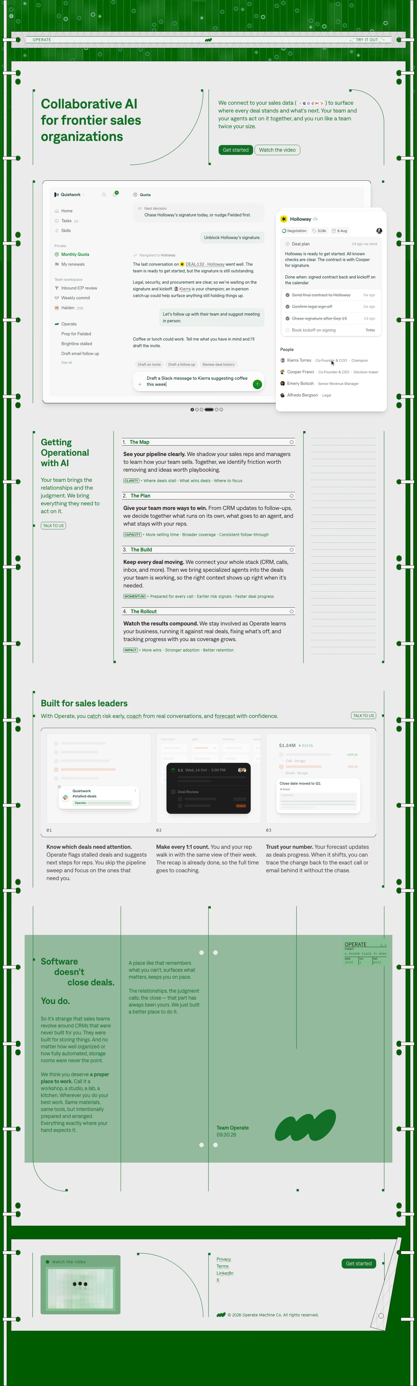
Top to bottom: a striped green frame with a masthead strip, a split headline and intro, a framed product window, a four-step numbered list, a three-card row, a pale green manifesto panel and a short footer. It measures 4778 pixels on desktop. Light grey fills the page while one green, near #117025, carries headings, borders and buttons, and a softer sage near #8ab594 floods the manifesto. Denim sets the headings and muoto the body text. The distinctive move is a ring-binder and ledger-paper theme, with punched holes, crop marks and a stamped label.
Above the fold
A masthead strip across a dotted green field reads "OPERATE" at left and "TRY IT OUT" at right. Below it, "Collaborative AI for frontier sales organizations" runs in three bold lines at left, beside a four-line paragraph with tiny app icons inline. Two buttons follow, a filled "Get started" and an outlined "Watch the video". A framed "Quietwork" window beneath shows a chat, a sidebar and a floating "Kierra Torres" card.
Four-step numbered list
"Getting Operational with AI" sits in a narrow left column with an outlined "TALK TO US" button. Four ruled rows run beside it, "The Map", "The Plan", "The Build" and "The Rollout", each opening with a bold sentence and ending with a boxed tag, "CLARITY", "CAPACITY", "MOMENTUM" or "IMPACT", followed by three short phrases. A dotted empty column fills the right edge, so the list looks like a printed form.
Sales leaders row and manifesto panel
"Built for sales leaders" heads three numbered mockups, 01 to 03, inside one bracketed frame, captioned "Know which deals need attention.", "Make every 1:1 count." and "Trust your number.". Next, a sage panel staggers "Software doesn't close deals." and "You do." over two text columns. A small stamp reads "A PROPER PLACE TO WORK", and the panel ends with a signature, "Team Operate" dated "09.30.26", beside three green blobs.
Footer strip
The page ends in a thin footer rather than a closing pitch. A pale green "Watch the video" thumbnail sits at left, four small links, "Privacy", "Terms", "LinkedIn" and a lone X, stand in the centre, and a filled "Get started" button sits at right. A copyright line names Operate Machine Co. Dark green fills the bottom edge.
On mobile
At 390px the page reaches 5527 pixels. The headline, paragraph and buttons stack, and "Watch the video" now sits above "Get started". The product window crops to only the right-hand deal card. The four steps and three captions each run in one column, and the manifesto becomes a single flow. In the footer the links come first, then the button and copyright, and the video thumbnail drops to the bottom.
Worth borrowing
- A binder and ledger theme, with punched holes and a stamped label, turns one green into a recognisable identity.
- Boxed tags such as "CLARITY" and "IMPACT" under each numbered step give a long list a scannable summary.
- Ending on a dated, signed note from "Team Operate" replaces the usual closing pitch with a voice.