
Stagehand
stagehand.dev/
Stagehand is a Engineering & Infrastructure product. See its stagehand.dev landing page design in full — desktop and mobile screenshots plus close-ups of the heroes, features, footers and blog pages. It's built with Next.js and Tailwind CSS. Its type is set in planar, anchored by a #d5dce8 palette. Study how Stagehand structures its messaging, layout and visual hierarchy, then explore more of the best Engineering & Infrastructure website designs.
- Category
- Engineering & Infrastructure
- Style
- LightMinimal
- Stack
- Next.jsTailwind CSS
- Fonts
- planarplainstandardMono
- Palette
- Meta title
- The SDK for browser agents | Stagehand
- Sections
- 4
- Updated
Stagehand's landing page, section by section
Each section below is cropped straight from Stagehand's live page — useful references for engineering & infrastructure landing page design.
Stagehand design review: how the homepage is built
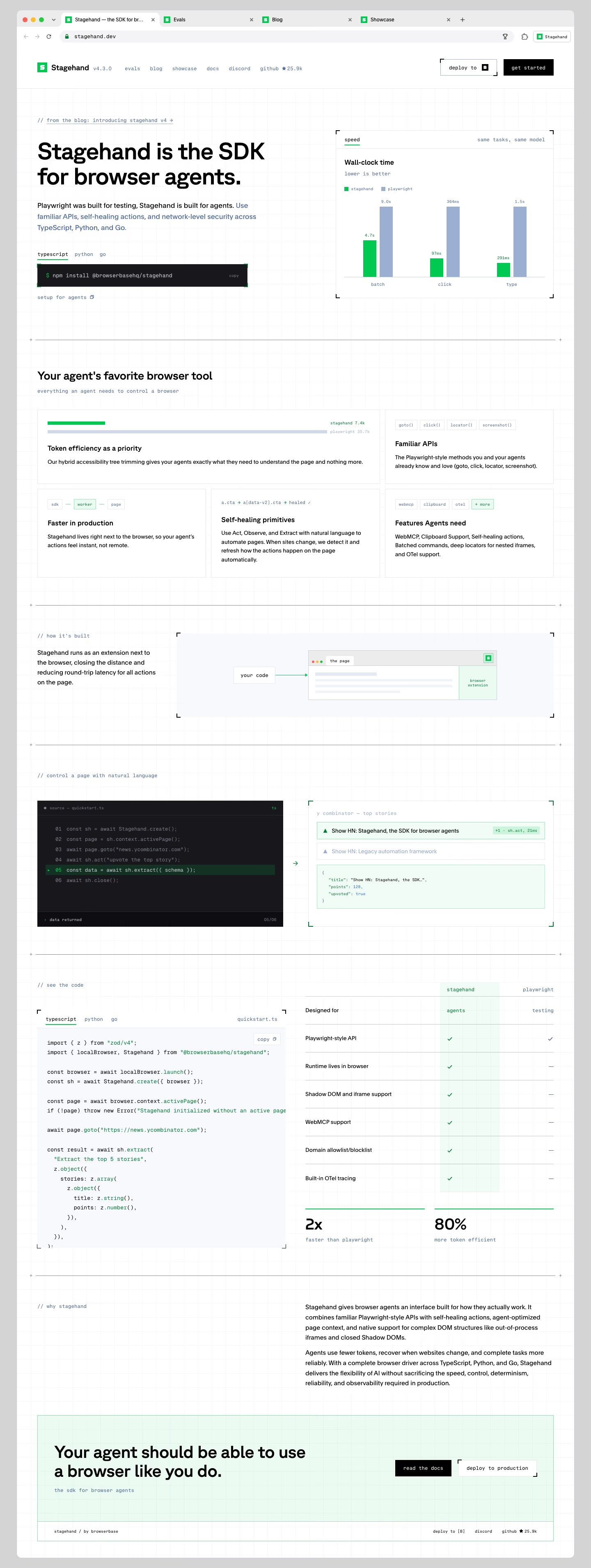
The whole page is drawn inside a mock browser window, complete with "Evals", "Blog" and "Showcase" tabs and a "stagehand.dev" address bar, which frames the product as something that lives in the browser. Inside, a short 3817-pixel page runs hero, feature grid, architecture diagram, live demo, code sample with comparison table, a two-paragraph pitch and a mint closing panel. The ground is white #fefefe on a faint grid, with green #00c549 for Stagehand and slate blue #99add1 for Playwright in every chart. Planar sets the headings, while Plain and StandardMono carry body copy and the lowercase monospaced labels.
Above the fold
The header shows the logo with "v4.3.0", six lowercase mono links from "evals" to "github" with a 25.9k star count, a bracketed "deploy to" button and a black "get started". A link reading "// from the blog: introducing stagehand v4" sits above the two-line headline. Under the subhead, "typescript", "python" and "go" tabs switch a dark install line. The right half is a "Wall-clock time" bar chart comparing "batch", "click" and "type".
Five feature cards and the extension diagram
"Your agent's favorite browser tool" heads five bordered cards in a two-over-three grid: "Token efficiency as a priority" spans two columns with a token bar, then "Familiar APIs", "Faster in production", "Self-healing primitives" and "Features Agents need". Each card opens with a tiny mono illustration, such as method pills. Under "// how it's built", a diagram links a "your code" box to a page with a "browser extension" panel.
Demo, code sample and comparison table
"// control a page with natural language" sets a six-line dark script beside its result: a Hacker News list where "Show HN: Stagehand, the SDK for browser agents" is highlighted, plus the returned JSON. Under "// see the code" a full "quickstart.ts" listing sits left of a seven-row table with a mint Stagehand column of ticks and Playwright dashes. Two large stats, "2x" and "80%", close it.
Closing section and footer
"// why stagehand" labels two right-aligned paragraphs with no heading. The close is a mint panel outlined in green: "Your agent should be able to use a browser like you do." on the left, "read the docs" in black and "deploy to production" in bracket corners on the right. A single footer strip reads "stagehand / by browserbase" with three short links.
On mobile
At 390px the page grows to 7017 pixels and keeps the browser frame, now with an address bar and four truncated tabs. The nav links wrap into two rows under the logo and "get started". The chart drops below the install line, the feature cards stack singly, and code blocks crop at the right edge. The closing buttons stack, with the footer links in a short column.
Worth borrowing
- Wrapping the whole homepage in a mock browser window makes the framing itself explain a browser-automation tool.
- Colouring Stagehand green and Playwright slate across the chart and the table keeps one comparison running through the page.
- Lowercase mono labels like "// see the code" make section headings read as code comments for a developer audience.





