Altitude
altitude.so/
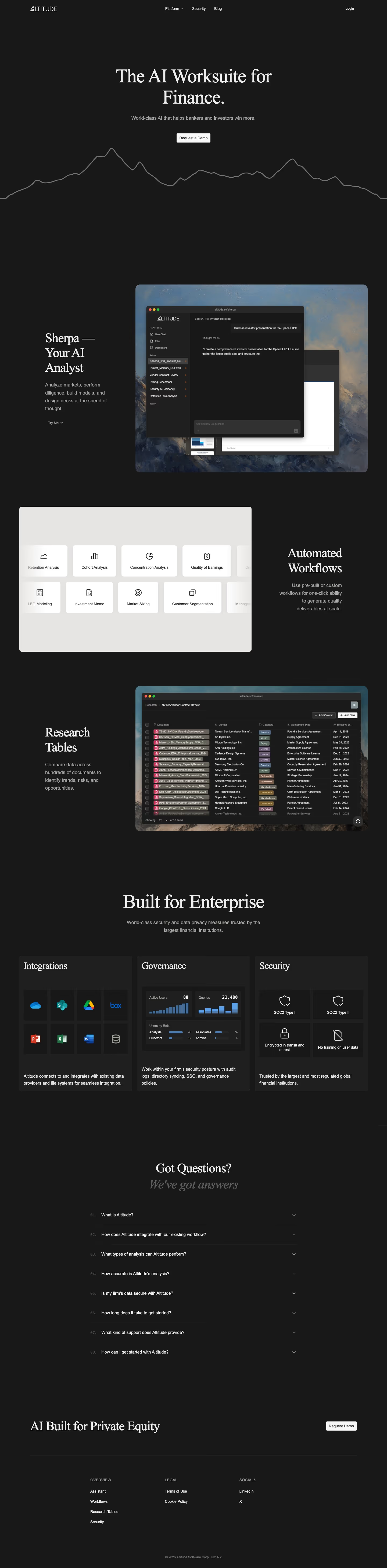
Altitude calls itself "the AI Worksuite for Finance," built for bankers, investors, and private equity professionals to research markets, build financial models, and generate presentations. Its centerpiece is "Sherpa," an AI analyst demonstrated live on the page by building a mock SpaceX IPO pitch deck complete with revenue analysis and growth-strategy slides, rather than describing the capability in the abstract. A separate research-table feature is shown scanning "hundreds of documents" for contract terms and risk trends. The site emphasizes SOC 2 Type I and II compliance and states user data is not used to train its models. Notably, a banner on Acctual's own site announces it is joining Altitude, suggesting recent acquisition activity.
- Category
- Finance & Commerce
- Style
- DarkMinimal
- Stack
- Tailwind CSS
- Fonts
- Libre BaskervilleInter
- Palette
- Meta title
- Altitude — AI for Finance | Automate Research & Analysis
- Sections
- 6
- Updated
Altitude's landing page, section by section
Each section below is cropped straight from Altitude's live page — useful references for finance & commerce landing page design.
Heroes
More heroesFeatures
More featuresFAQs
More faqsContact Us
More contact usBlog pages
More blog pagesAltitude design review: what the page does, section by section
Altitude's page runs 5842 pixels at 1440px wide: a nav bar, a centred hero, "Sherpa — Your AI Analyst" with a screenshot, "Automated Workflows", "Research Tables", "Built for Enterprise" with three cards, an eight-question FAQ, a closing "AI Built for Private Equity" band, and a footer. Colour stays near-black, with #181818 as the ground and greys such as #383838, #575757 and #888888 for secondary text. Headlines use a serif, consistent with the detected Libre Baskerville, with Inter for interface text. A line-drawn mountain ridge under the hero is the distinctive move.
HeroesView crop
The hero centres a two-line serif headline, "The AI Worksuite for Finance.", above "World-class AI that helps bankers and investors win more." and one white "Request a Demo" button. The nav holds the wordmark, "Platform", "Security", "Blog" and "Login". A grey ridge line runs edge to edge beneath the button as the only graphic.
FeaturesView crop
"Built for Enterprise" opens with a centred headline, then three equal dark cards: "Integrations" with eight app icons in a 4 by 2 grid, "Governance" with a mock dashboard showing "Active Users 88" and "Queries 21,480", and "Security" with four tiles including "SOC2 Type I" and "No training on user data".
FAQsView crop
Under "Got Questions?" and the italic grey "We've got answers", eight collapsed questions sit in a narrow centred column. Each row has a monospace number from "01." to "08.", the question in white, and a right-aligned chevron, divided by hairline rules. The first is "What is Altitude?"; no answer is open.
Contact UsView crop
On the contact page, "Get in touch" sits left over a grey paragraph and three ruled bullets. On the right, a dark form card floats over a painted cloud-and-mountain image, with name, "Title", "Work email", "Company", "Firm Type" and "Use Case" fields and a white "Contact Sales" button.
Blog pagesView crop
The blog page switches to a light off-white ground. A serif "Blog" heading sits over the tabs "All Posts" and "Product", with a list and grid toggle at right. One entry shows "Feb 25, 2026" in a left column beside the title "Frontier Labs Can't Automate Your Deliverables" and a two-line excerpt.
FootersView crop
The footer repeats "AI Built for Private Equity" in large serif with a white "Request Demo" button at right, then a rule. Three link columns follow: "OVERVIEW" with four links, "LEGAL" with "Terms of Use" and "Cookie Policy", and "SOCIALS" with "LinkedIn" and "X". A centred copyright line closes the page.
On mobile
At 390px the page becomes one column about 7137 pixels tall, and no navigation bar appears in the capture. The hero headline wraps to three lines, with the ridge line crossing the subline. Workflow tiles drop to two columns, enterprise cards stack, and the footer places "Request Demo" under the headline.
Worth borrowing
- Use one thin line illustration, like the ridge under the hero, to carry brand meaning without photography.
- Set dark app screenshots on a painted landscape backdrop so windows gain depth on a flat dark page.
- Number collapsed FAQ rows in monospace ("01." to "08.") to give a closed list structure.