V7labs
v7labs.com/
V7 Go automates document-heavy workflows in private markets, insurance and real estate — due diligence, underwriting, claims processing, deal analysis — under the hero line "Complex workflows. Zero room for error." Rather than generic praise, its testimonial carousel is built entirely around cost and speed comparisons customers state in their own numbers: one client says an in-house build would have cost "$2M and 18 months" versus V7 going live in six weeks, another cites "21x faster processing, 54% fewer errors," and a real estate client claims it "replaced three separate tools" for a 40% cost cut. Each of the six testimonials names a specific outcome tied to a named firm (Star Mountain Capital, Pinsent Masons, Alaris Acquisitions) rather than a generic quote.
- Category
- Finance & Commerce
- Style
- DarkMinimal
- Stack
- Framer
- Fonts
- Martina Plantijn LightSTK Bureau STK Bureau
- Palette
- Meta title
- V7 Go | AI for Private Equity & Finance
- Sections
- 9
- Updated
V7labs's landing page, section by section
Each section below is cropped straight from V7labs's live page — useful references for finance & commerce landing page design.
Heroes
More heroesLogo clouds
More logo cloudsAbout Us
More about usContact Us
More contact usPricing & Plans
More pricing & plansAffiliate pages
More affiliate pagesCareers pages
More careers pagesBlog pages
More blog pagesV7labs design review: how the homepage is built
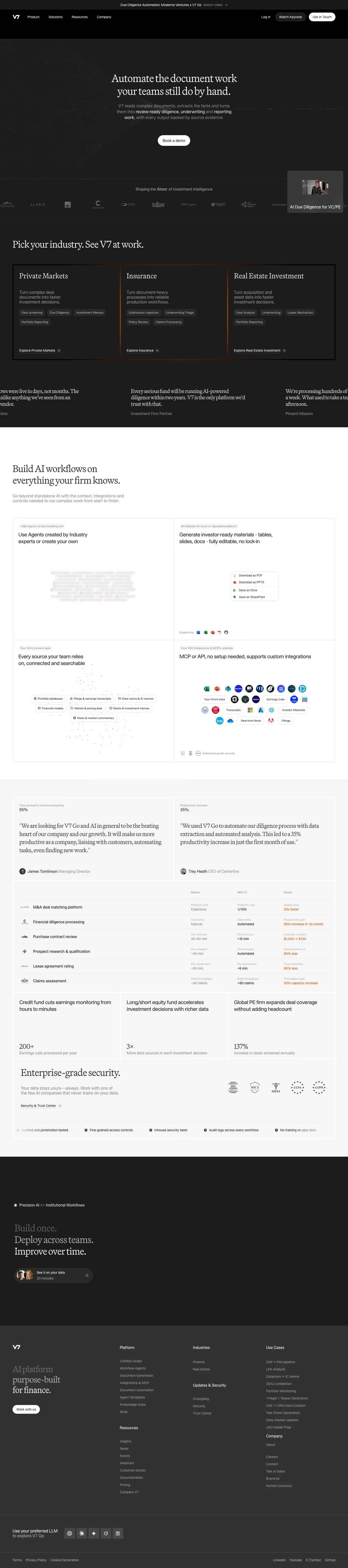
The V7labs homepage runs 6,484 pixels at desktop width and alternates dark and light bands. A dark hero and industry picker come first, then a white product grid, a warm off-white proof band, a dark closing block and a grey footer. Colour stays near-monochrome, using #1c1c1c and #010101 for dark fields, #fafafa for light ones and #373737 and #676767 for secondary text, with thin orange accents on card borders and result figures. Headlines use Martina Plantijn Light, a serif, while body text uses STK Bureau, a pairing that suits its finance audience.
Above the fold
A thin bar reads "Due Diligence Automation: Moderne Ventures x V7 Go". The nav holds "Product", "Solutions", "Resources" and "Company", plus a white "Get in Touch" pill. The centred serif headline "Automate the document work your teams still do by hand." sits over a faint line-field graphic. One white "Book a demo" button follows the grey subcopy, and a floating video tile overlaps the bottom right corner.
Logo strip, industry cards and quotes
A scrolling row of about ten greyscale logos sits under "Shaping the future of investment intelligence". "Pick your industry. See V7 at work." introduces three equal bordered cards: "Private Markets", "Insurance" and "Real Estate Investment". Each carries a short description, three or four tag chips and an "Explore" link anchored at the bottom. The word "future" in that line is set in italic serif. Cropped serif quotes run below.
White product grid and proof tables
The background flips to white for "Build AI workflows on everything your firm knows." A two-by-two grid pairs small labels such as "+280 Agents to start building with" with product visuals. The warm grey band beyond holds two large serif quotes with metrics, "95%" and "35%", then a six-row table of Before, "With V7" and Result, with orange outcomes like "20x faster". Three stat cards follow.
Closing section and footer
An "Enterprise-grade security." block shows five certification marks, above a row of five short claims. The page then returns to dark with a three-line headline, "Build once. Deploy across teams. Improve over time.",. A pill reading "See it on your data" with "30 minutes" is the final call to action. The grey footer has four link columns and a row of five LLM icons.
On mobile
At 390px the page runs 7,433 pixels. The headline and "Book a demo" button stay centred, but the nav is gone and the logo strip shows only four marks. The three industry cards stack vertically, with the tag chips dropped. Product cells become single blocks, each gaining a link such as "Browse agents". Only one testimonial appears, and the before-and-after table and stat cards are absent. The footer folds into two columns.
Worth borrowing
- Three equal bordered cards with tag chips and anchored "Explore" links let visitors pick an industry first.
- Flipping from dark to white to warm grey gives picker, product grid and proof separate registers.
- A Before, "With V7" and Result table with orange figures makes evidence scannable.