Callsine
callsine.com/
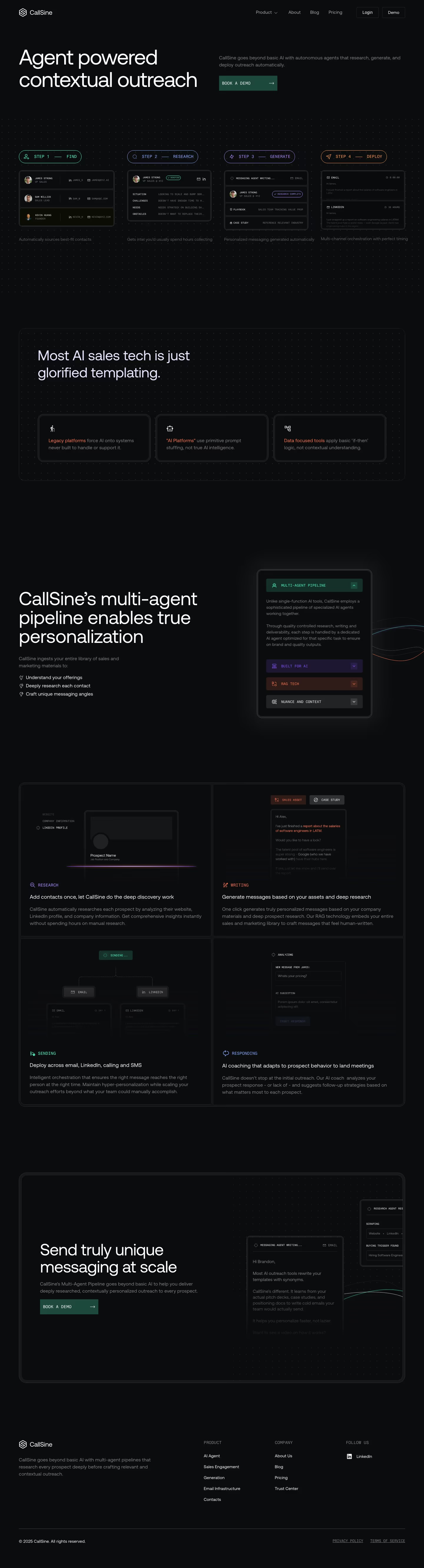
Callsine automates sales outreach with a multi-agent pipeline that researches prospects, writes contextual messages, and sends them across email, LinkedIn, and phone. Rather than leading with numbers, the page opens by criticizing competitors — calling most AI sales tools "glorified templating" built on "primitive prompt stuffing" and "basic if-then logic" — before positioning its own four-step process (Find, Research, Generate, Deploy) as different because it "ingests your entire library of sales and marketing materials." The page has no visible testimonials, customer logos, or usage statistics, relying entirely on this contrarian framing and sample email outputs to make its case.
- Category
- Sales & Support
- Style
- DarkMinimal
- Stack
- Framer
- Fonts
- Aeonik RegularPP Neue Montreal
- Palette
- Meta title
- CallSine
- Sections
- 5
- Updated
Callsine's landing page, section by section
Each section below is cropped straight from Callsine's live page — useful references for sales & support landing page design.
Callsine design review: how the homepage is built
The page is 5322px tall at 1440px and moves from a two-column hero to a four-step product strip, a boxed critique of competitors, a multi-agent explainer with a phone-shaped panel, a two-by-two grid of feature cards, a boxed closing call to action and a short footer. Near-black #0b0c0d fills the whole page, with #1d4a3c reserved for the demo buttons and thin grey borders around every block. Aeonik Regular and PP Neue Montreal are listed as fonts. Small monospace uppercase labels and faint dot grids give a terminal feel. Interface mockups carry the visual weight.
Above the fold
The header has a hexagonal wordmark, "Product" with a chevron, "About", "Blog" and "Pricing" links, and two outlined buttons, "Login" and "Demo". The headline "Agent powered contextual outreach" occupies the left half in two lines of large white type. At right, a grey paragraph sits above a flat dark-green "BOOK A DEMO" button. Below, a dotted background holds four outlined pills, "STEP 1 FIND", "STEP 2 RESEARCH", "STEP 3 GENERATE" and "STEP 4 DEPLOY", each above a small card.
Competitor critique and pipeline explainer
A rounded box carries the line "Most AI sales tech is just glorified templating." over three small cards. Each opens with a coloured phrase: "Legacy platforms", "AI Platforms" in quotes and "Data focused tools". Below, "CallSine's multi-agent pipeline enables true personalization" sits left of a phone-shaped panel, with three check-style bullets starting "Understand your offerings". The panel holds a green "MULTI-AGENT PIPELINE" bar and collapsed rows labelled "BUILT FOR AI", "RAG TECH" and "NUANCE AND CONTEXT", each tinted differently.
Four-card feature grid
One bordered container splits into a two-by-two grid. Each card shows a faded mockup above a coloured monospace label and a white one-line heading: "RESEARCH" for "Add contacts once, let CallSine do the deep discovery work", "WRITING" for message generation, "SENDING" for "Deploy across email, LinkedIn, calling and SMS" with a branching diagram, and "RESPONDING" for AI coaching. Grey paragraph copy of three lines sits beneath each heading.
Closing section and footer
The closing box repeats the flat green button beneath "Send truly unique messaging at scale". At right, a cold-email mockup cropped by the box edge reads "Hi Brandon," and fades out. The footer has the wordmark, columns headed "PRODUCT" with five links and "COMPANY" with four, a "FOLLOW US" column with a LinkedIn link, and a copyright line with underlined "PRIVACY POLICY" and "TERMS OF SERVICE".
On mobile
At 390px the page becomes 7654px tall in one column. The nav collapses to a hamburger icon and the headline wraps to three lines. The four step pills stack vertically with their cards, and the competitor cards stack. The feature grid turns into four full-width cards. The cold-email mockup moves below its button and is clipped at the right edge, and the footer keeps three columns.
Worth borrowing
- Four coloured step pills with matching mini-interfaces explain the whole workflow under the hero.
- Opening with a boxed critique of competing tools frames the product through contrast.
- Monospace uppercase labels on dark cards keep a software-product feel without any photography.