Evervault
evervault.com/
Evervault is a Security product. See its evervault.com landing page design in full — desktop and mobile screenshots plus close-ups of the heroes, footers, contact us, pricing & plans, careers pages, and 1 more. It's built with Framer. Its type is set in Roobert Medium, anchored by a #17252a palette. Study how Evervault structures its messaging, layout and visual hierarchy, then explore more of the best Security website designs.
Evervault's landing page, section by section
Each section below is cropped straight from Evervault's live page — useful references for security landing page design.
Heroes
More heroesContact Us
More contact usPricing & Plans
More pricing & plansCareers pages
More careers pagesBlog pages
More blog pagesEvervault design review: how the homepage is built
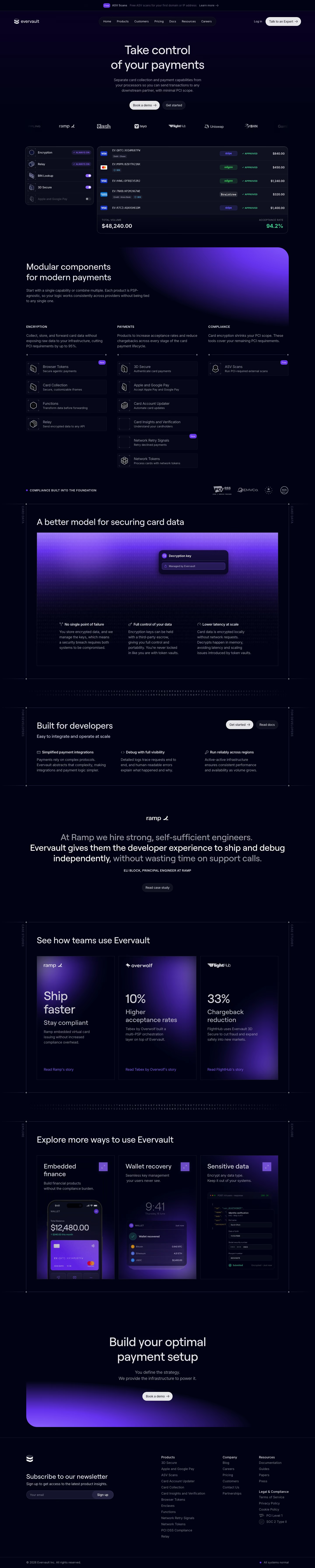
Top to bottom: an announcement bar, a pill-shaped nav, a centred hero, a logo strip, a payments-table mockup, a three-column product grid, a compliance badge row, a card-data explainer, a developer row, one large quote, three case-study cards, three more tiles, a closing call to action and a four-column footer. The page measures 7151 pixels on desktop. Near-black navy #040318 fills it, with violet gradients reserved for panels and cards. Roobert Medium sets the headings. The distinctive move is a transaction table with approval badges standing in as the hero image.
Above the fold
A thin top bar carries a violet "New" tag beside "Browser Tokens" and a "Learn more" link, above a pill-shaped nav of seven links, "Log in" and a white "Talk to an Expert" button. The two-line headline "Take control of your payments" sits centred over a three-line subhead, a white "Book a demo" button and a dark "Get started" button. A strip of logos including "Slash" and "Uniswap" runs cropped at both edges.
Transaction table and product grid
A five-row toggle panel ("Encryption", "Relay", "BIN Lookup", "3D Secure") sits beside a table of card IDs, processor tags and "APPROVED" badges, closing on a total volume and a green acceptance rate. "Modular components for modern payments" opens a three-column grid of icon rows such as "Card Collection", "Functions" and "ASV Scans", with "New" and "Free" tags. Four certification badges follow.
Card-data model, developer row and case studies
"A better model for securing card data" sits in a bordered frame with a violet gradient panel and a "Decryption key" card, over three captions: "No single point of failure", "Full control of your data" and "Lower latency at scale". "Built for developers" repeats the three-column pattern with two buttons. One large grey-and-white quote from a Ramp engineer follows, then "See how teams use Evervault" with three gradient cards: "Ship faster", "10%" and "33%".
Explore tiles, closing section and footer
"Explore more ways to use Evervault" shows three tall tiles, "Embedded finance", "Wallet recovery" and "Sensitive data", each with a phone, wallet or code mockup and a violet arrow button. "Build your optimal payment setup" centres a white "Book a demo" button on a curved violet glow. The footer pairs "Subscribe to our newsletter" with four link columns, "Products", "Company", "Resources" and "Legal & Compliance", and a bottom bar reading "All systems normal".
On mobile
At 390px the page grows to 10704 pixels and a compact bar with "Log in", a white "Talk to an Expert" button and a menu icon replaces the pill nav. The toggle panel and table stack at full width, the three product columns become one long list, and the case-study and explore tiles run one per row. Footer links stack in a single column.
Worth borrowing
- A transaction table with approval badges as the hero image shows the product's output instead of describing it.
- Grouping icon rows by column with "New" and "Free" tags lets a long product catalogue scan quickly.
- Setting one large quote in two greys, brighter on the claim, lets a single customer carry the developer message.