
Navigation
Footer wordmark
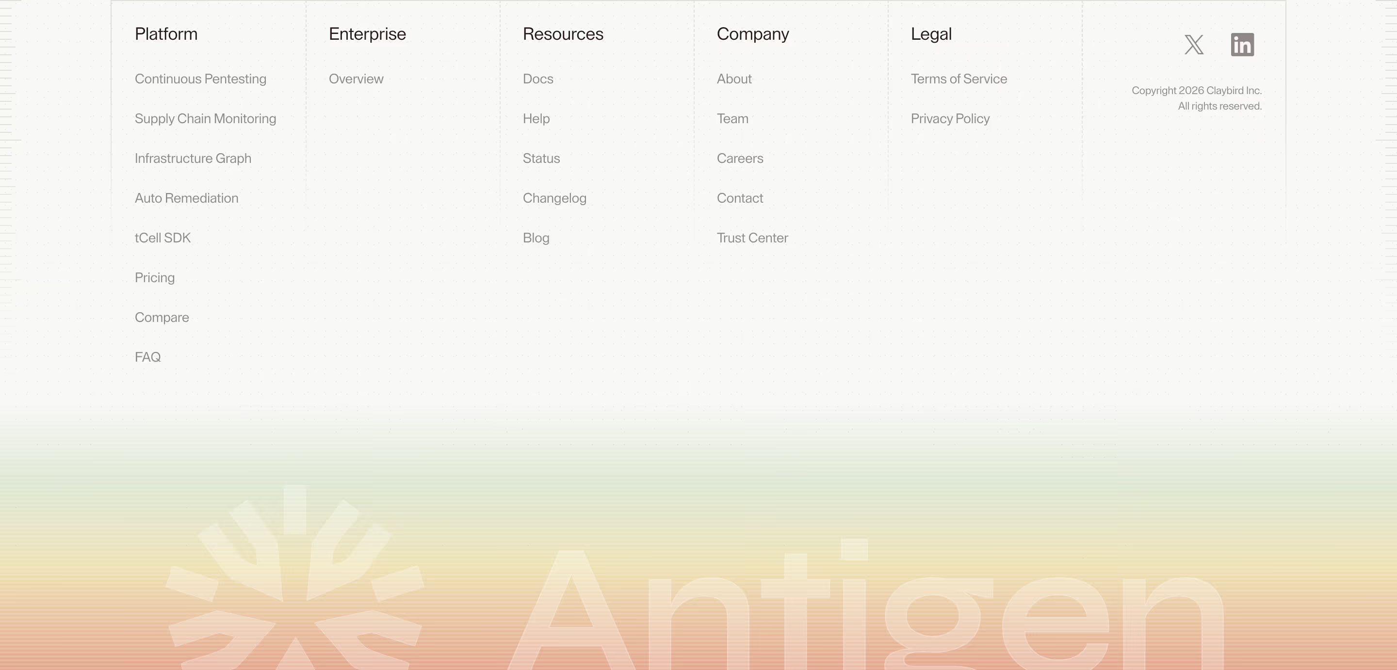
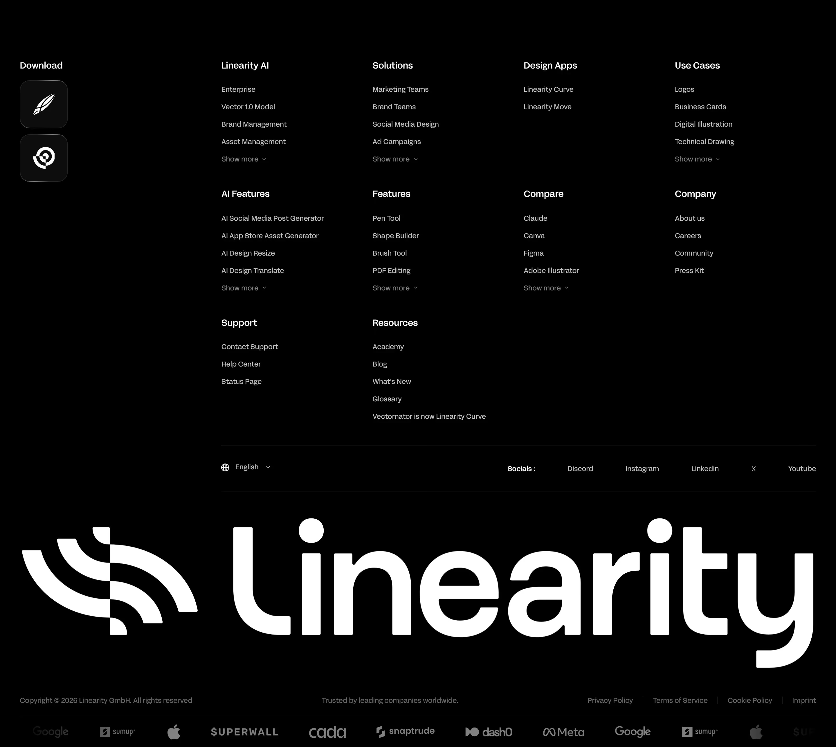
A footer wordmark is the company name set very large across the bottom of the footer, often faded or cropped, so the page ends on the brand itself.
- Also called
- Oversized footer logo, Giant footer wordmark, Big type footer
- Spotted on
- 32 of 422 homepages
- Browse examples
- Footers →
What is a footer wordmark?
The oversized wordmark is one of the most recognizable footer trends on current SaaS sites. Superhuman runs a low-contrast "SUPERHUMAN" along the bottom edge, Semaloop crops a faint wordmark at both edges and Arcade fills its gradient logotype across the width.
It works as a sign-off: after dense link columns, a single huge word gives the page a clear end and a moment of brand. Most versions keep it quiet, in low contrast, outline or a tint close to the background, so it reads as texture rather than a second headline. Hedra goes further and places it behind the bottom row of links.
It works less well when it's full contrast and competes with the closing CTA above it, or when it pushes the legal links below a whole extra screen on mobile.
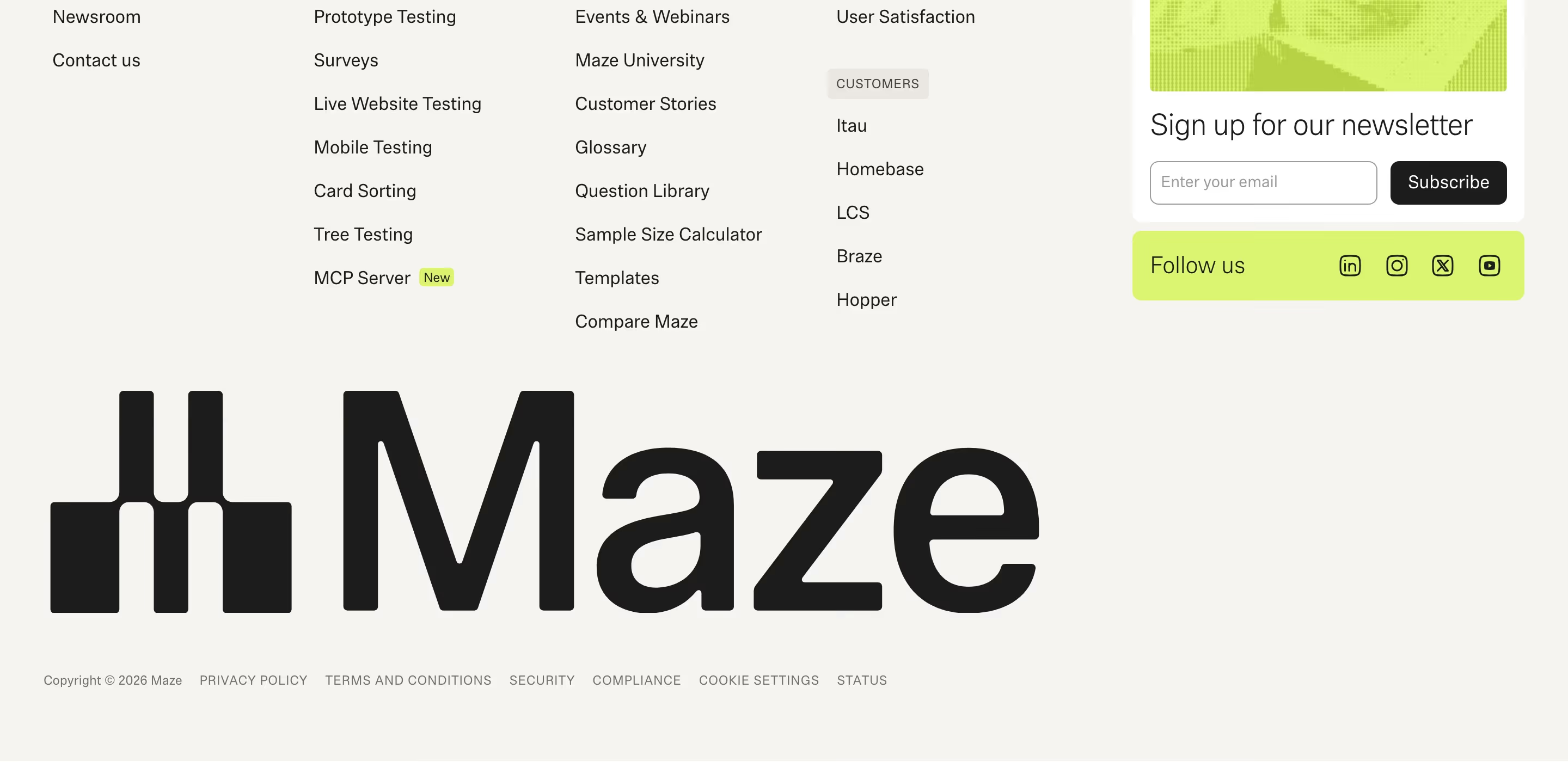
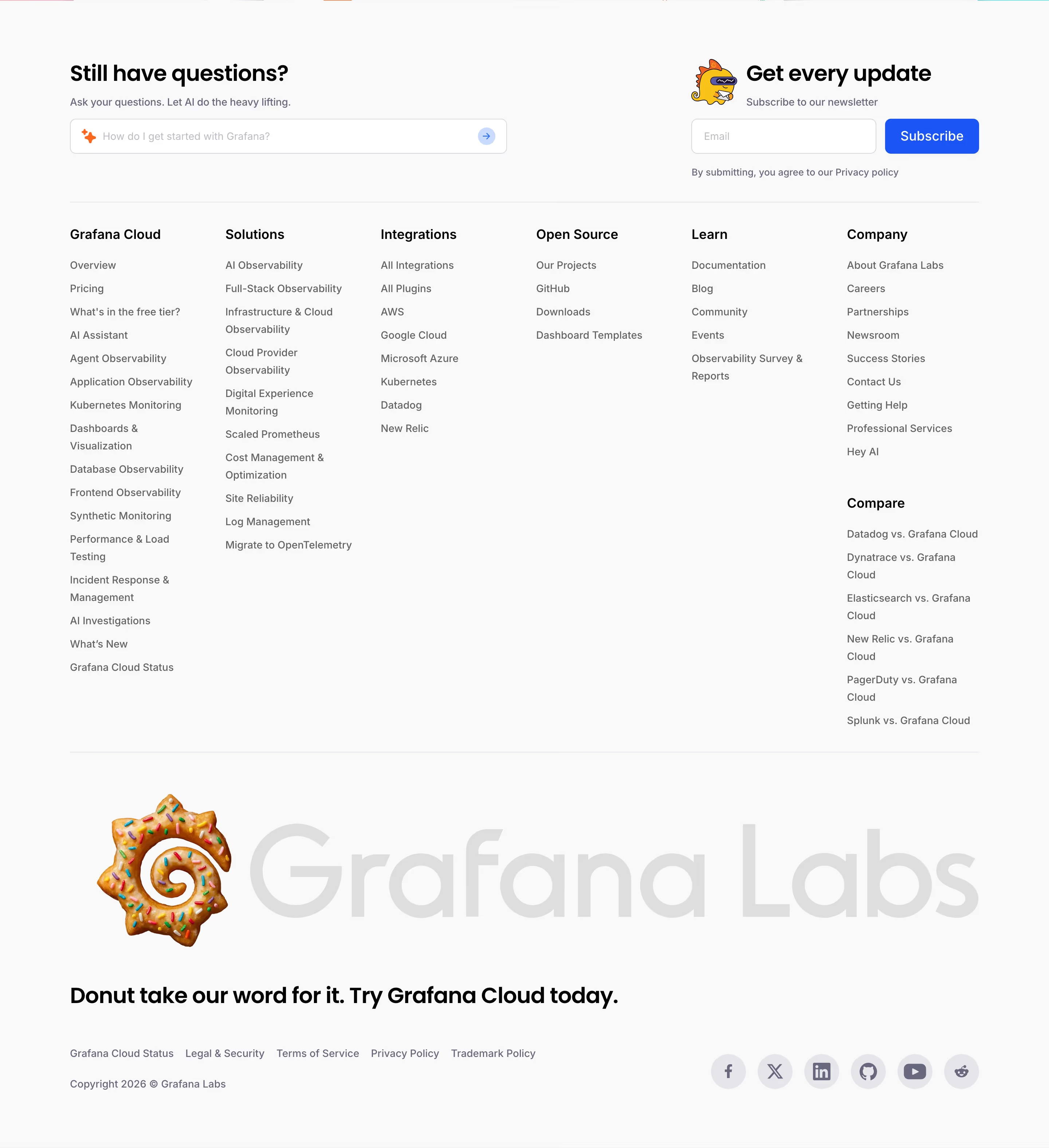
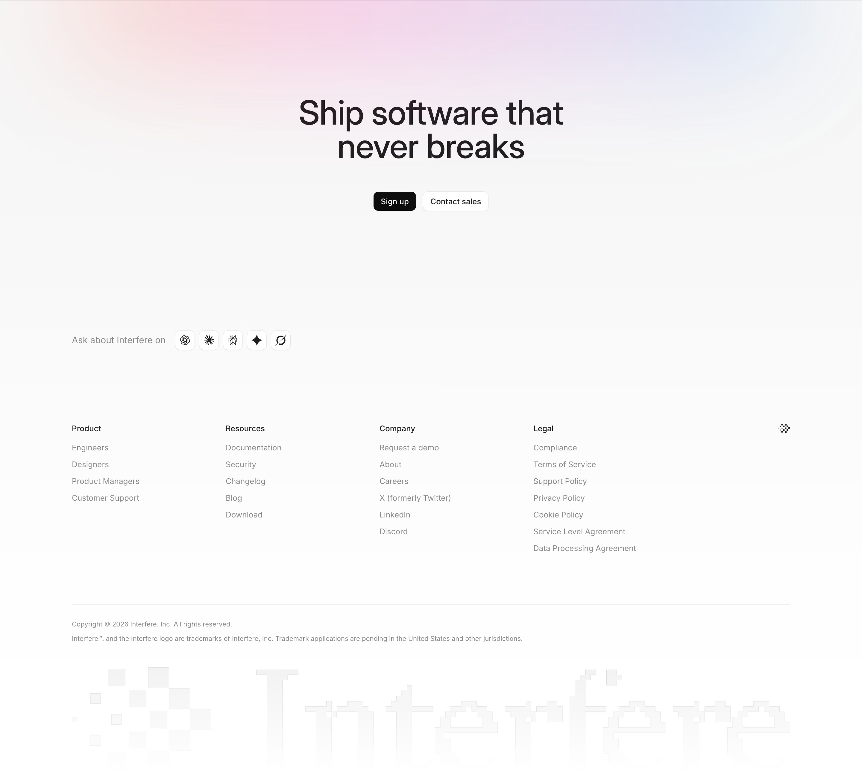
Footer wordmark examples from real SaaS sites
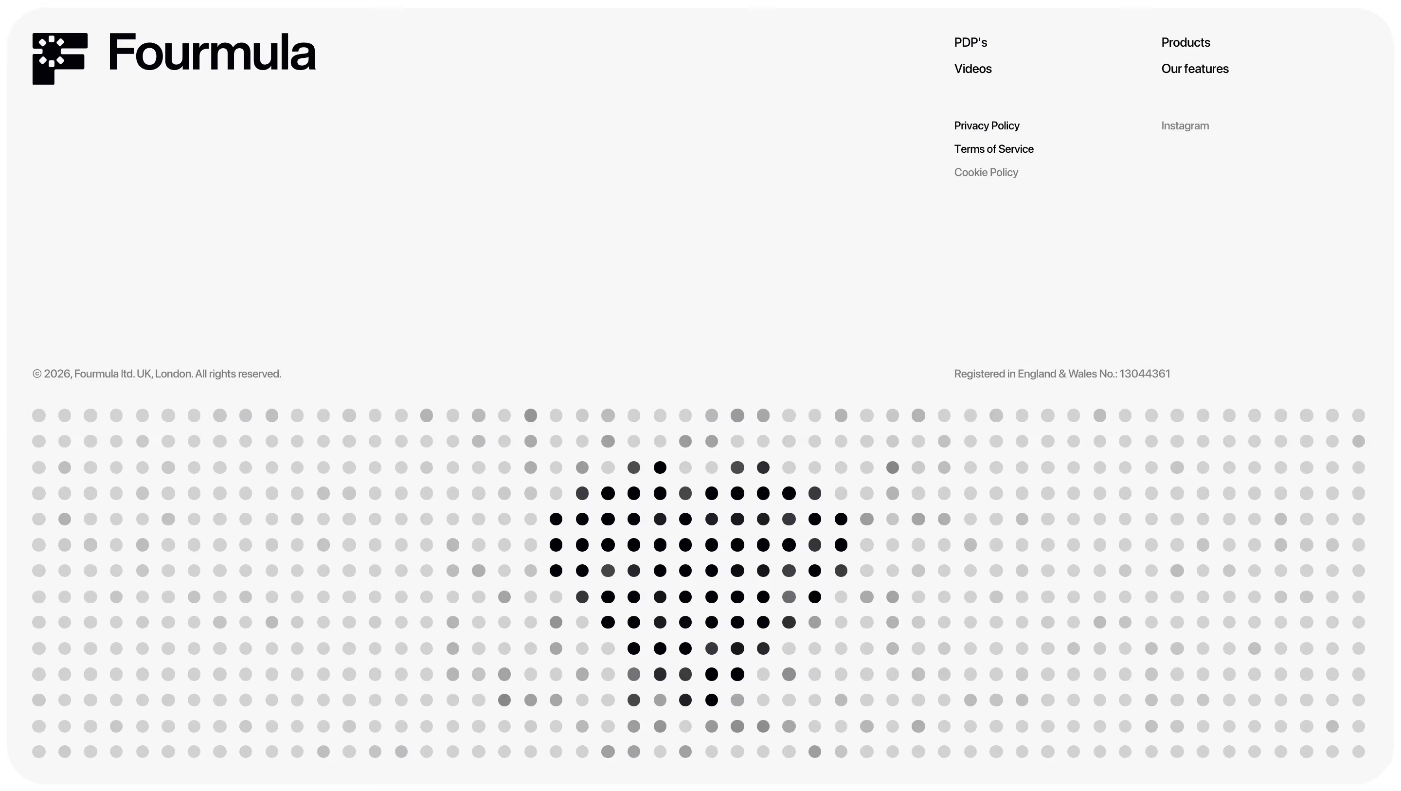
Each one is a footer capture whose design review mentions the footer wordmark.
When to use a footer wordmark, and when not to
Use it for
- Strong wordmarkYour logo is a distinctive word that holds up at hundreds of pixels tall.
- Minimal pagesRestrained sites that need one bold moment without adding imagery.
- Short footersA few link columns that would otherwise leave the bottom of the page feeling thin.
Avoid it for
- Icon-led brandsIf the brand is a symbol rather than a word, the effect loses its point.
- Long namesA long company name has to shrink so far to fit that it stops being oversized.
- Busy footersEight link columns, badges and a newsletter field already fill the space.
Anatomy of a footer wordmark
- 1Link areaThe normal footer columns and utility row above.
- 2WordmarkThe company name spanning most or all of the page width.
- 3TreatmentLow contrast, outline, gradient, grain or pixel styling that keeps it decorative.
- 4CroppingOften cut off at the bottom or sides so it feels larger than the viewport.
Common footer wordmark variants
1. Ghosted wordmark
A faint tint of the background color, readable up close but quiet at a glance.
2. Cropped wordmark
Letters cut off by the page edge, as on Cosmos and Semaloop.
3. Styled wordmark
Gradient, grain, outline or pixel lettering, like Arcade's gradient or Interfere's pixel-style mark.
Spotted in our design reviews
Our reviews describe a footer wordmark on 32 of the 422 SaaS homepages in the catalog. A few of them:
A huge dark-grey "HEDRA" wordmark sits behind a monospace bottom row with "LINKEDIN", "INSTAGRAM", "DISCORD", a support email and "HEDRA 2026 — ALL RIGHTS RESERVED".
Hedra · Footers
A giant white "teachable" wordmark fills the lower left, and an "AICPA SOC" badge.
Teachable · Footers
An oversized, low-contrast "Kombai" wordmark ends the page.
Kombai · Footers
The footer has a large 3D wordmark, "Contact us" and link columns headed "Product", "Solutions" and "Compare".
Ploy · Closing section and footer
The navy footer adds "Always the best agent, one call away." and four link columns, "PRODUCT", "DEVELOPERS", "LEARN" and "LEGAL", above a faint oversized wordmark.
Agentsky · Closing section and footer
The footer has six small-caps link columns and a giant ghosted "Hebbia" wordmark above the copyright line.
Hebbia · Security grid and footer
"From Delays to Deals With Refold AI" repeats both buttons before an oversized "Refold AI" wordmark and a three-column footer with four security badges.
Refold · Deployment, audiences, testimonial and footer
An oversized, low-contrast "SUPERHUMAN" wordmark spans the bottom edge.
Superhuman · Closing section and footer
Often confused with
Footer wordmark vs. footer
The footer is the whole bottom section; the footer wordmark is one optional decorative element inside it.
Footer wordmark vs. serif headline
Both are typographic statements, but a serif headline carries a message while a footer wordmark carries only the brand name.
Frequently asked
Is an oversized footer wordmark accessible?
Treat it as decoration: keep the real company name and links in normal text, and mark the giant version as decorative so screen readers don't announce it twice.
How do you build a footer wordmark that fits any screen width?
Usually an inline SVG of the logo set to 100% width, or text sized in viewport units. SVG scales cleanly and keeps the kerning of the real logo.